Working between image and system to shape clear, considered brands with clarity, refinement, and longevity.
Working between image and system to shape clear, considered brands with clarity, refinement, and longevity.
Returning Mana to the Port
Port of Auckland
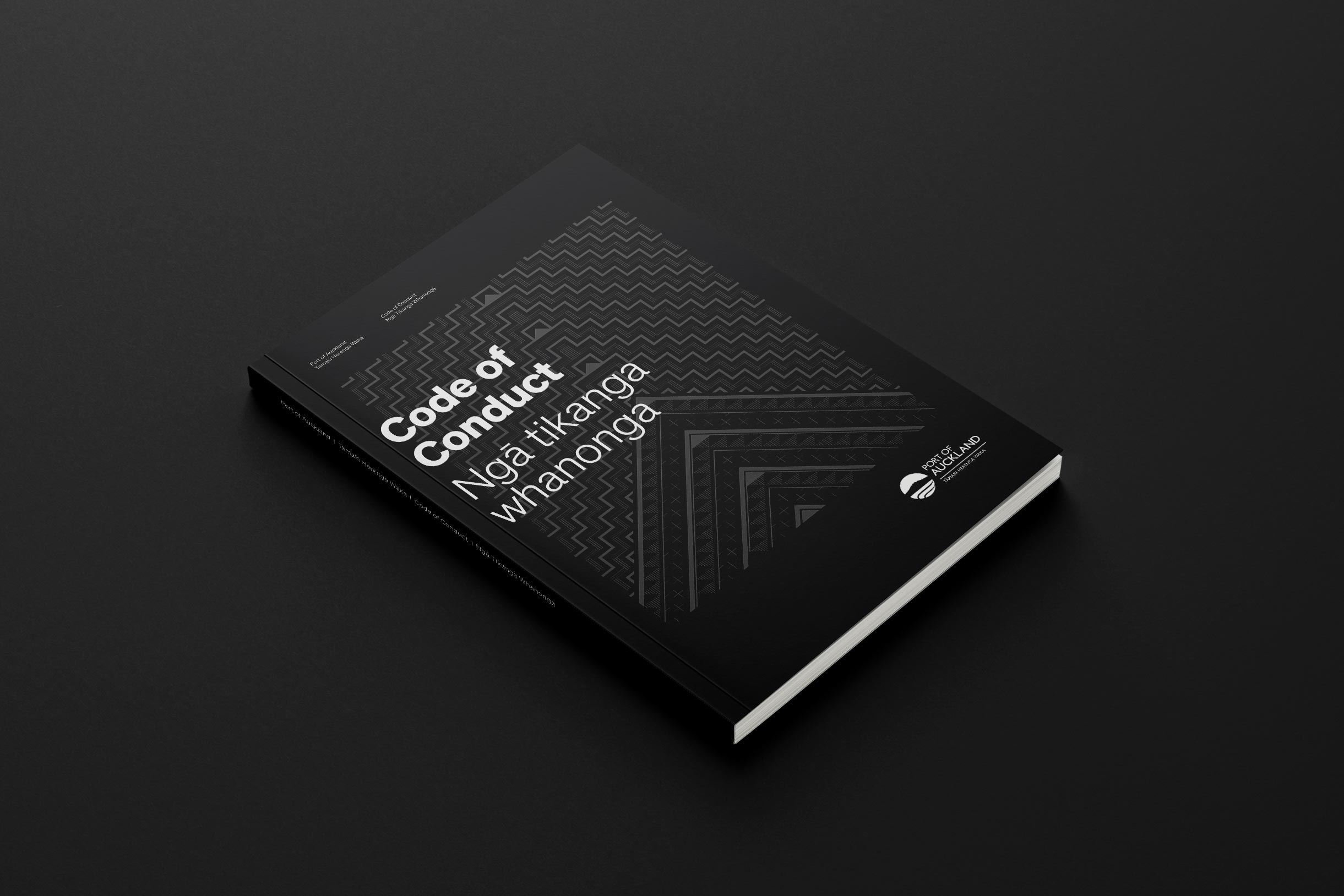
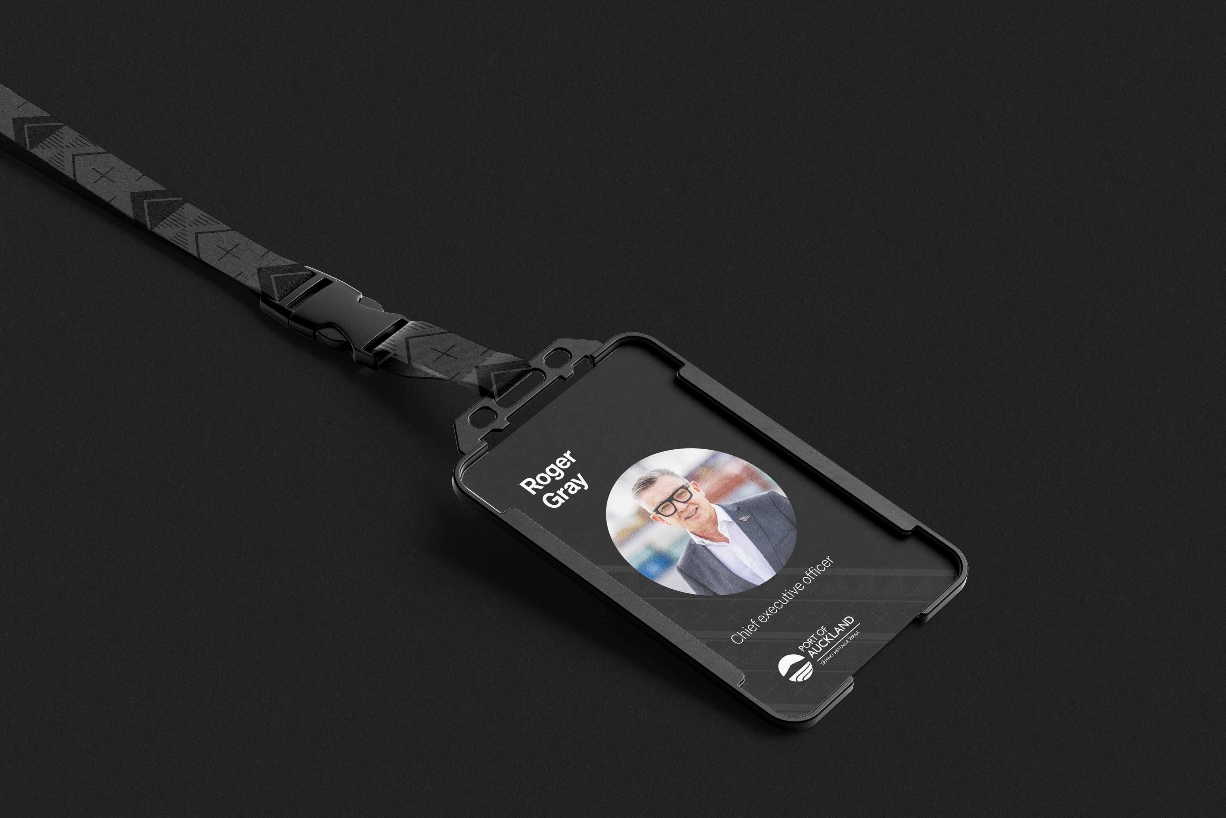
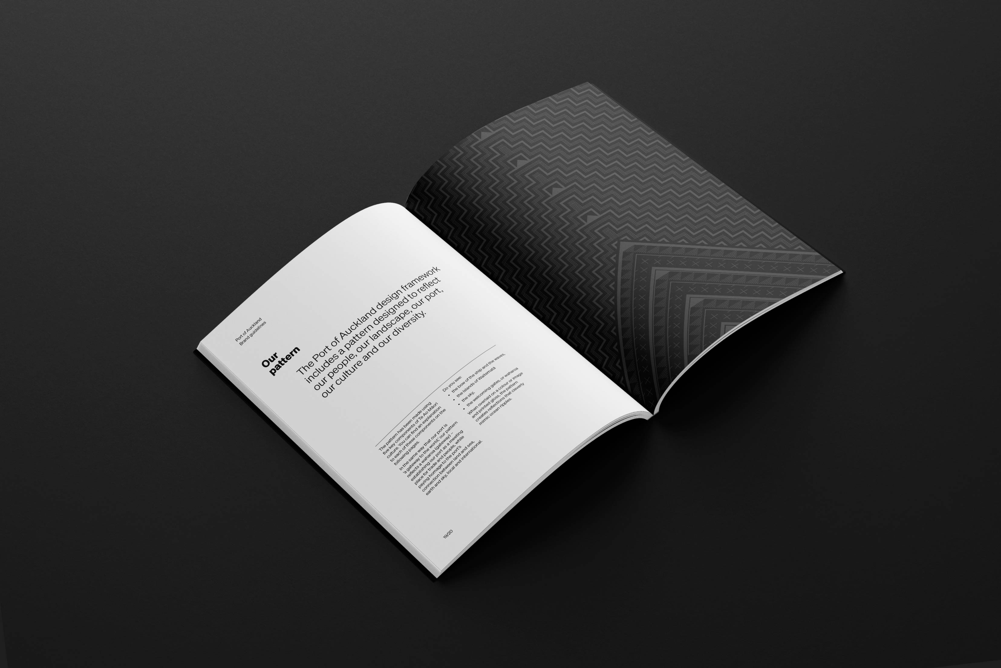
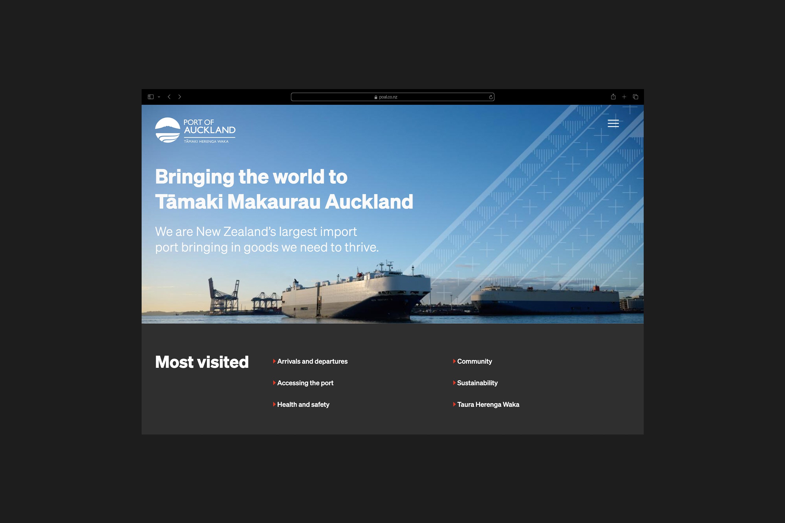
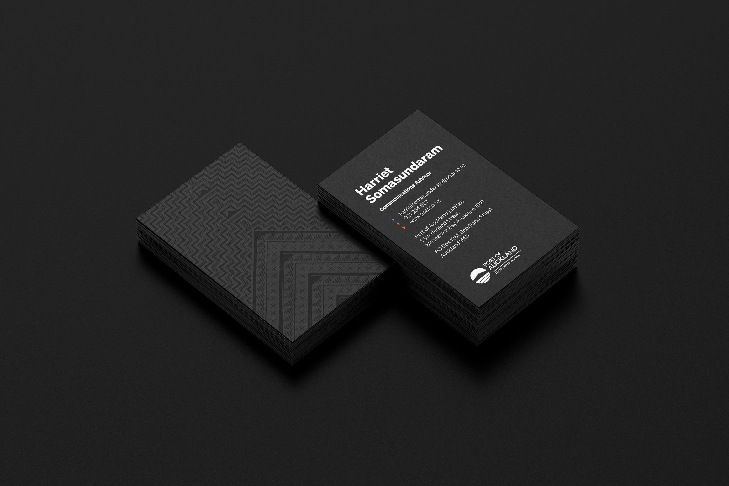
We refreshed the Port of Auckland brand with a contemporary design system that retained the existing logo while integrating elements of Te Ao Māori and acknowledging the port’s past, present, and future. The process was deeply inclusive and culturally grounded. The result sparked a renewed sense of pride and unity —igniting an internal movement that’s helping restore mana to the port. — Designed for Crave Group.


Returning Mana to the Port
We refreshed the Port of Auckland brand with a contemporary design system that retained the existing logo while integrating elements of Te Ao Māori and acknowledging the port’s past, present, and future. The process was deeply inclusive and culturally grounded. The result sparked a renewed sense of pride and unity —igniting an internal movement that’s helping restore mana to the port. — Designed for Crave Group.
The Untamed Winery
Wild Estate
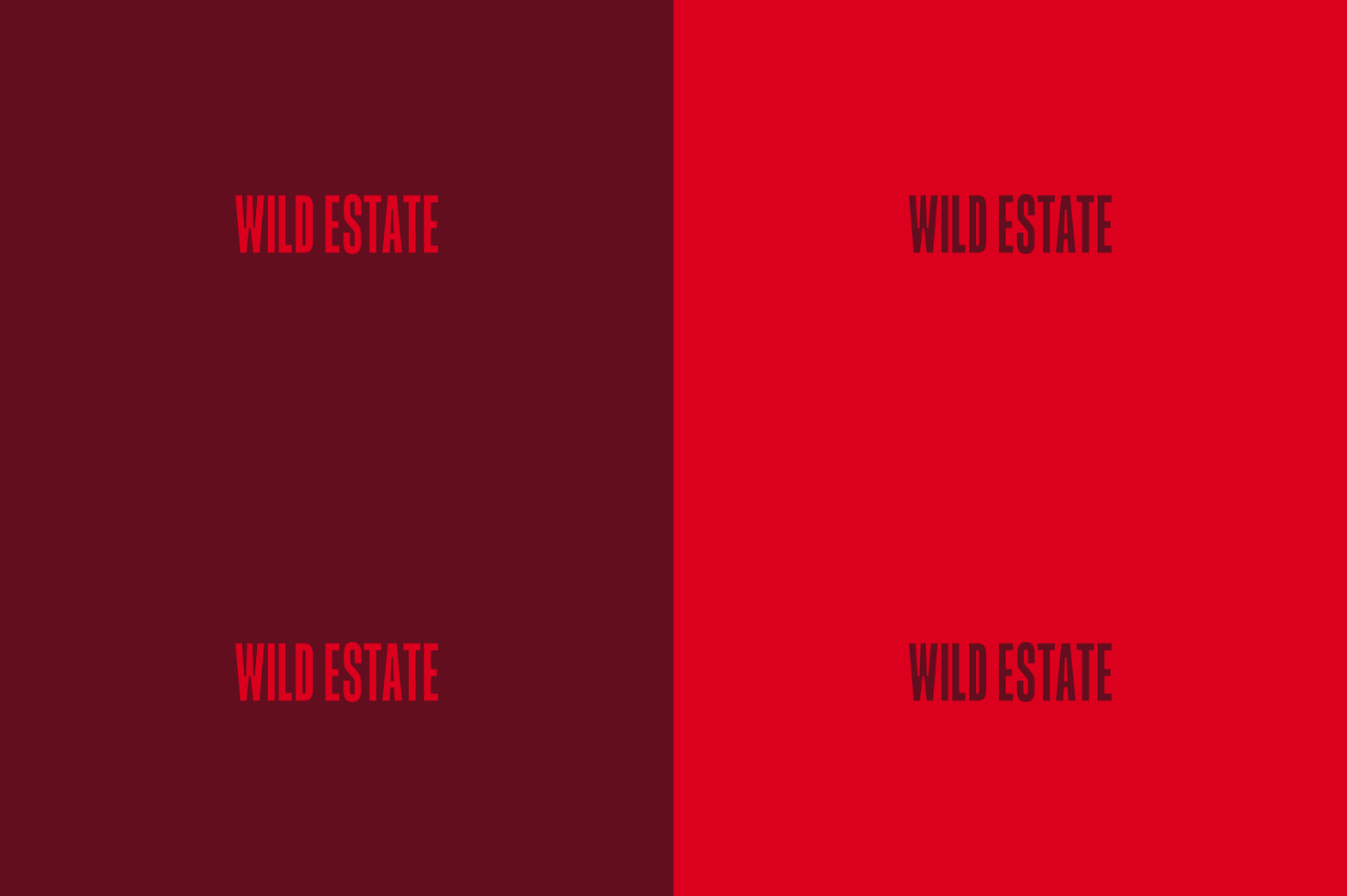
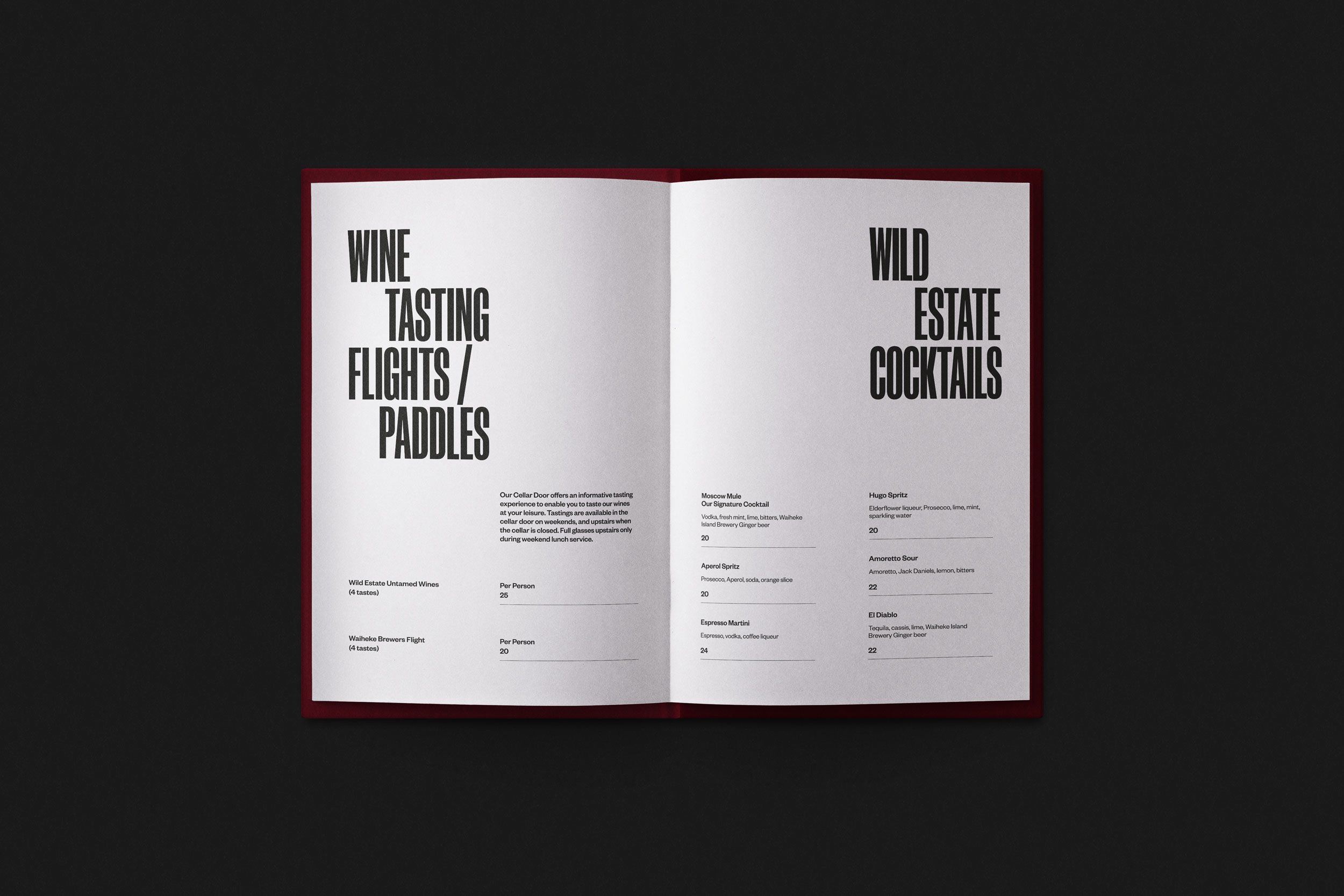
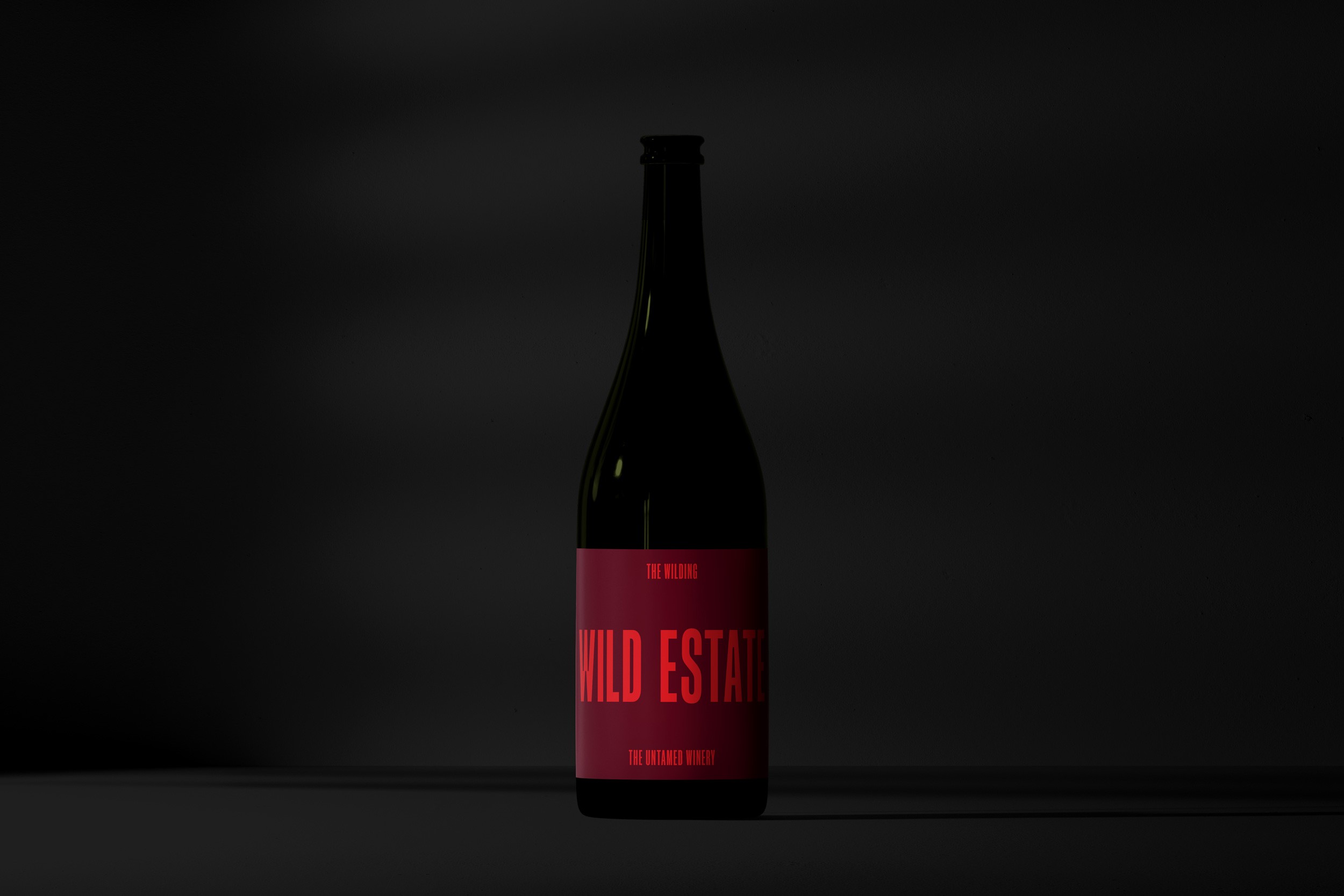
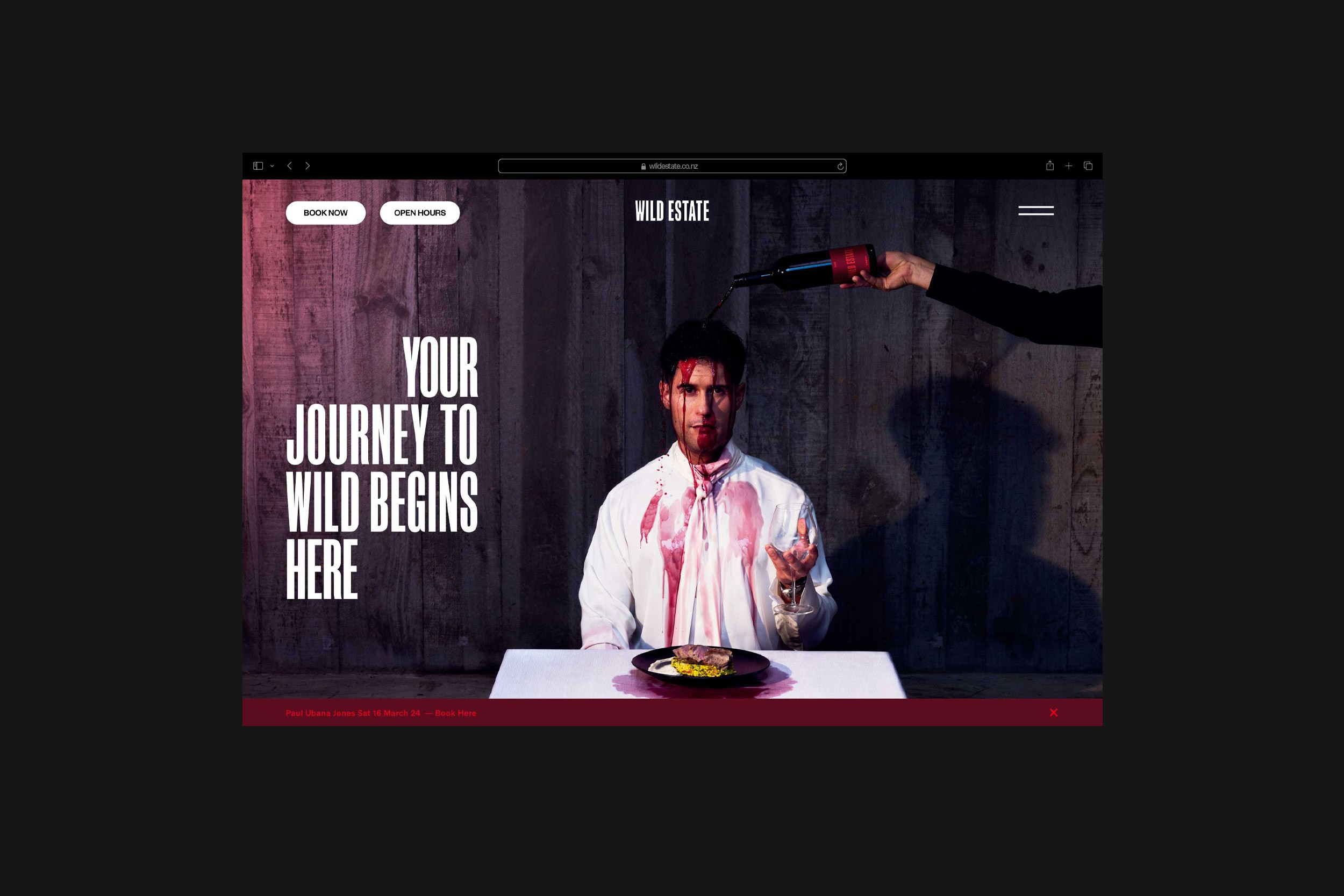
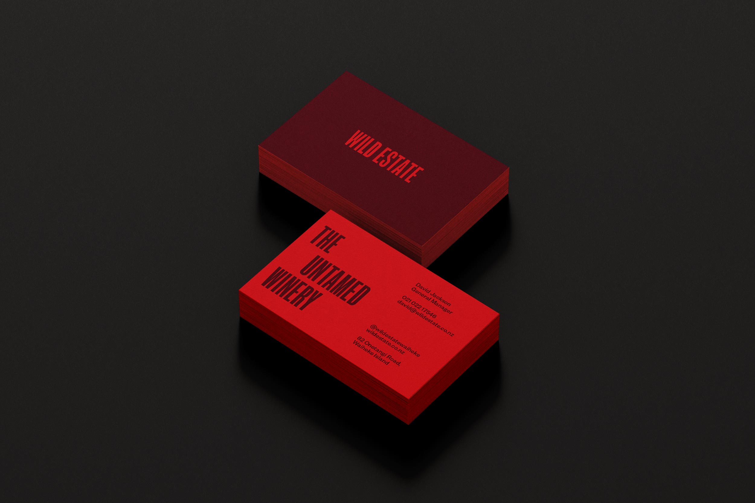
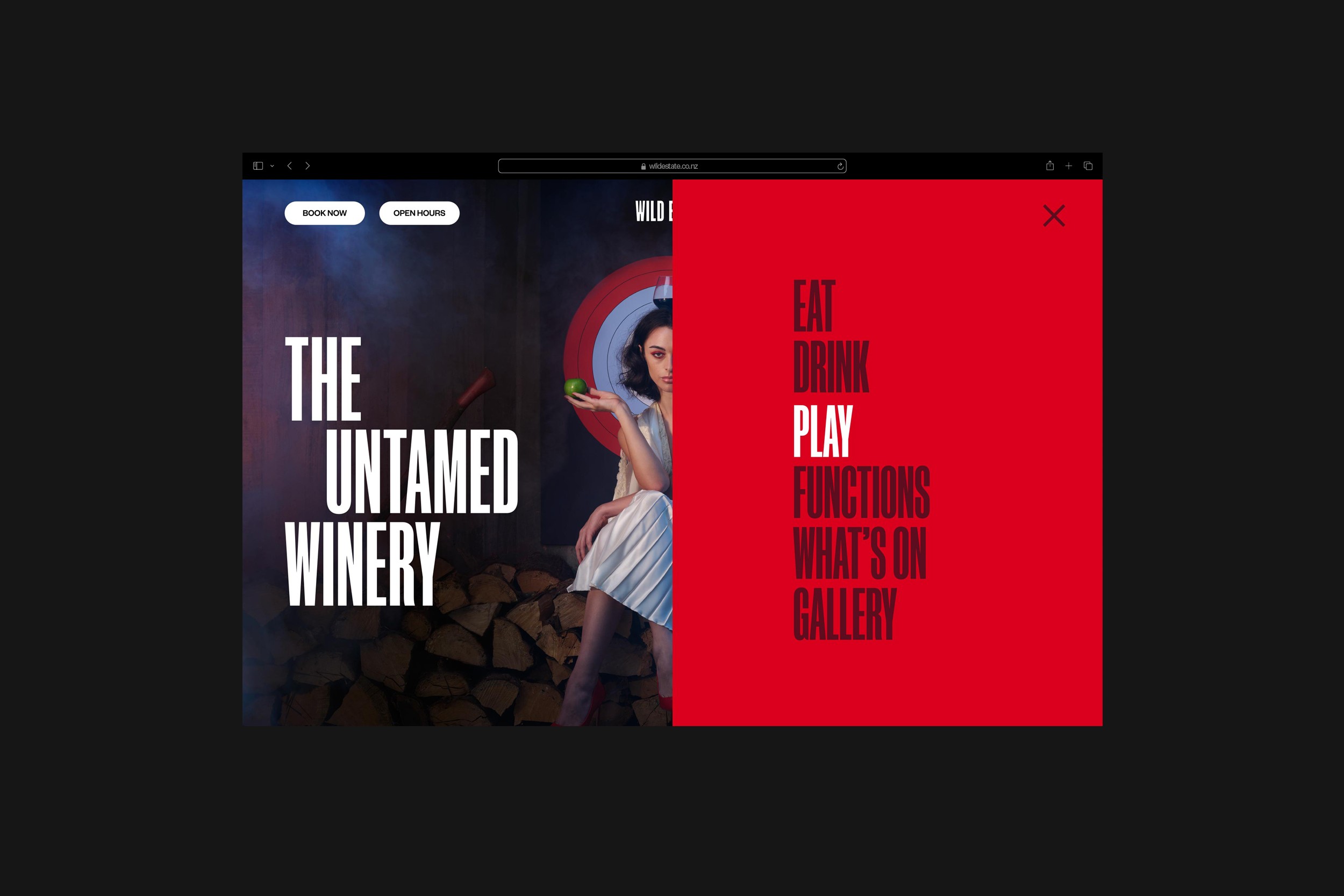
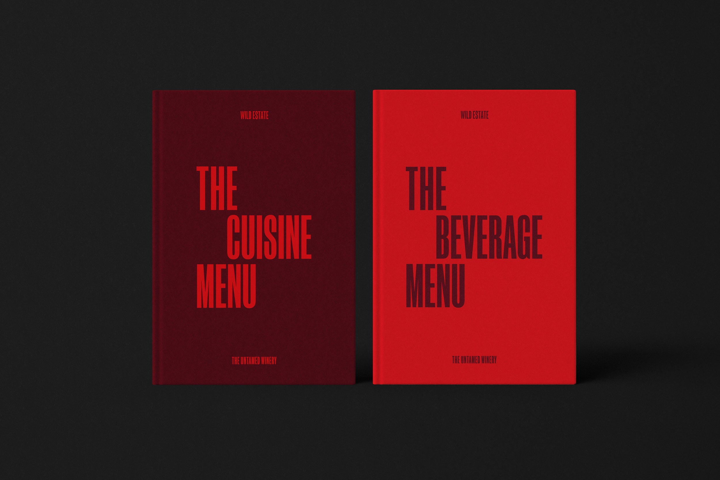
We revamped the branding of Wild Estate Winery to differentiate it in the highly competitive landscape of Waiheke Island, repositioning it as an adventurous playground for adults. Rooted in the concept of "Wild, Wilder, Wildest," it invites visitors to embrace their wild side. We developed a new visual identity, a new website design, campaign concepts, and an operational framework for the brand, providing the team with clear tools and guidance for the launch. — Designed for Crave Group.
The Untamed Winery
We revamped the branding of Wild Estate Winery to differentiate it in the highly competitive landscape of Waiheke Island, repositioning it as an adventurous playground for adults. Rooted in the concept of "Wild, Wilder, Wildest," it invites visitors to embrace their wild side. We developed a new visual identity, a new website design, campaign concepts, and an operational framework for the brand, providing the team with clear tools and guidance for the launch. — Designed for Crave Group.
Hype. Heart. Entertainment.
Auckland Club Rugby
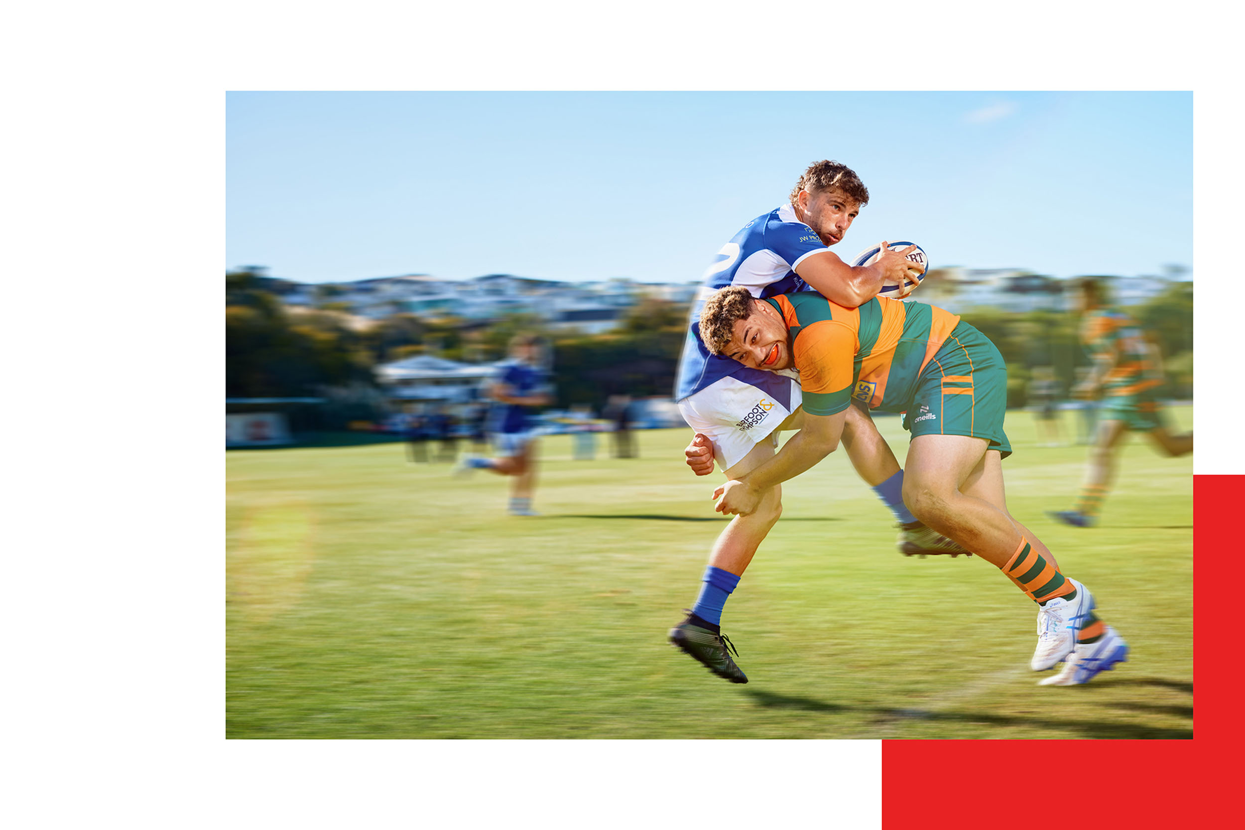
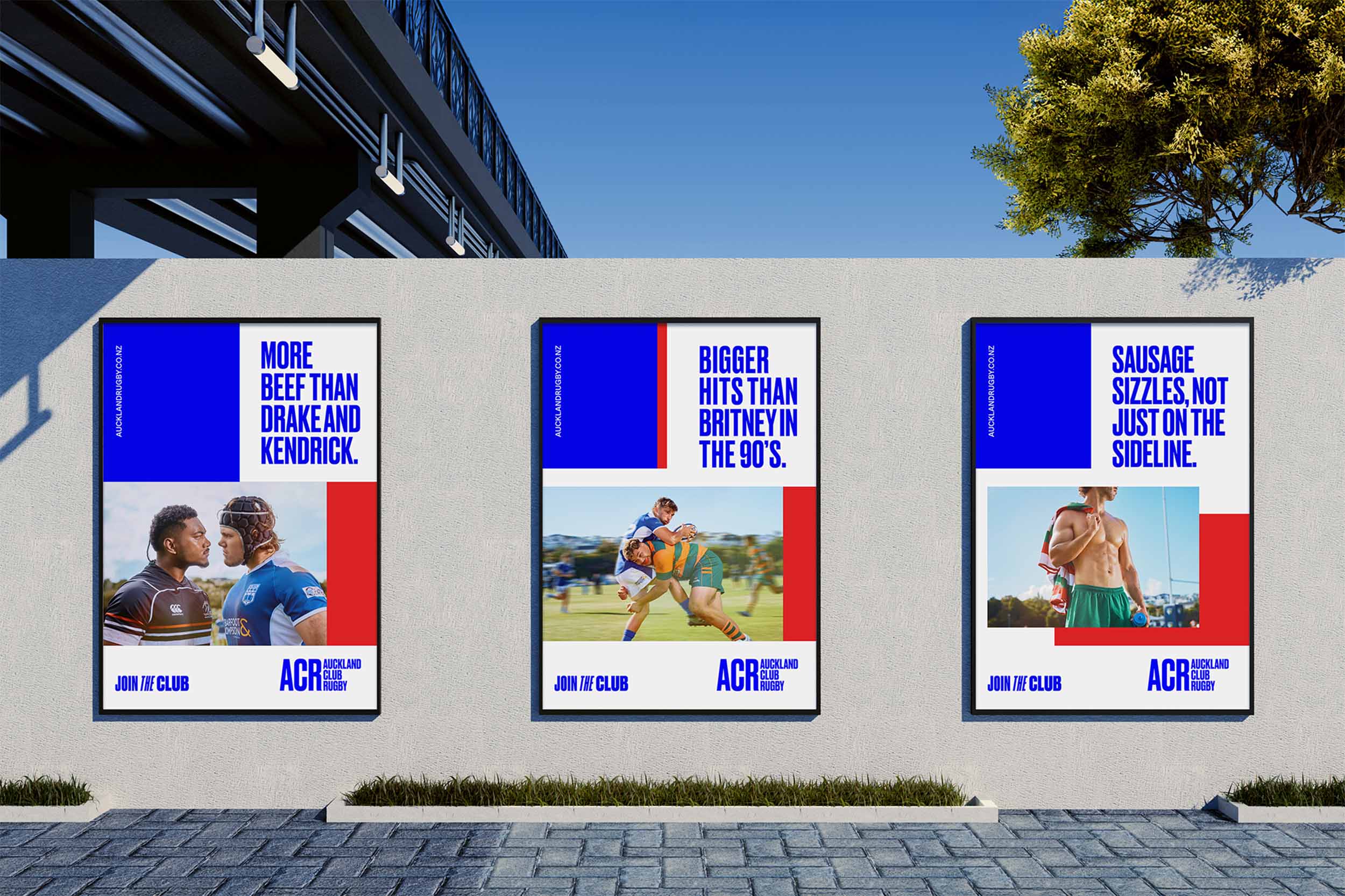
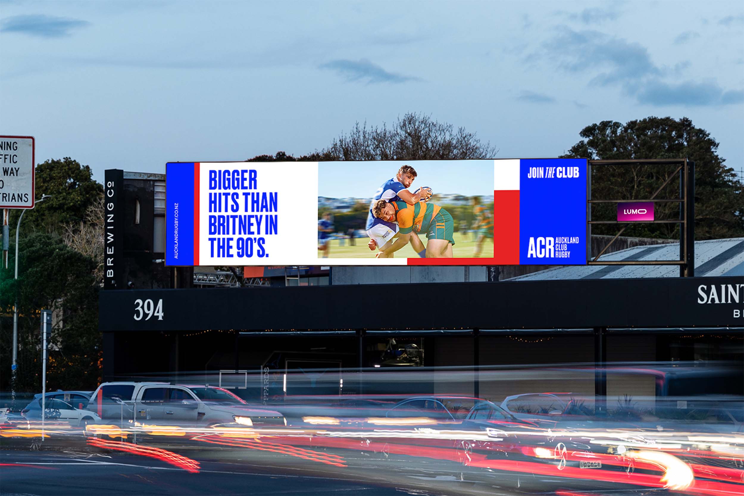
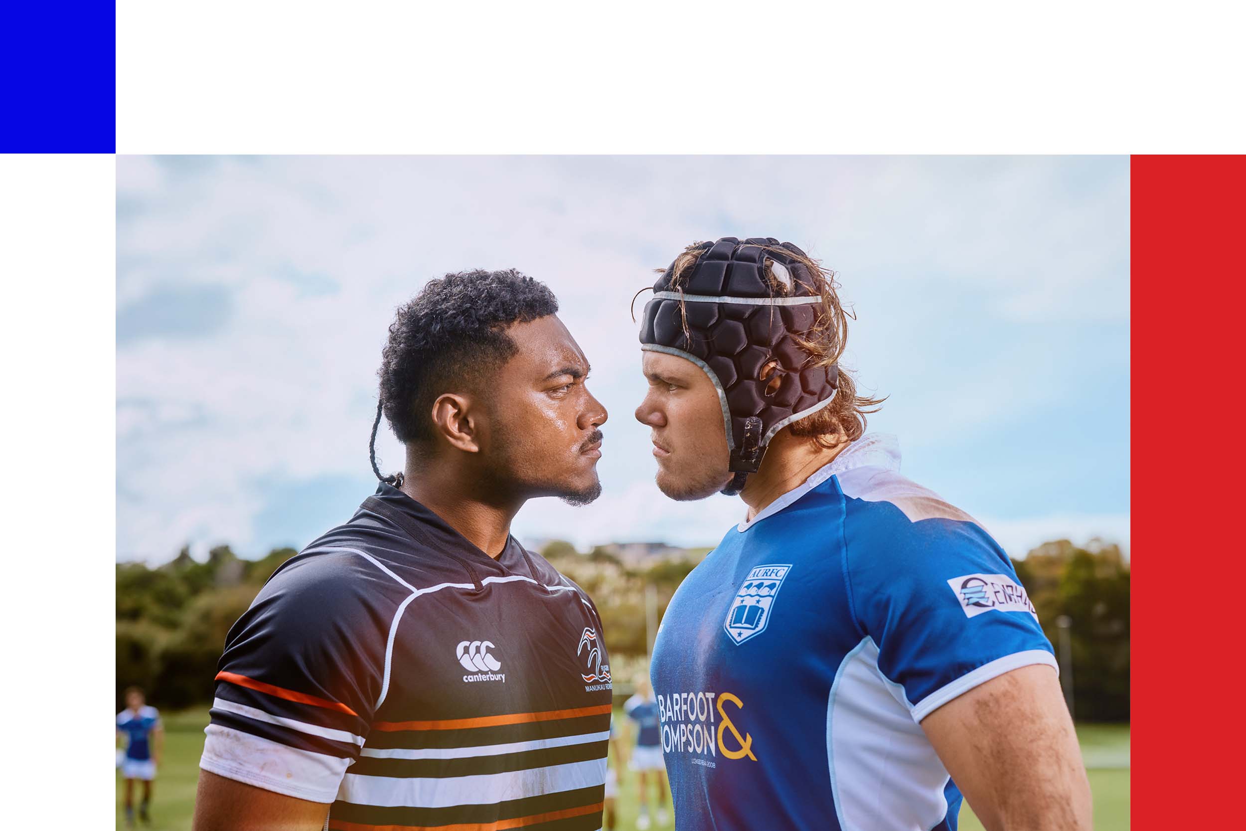
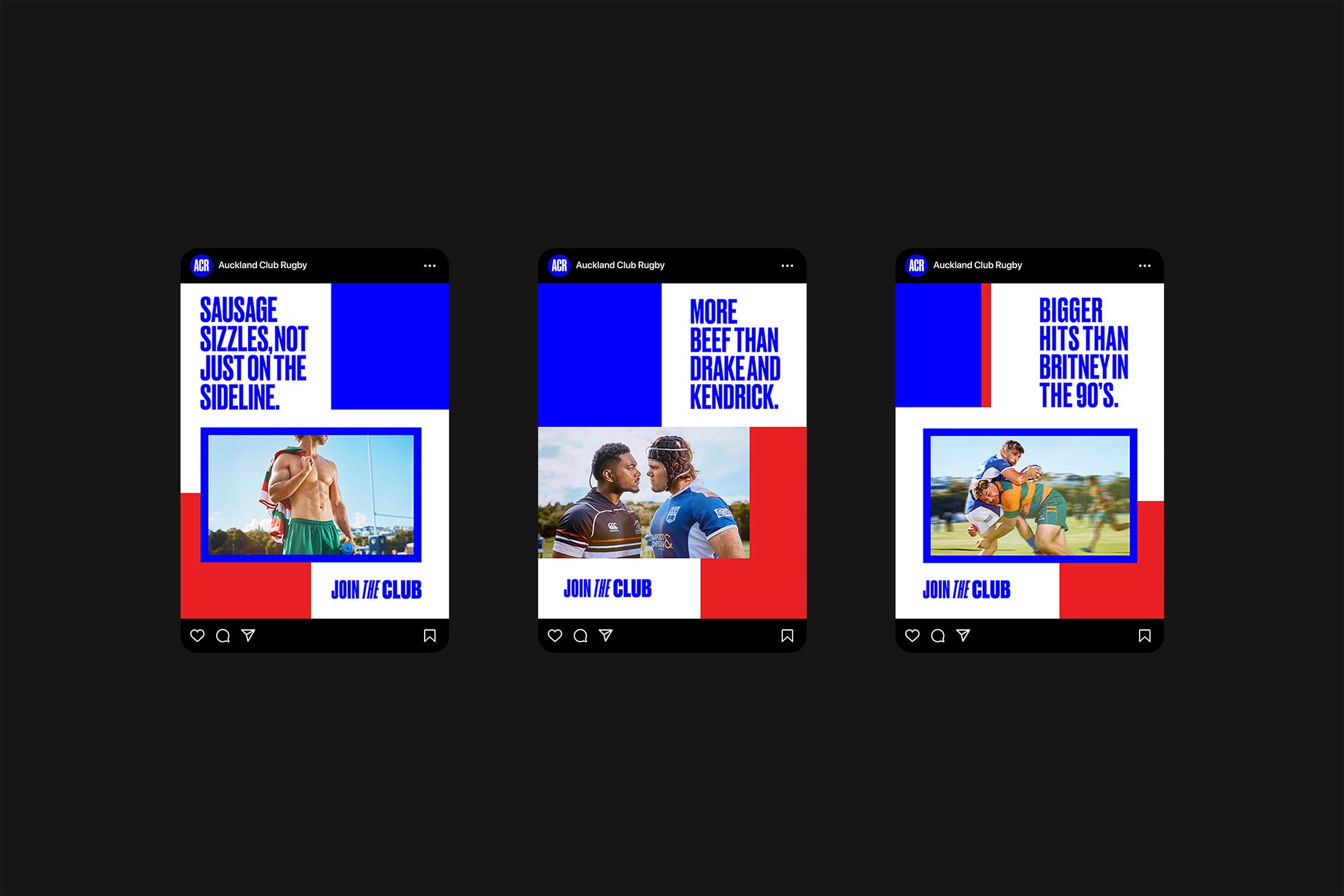
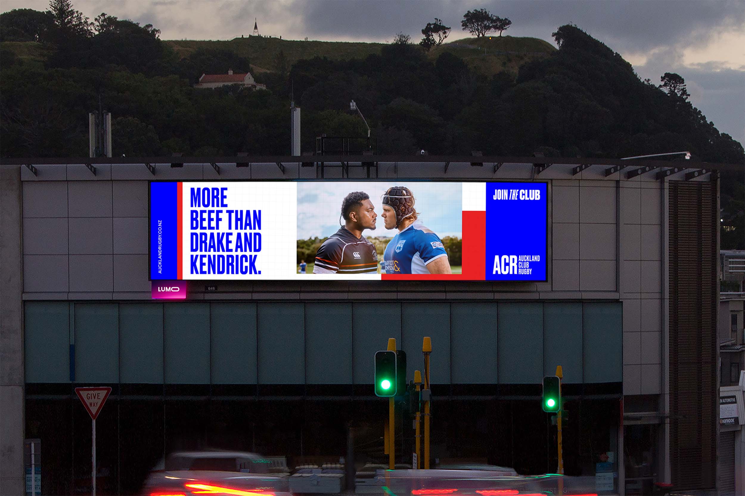
We created the framework and wordmark for a bold new Auckland Club Rugby brand — the first in over 150 years. Built on a grid inspired by the rugby field, the design system captures the game’s structure, movement, and connection. Dynamic layouts echo the energy of play, modernising perceptions and reconnecting younger Aucklanders with club rugby. — Designed for CraveGroup.
Hype. Heart. Entertainment.
We created the framework and wordmark for a bold new Auckland Club Rugby brand — the first in over 150 years. Built on a grid inspired by the rugby field, the design system captures the game’s structure, movement, and connection. Dynamic layouts echo the energy of play, modernising perceptions and reconnecting younger Aucklanders with club rugby. — Designed for CraveGroup.
This is Pool Life
The PoolHouse
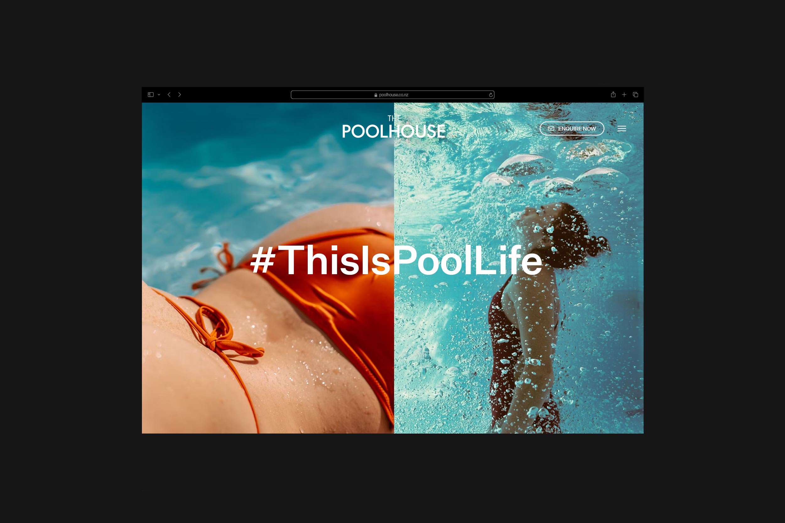
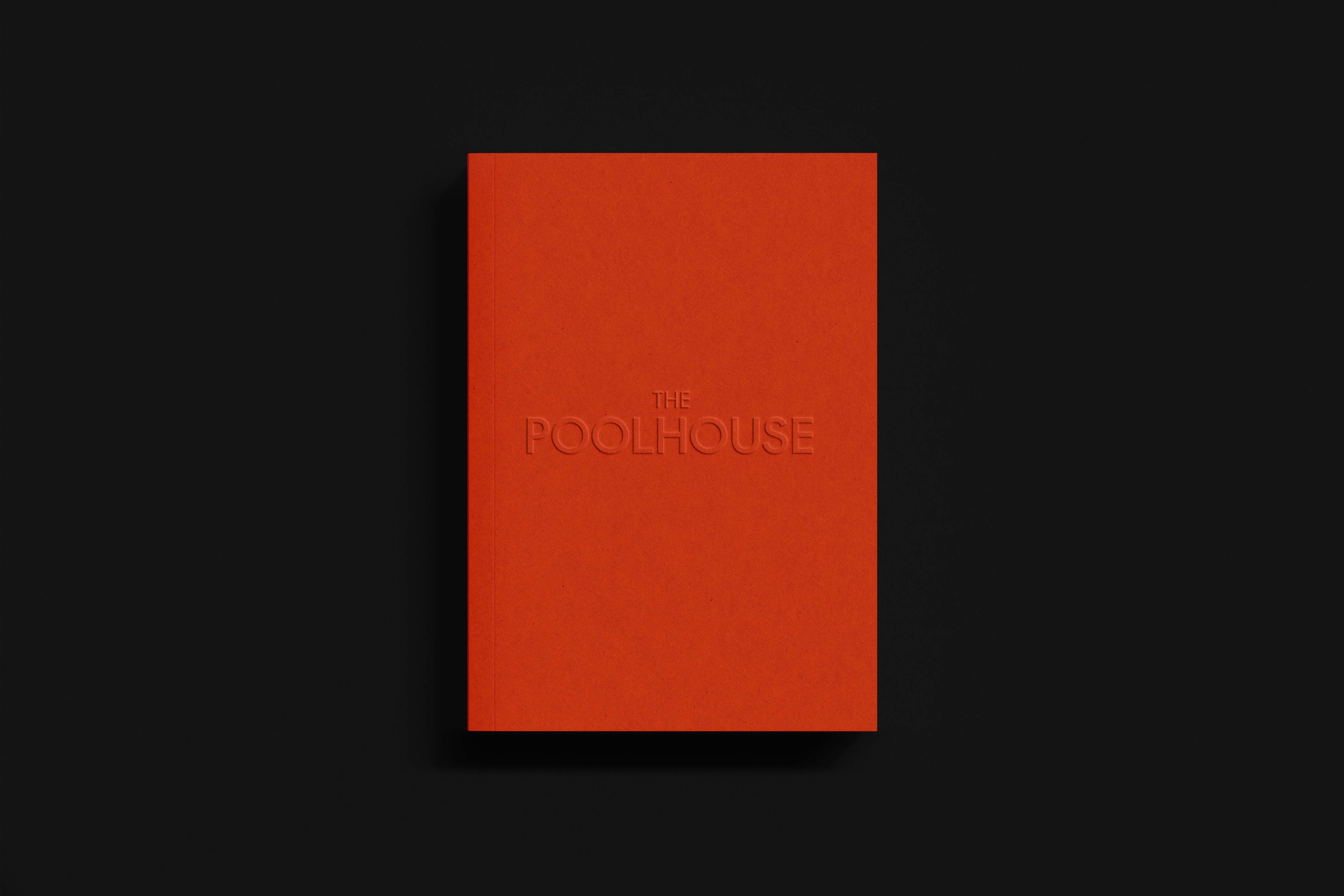
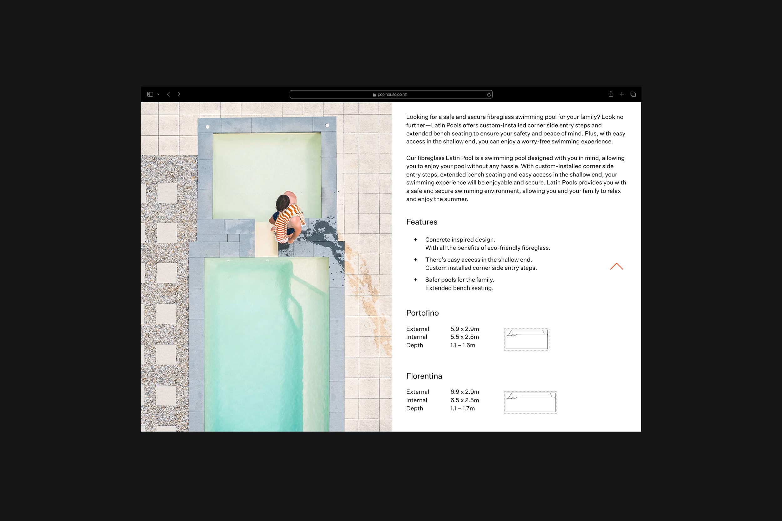
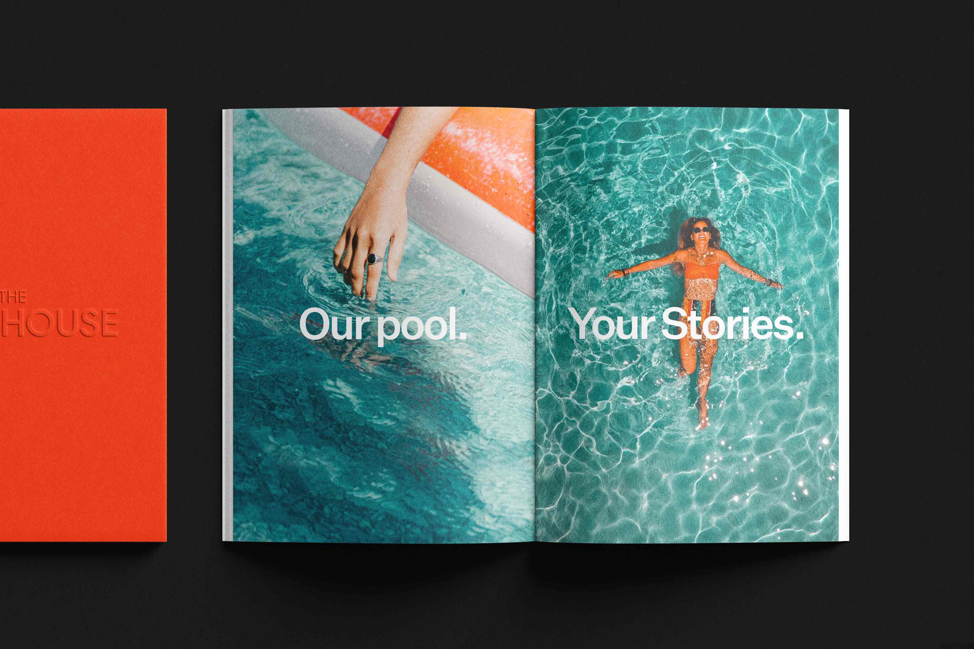
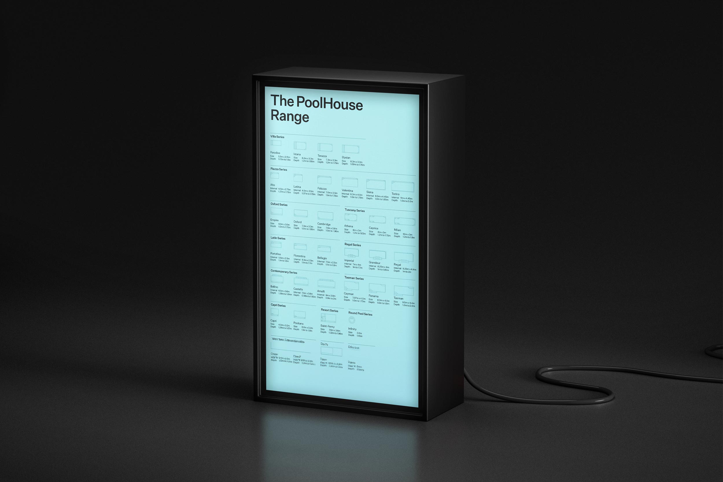
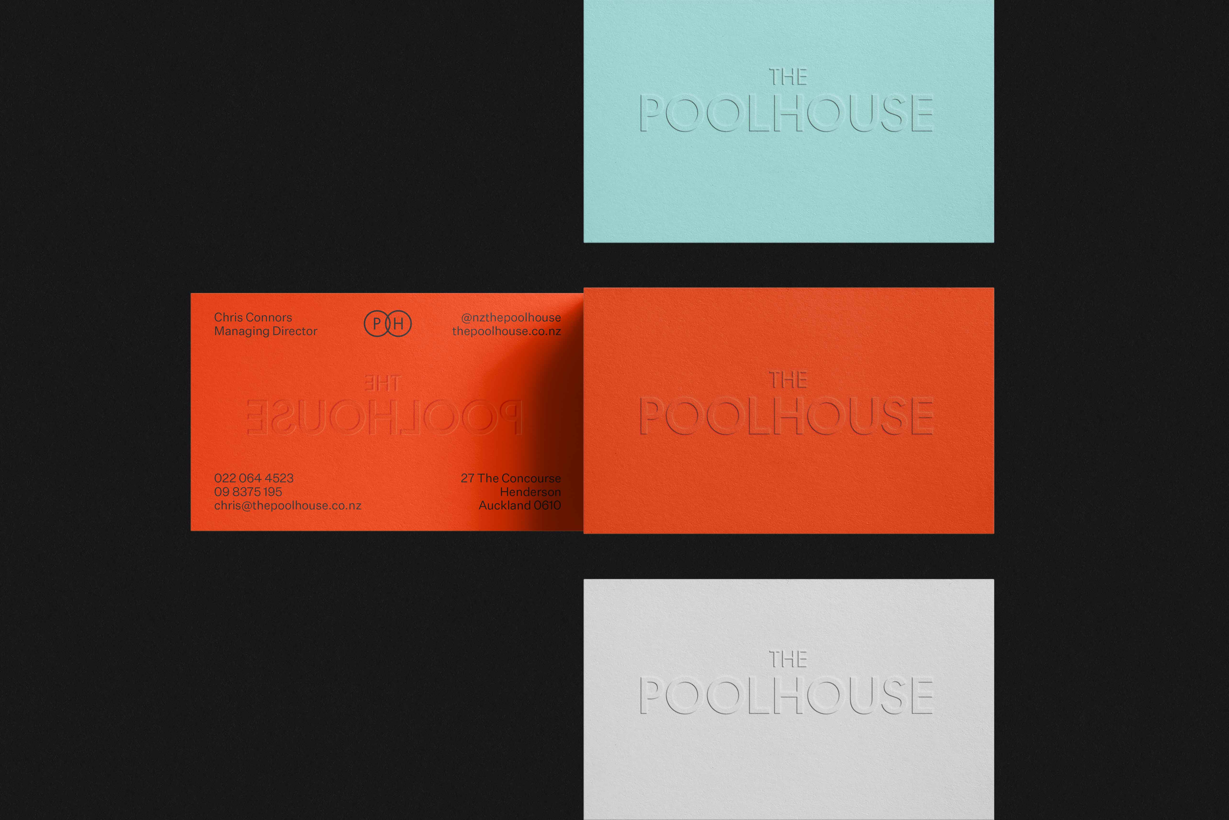
We helped shape a brand that celebrates Kiwi pool culture and rekindles childhood memories of those moments spent by the water. From rebranding to launch, we brought The Poolhouse to life primarily through print materials, a website, and social media, establishing a strong and timeless presence in the category. Playful yet sophisticated, sunny yet understated, the brand evokes a special feeling that lingers long after the season ends. — Designed for Crave Group.
This is Pool Life
We helped shape a brand that celebrates Kiwi pool culture and rekindles childhood memories of those moments spent by the water. From rebranding to launch, we brought The Poolhouse to life primarily through print materials, a website, and social media, establishing a strong and timeless presence in the category. Playful yet sophisticated, sunny yet understated, the brand evokes a special feeling that lingers long after the season ends. — Designed for Crave Group.
Les Turbulences
FRAC Centre
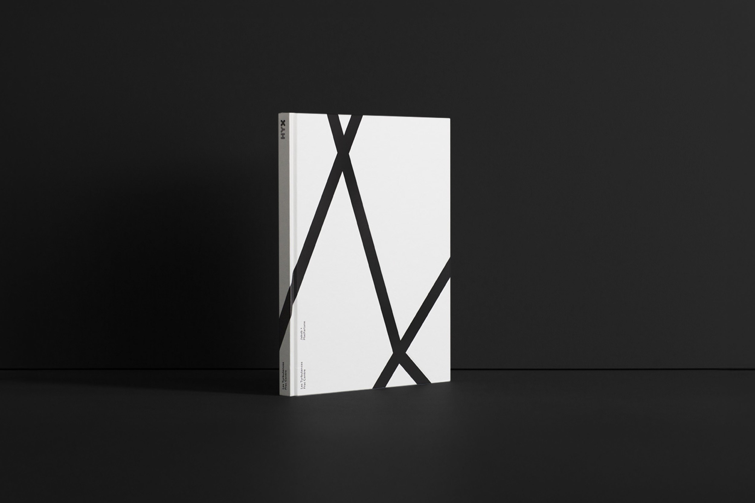
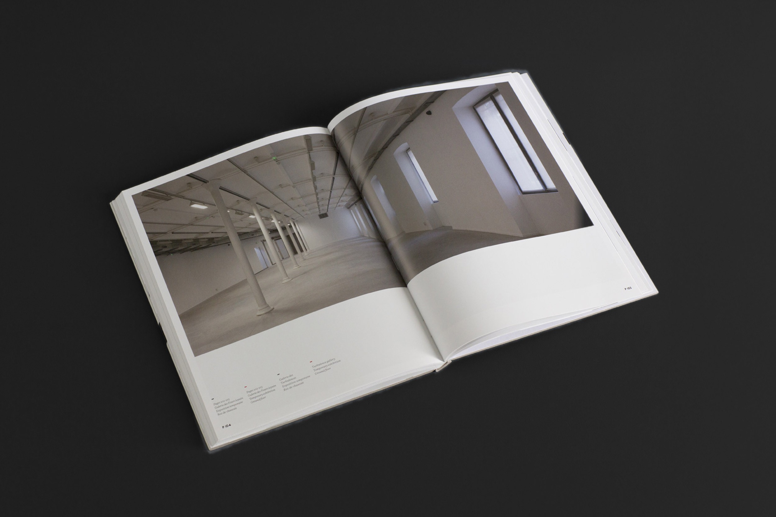
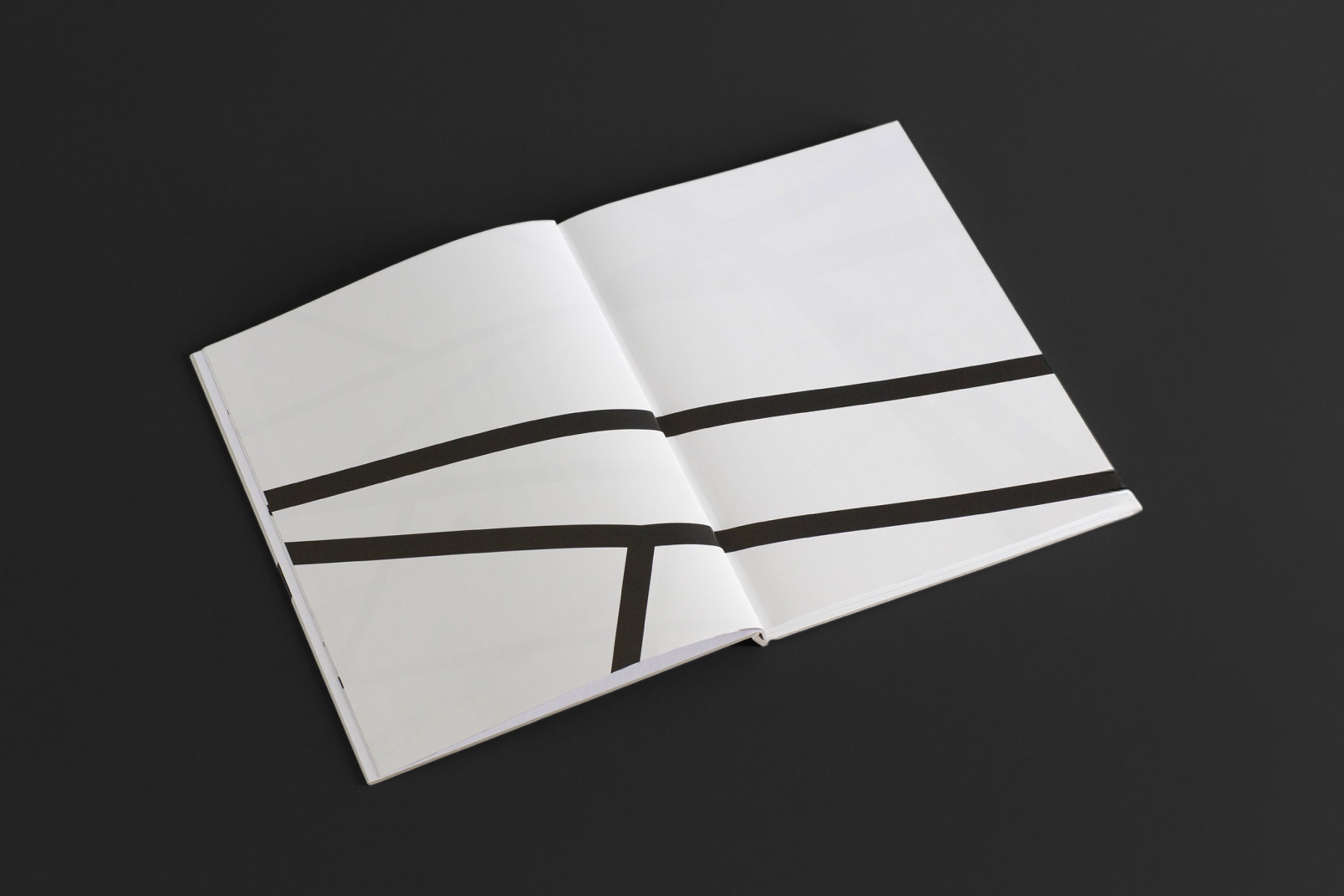
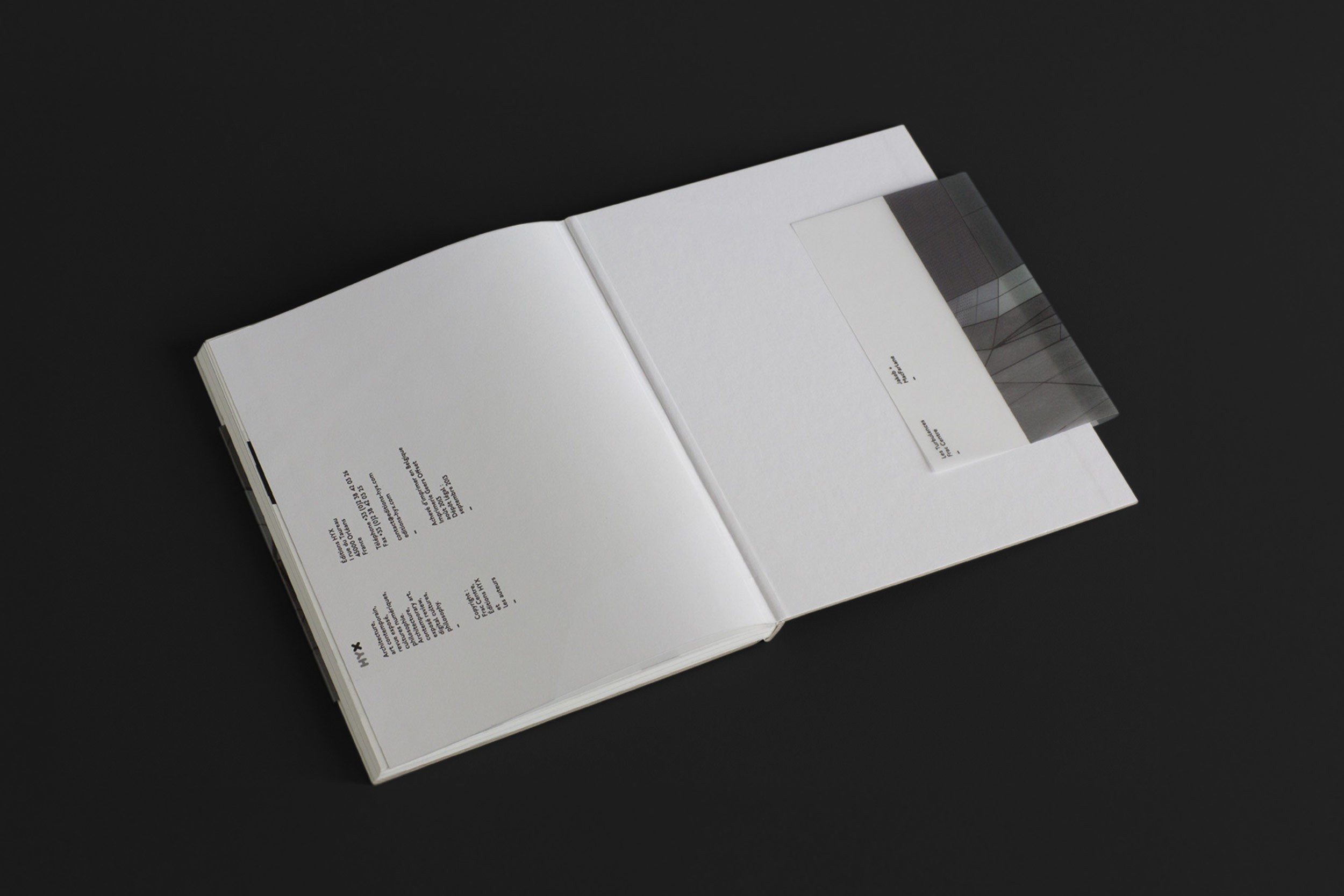
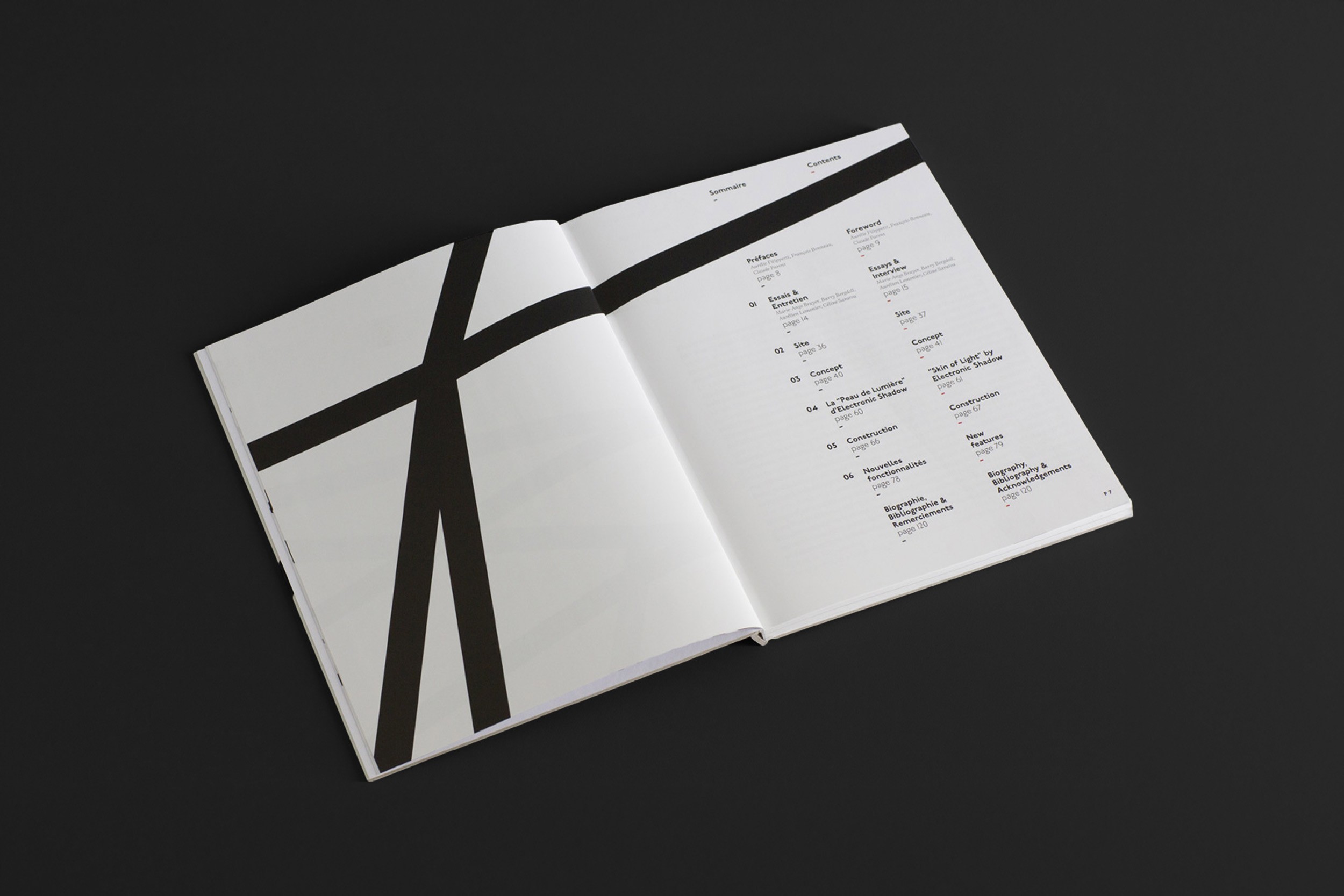
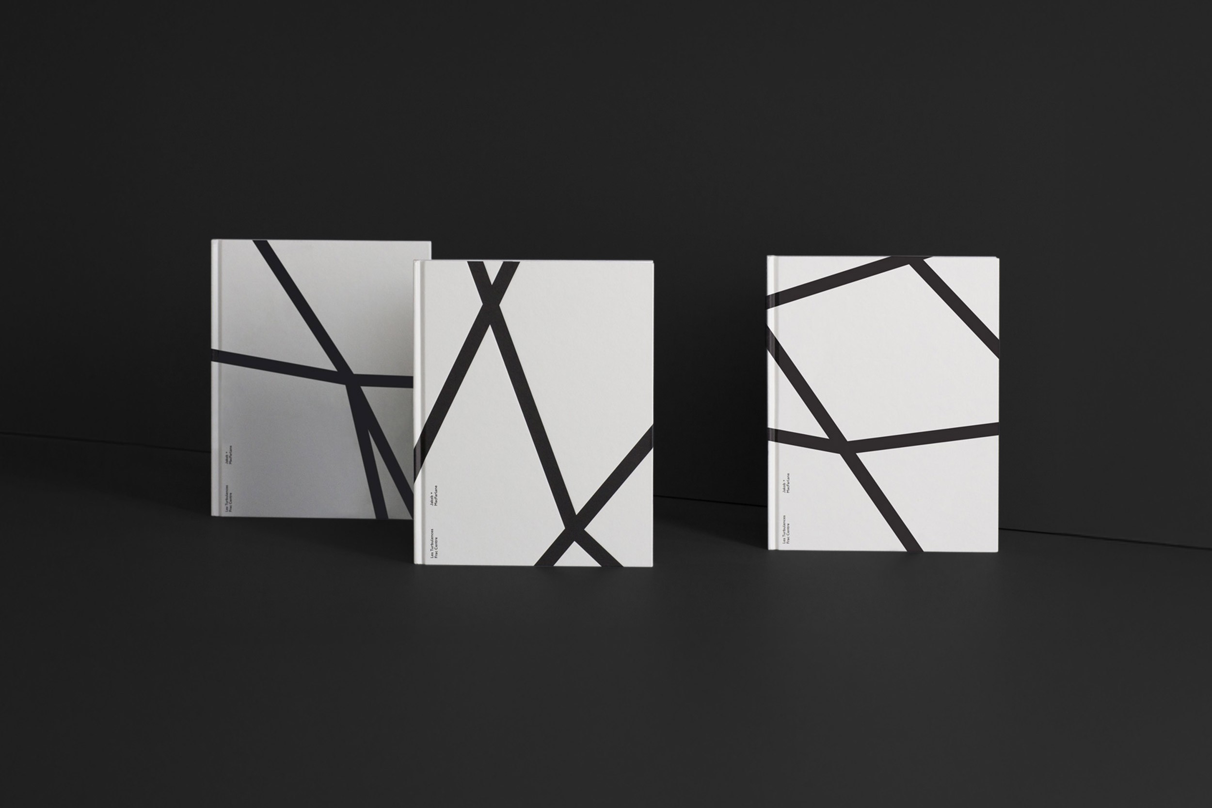
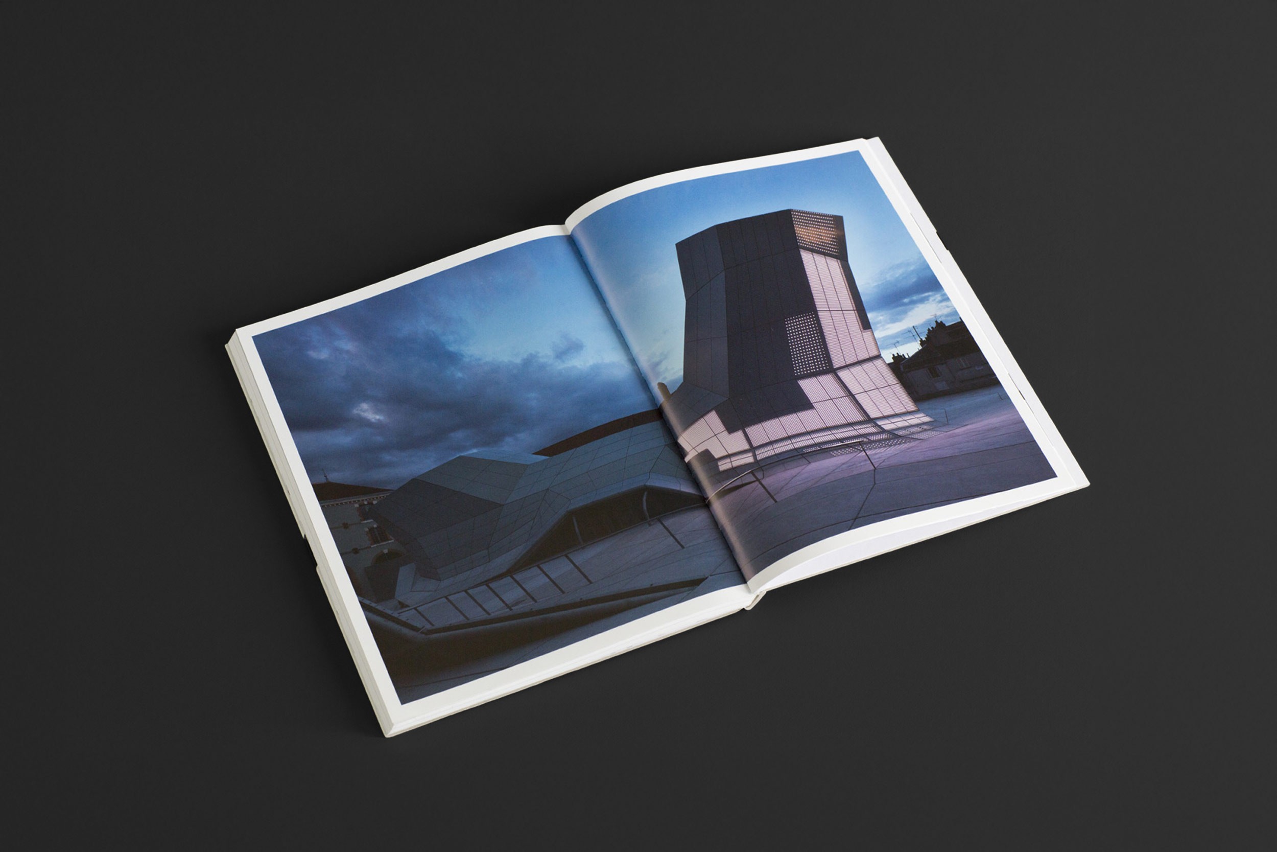
The Frac Centre is a contemporary art museum in Orléans, France. Designed by the architects Jakob and MacFarlane. The architecture appears to rise from the ground — a quality that informed the visual direction of the book. A graphic language was developed in response to the building’s points of intersection, drawing from its form and structure. The book traces the project from early sketches to final completion. — Designed while working at Brogen Averill Studio.
Les Turbulences
The Frac Centre is a contemporary art museum in Orléans, France. Designed by the architects Jakob and MacFarlane. The architecture appears to rise from the ground — a quality that informed the visual direction of the book. A graphic language was developed in response to the building’s points of intersection, drawing from its form and structure. The book traces the project from early sketches to final completion. — Designed while working at Brogen Averill Studio.
The shape of the data
Salon de la Data
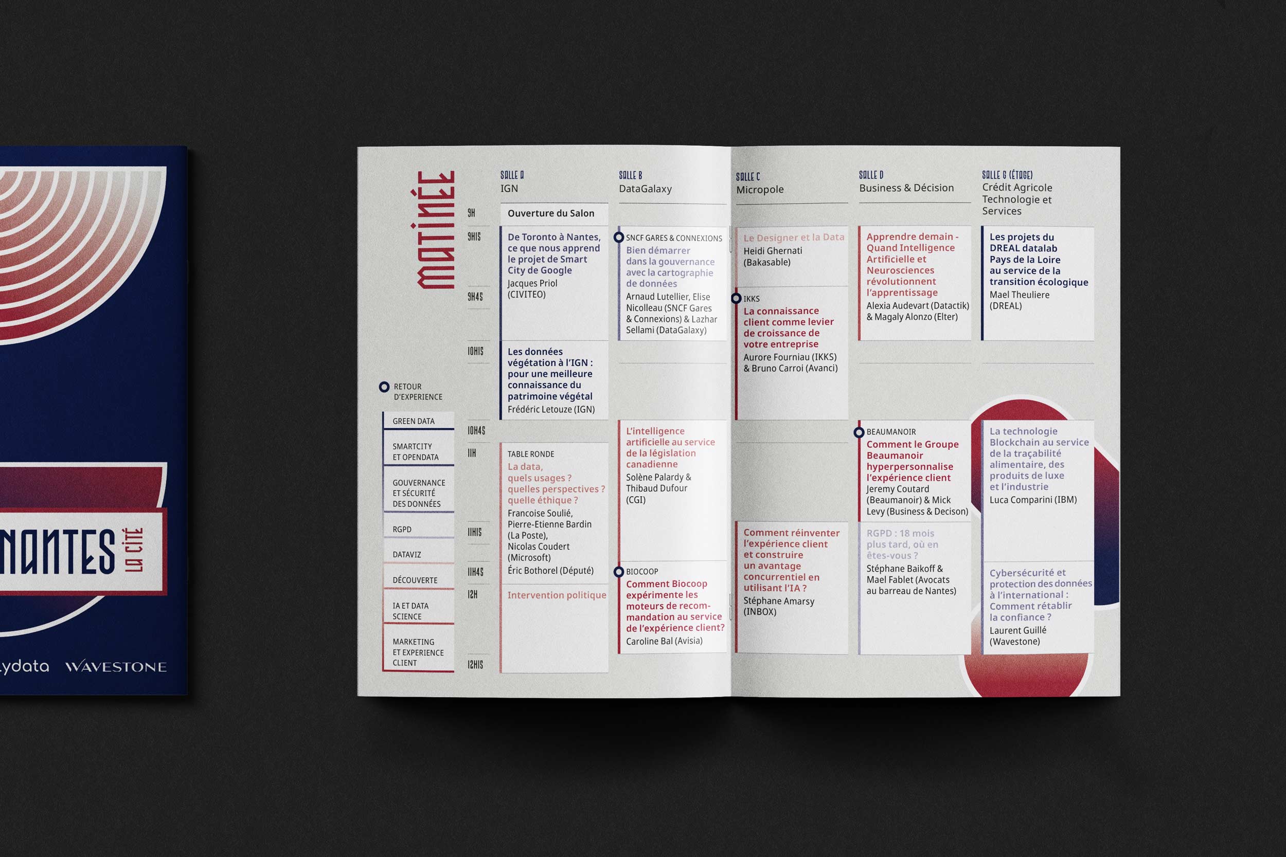
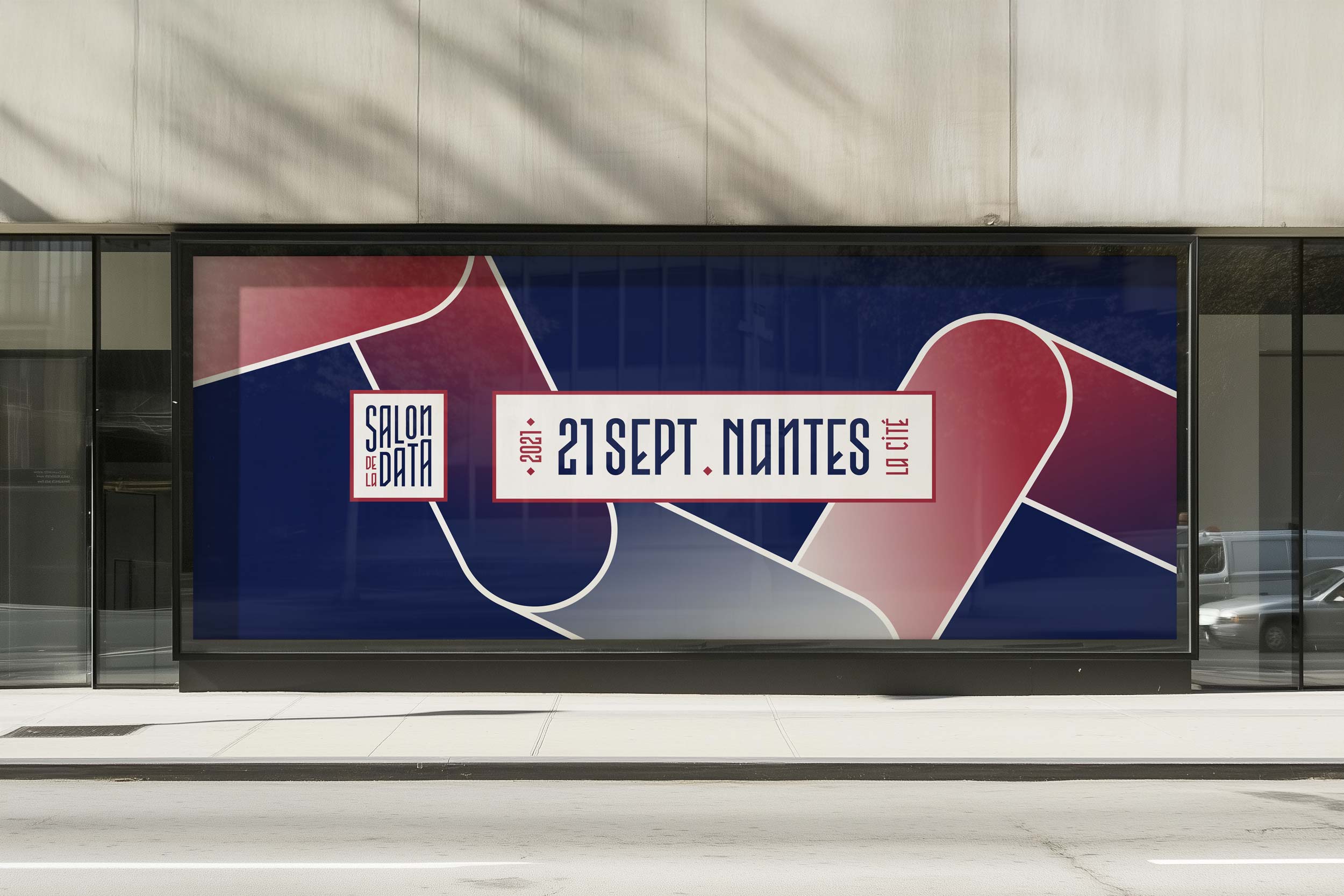
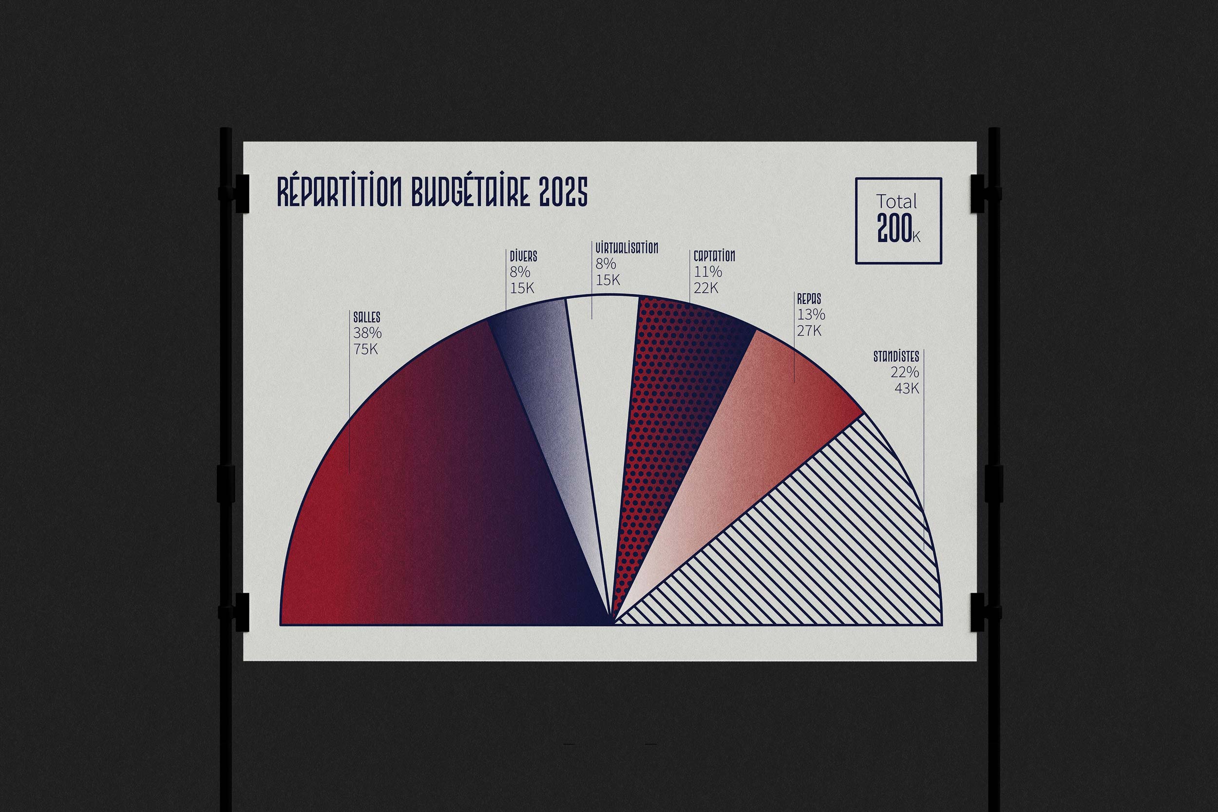
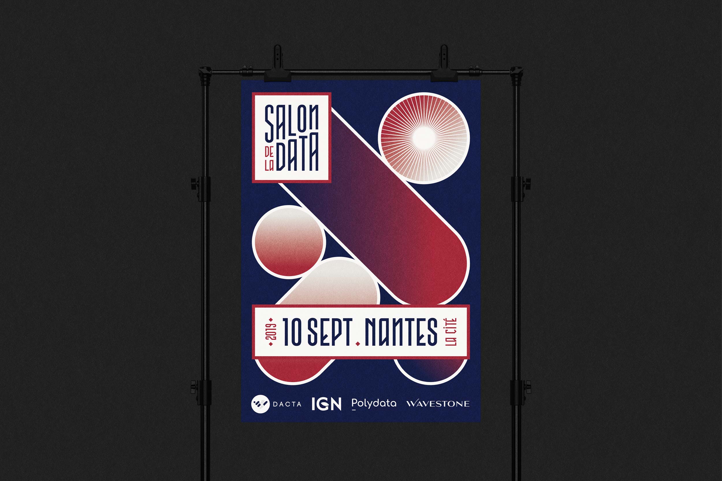
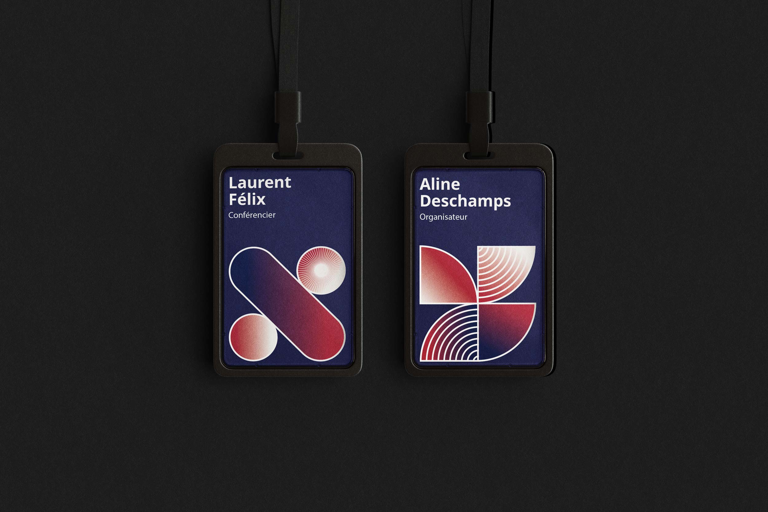
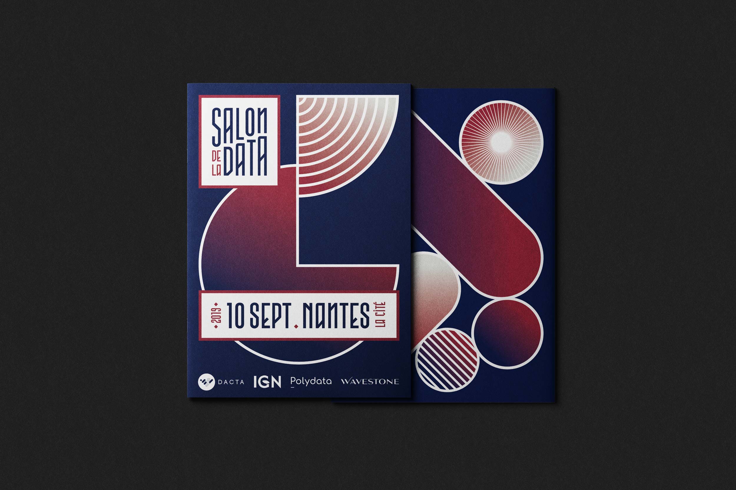
The Data Show is a free, volunteer-run event that aims to make data accessible and inspiring. Celebrating open initiatives, it has quickly established itself as a leading national event. We worked closely with the organizers to translate the event's spirit of openness, collaboration, and knowledge sharing into a cohesive brand identity. The resulting visual language relies on simple geometric shapes, using the form of data itself to express clarity, structure, and connection.
The shape of the data
The Data Show is a free, volunteer-run event that aims to make data accessible and inspiring. Celebrating open initiatives, it has quickly established itself as a leading national event. We worked closely with the organizers to translate the event's spirit of openness, collaboration, and knowledge sharing into a cohesive brand identity. The resulting visual language relies on simple geometric shapes, using the form of data itself to express clarity, structure, and connection.
The Power of Three
Treble Cone
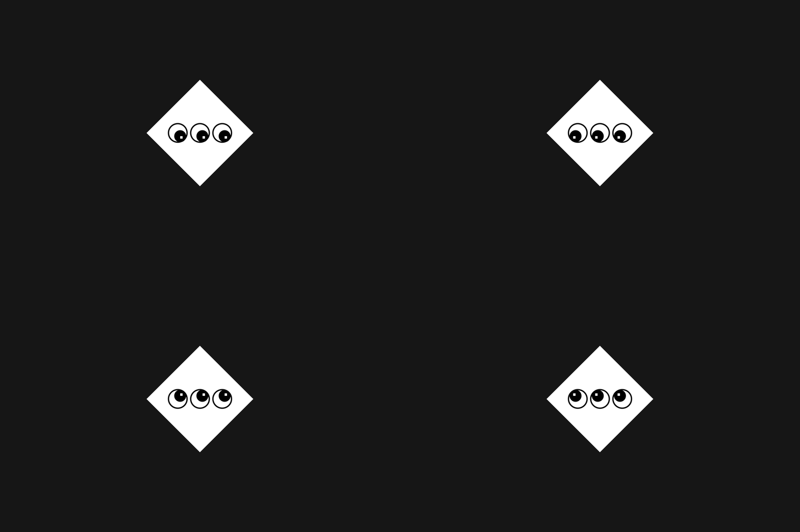
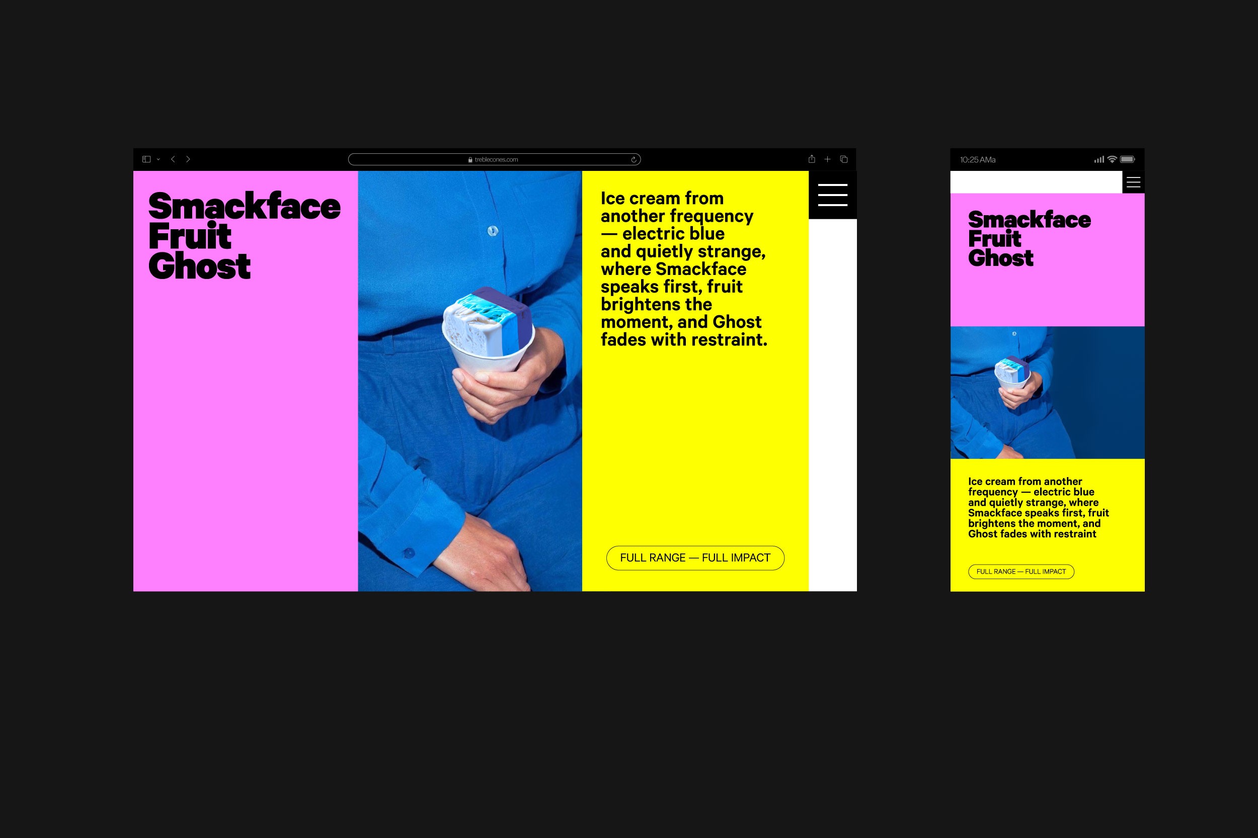
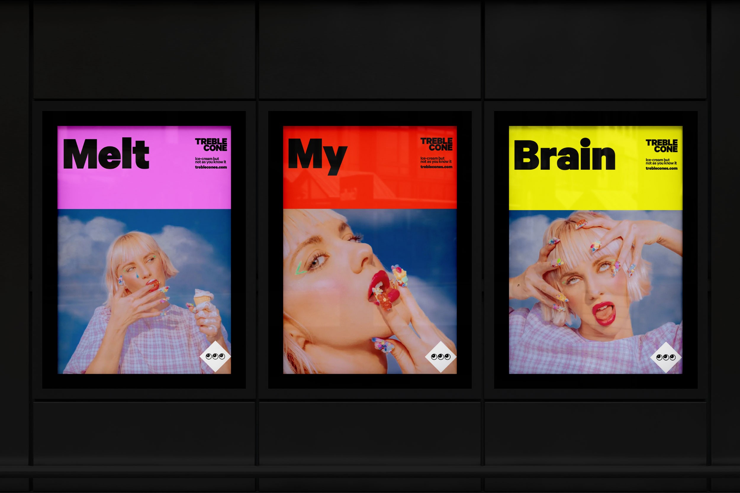
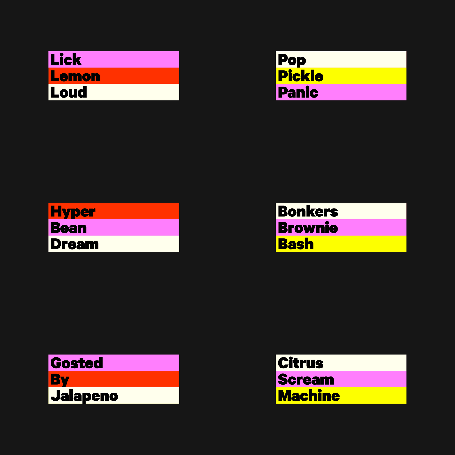
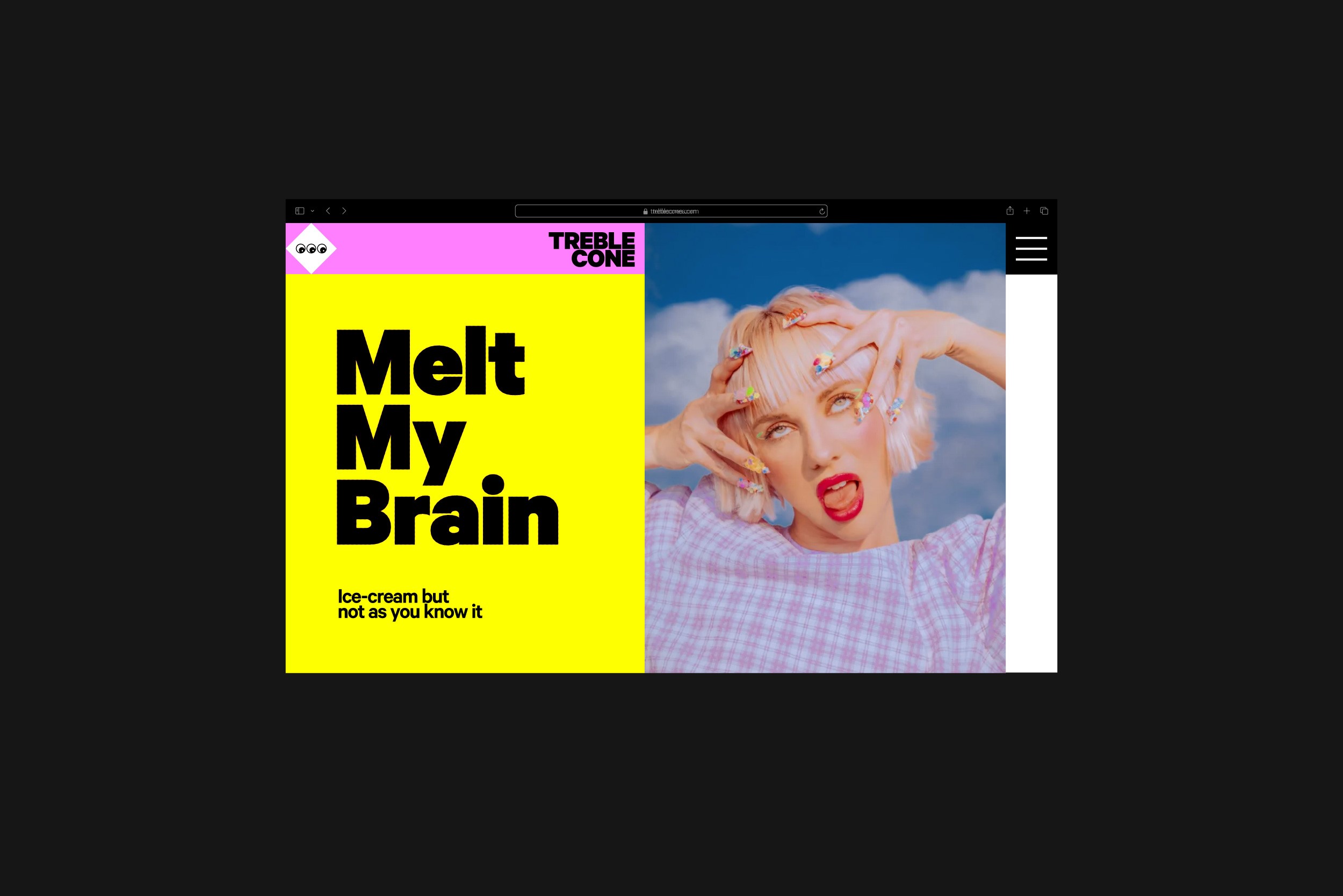
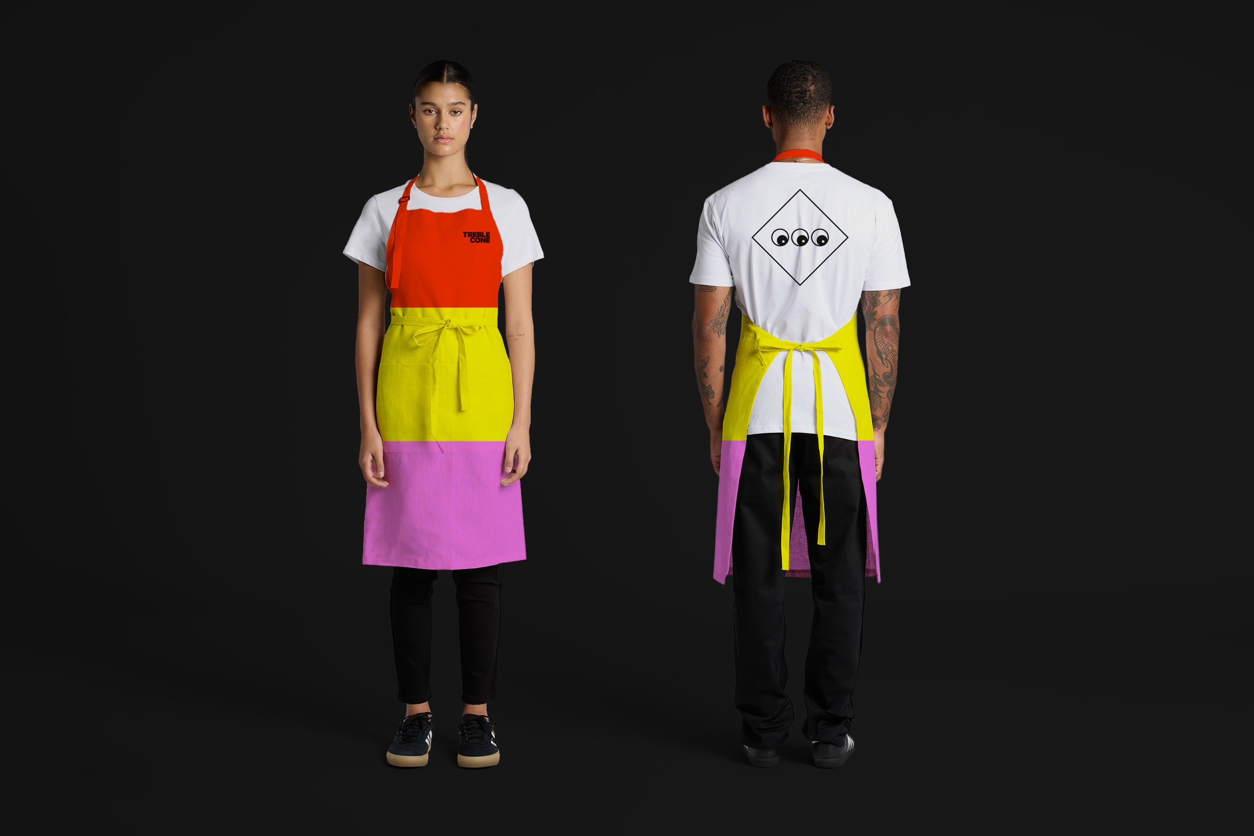
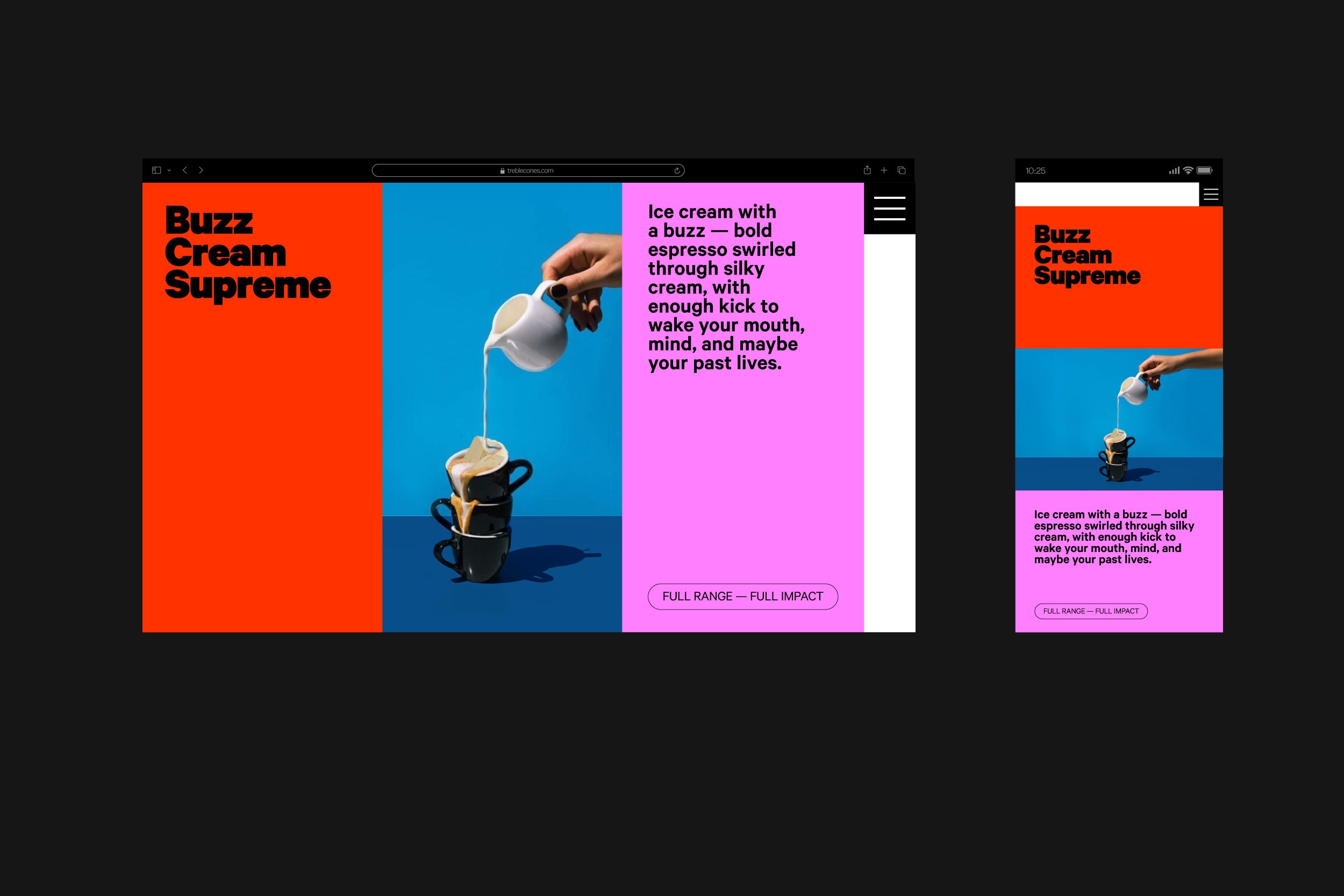
Treble Cone is a new ice cream brand built around the concept of threes. Patented layered square blocks served in a triangular cone create a distinctive form, while a small three-eyed character and a flexible three-colour system bring playfulness and curiosity to the identity. The brand extends across retail spaces, digital, and print, supporting an immersive and theatrical ice cream experience. — Designed for Crave Group.
The Power of Three
Treble Cone is a new ice cream brand built around the concept of threes. Patented layered square blocks served in a triangular cone create a distinctive form, while a small three-eyed character and a flexible three-colour system bring playfulness and curiosity to the identity. The brand extends across retail spaces, digital, and print, supporting an immersive and theatrical ice cream experience. — Designed for Crave Group.
Thursday
Thursday Bar
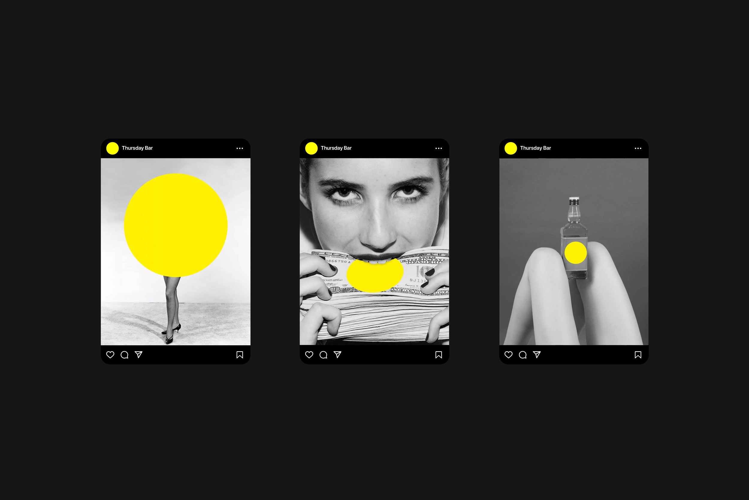
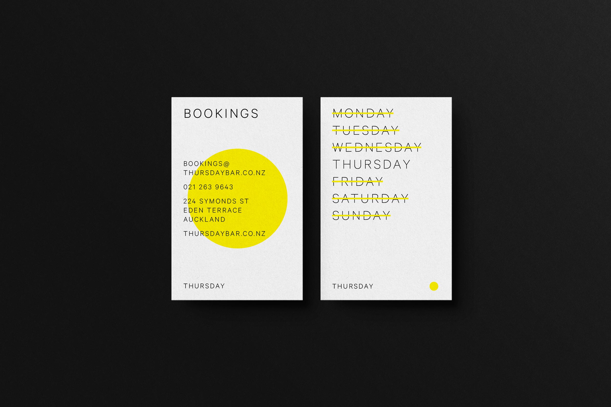
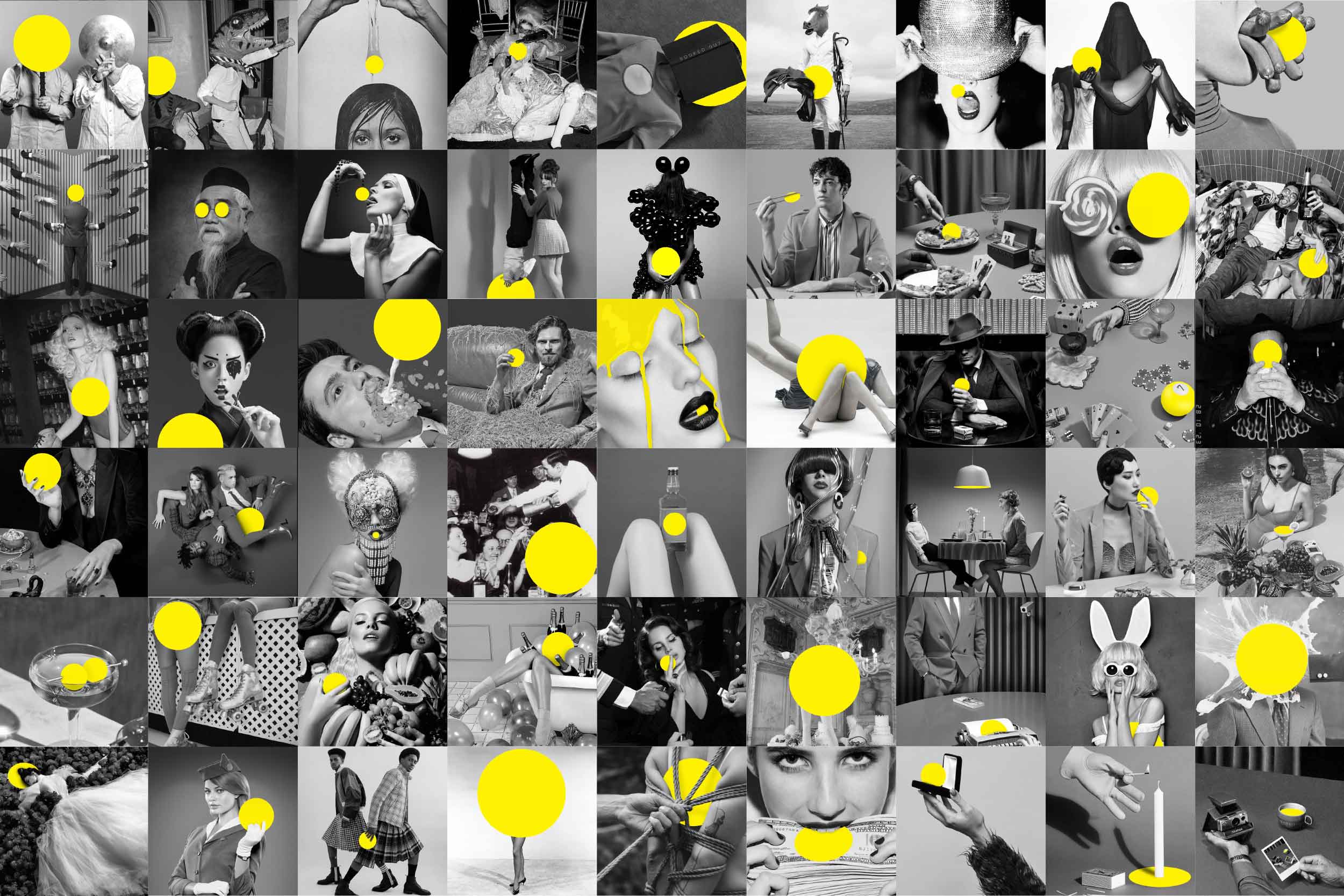
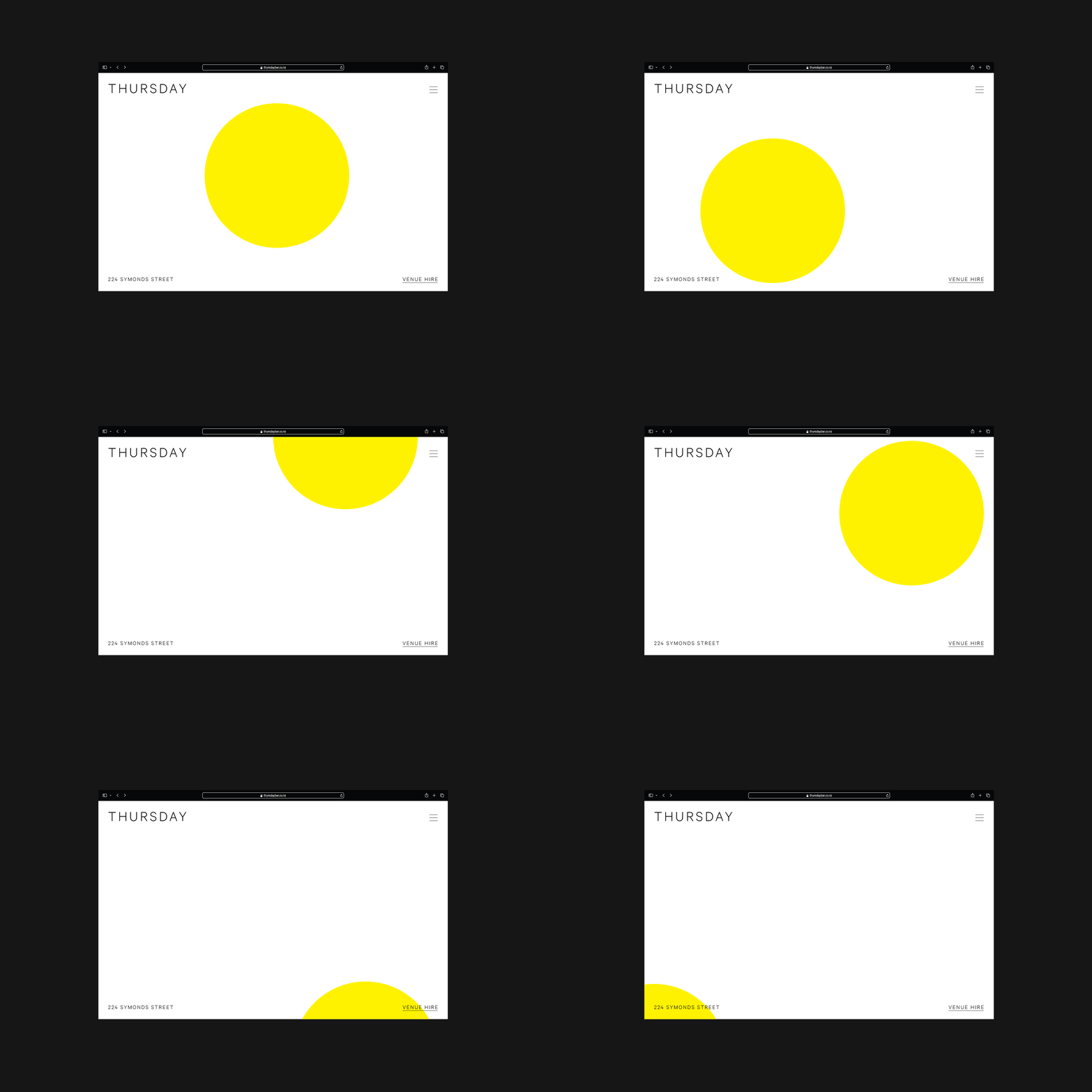
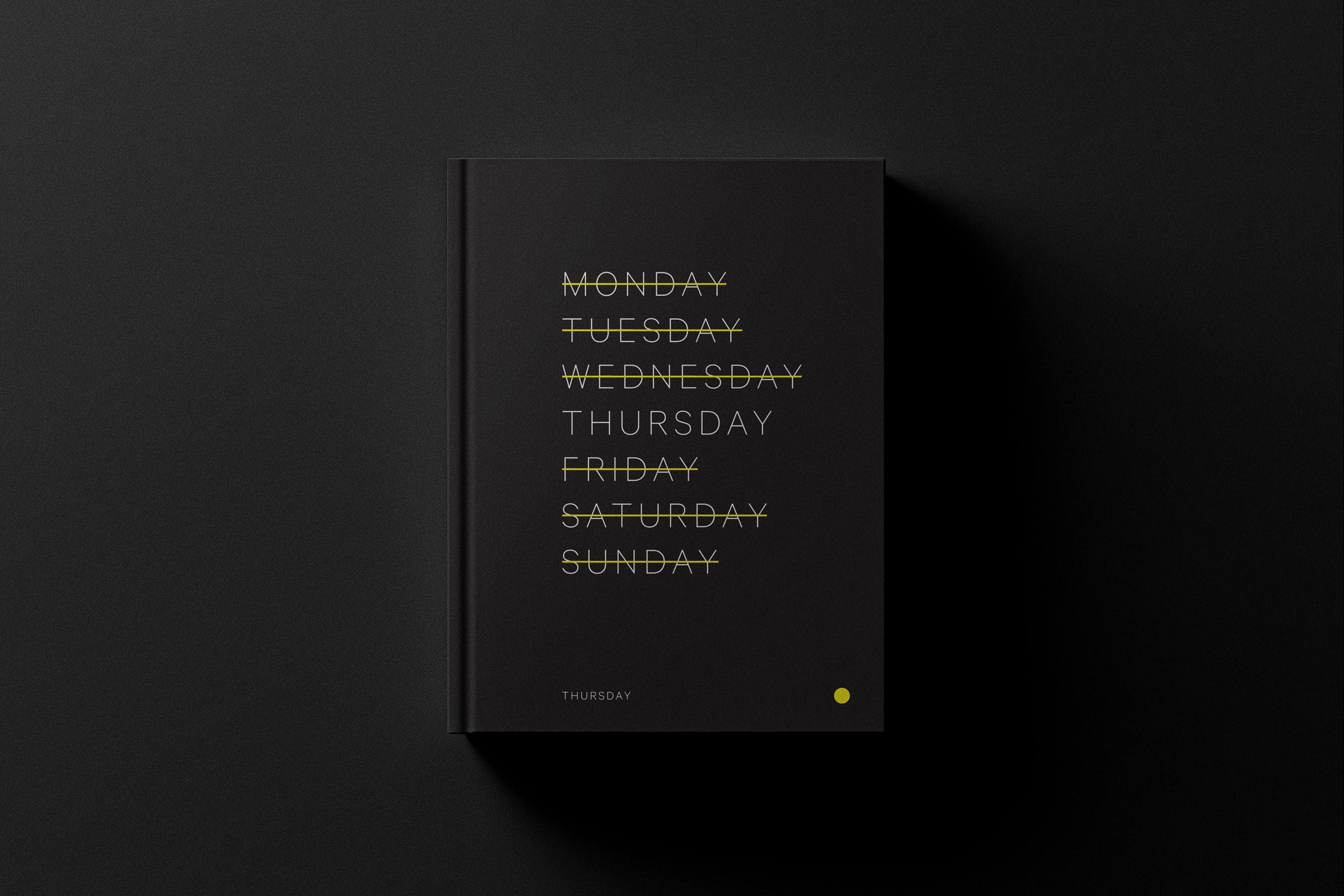
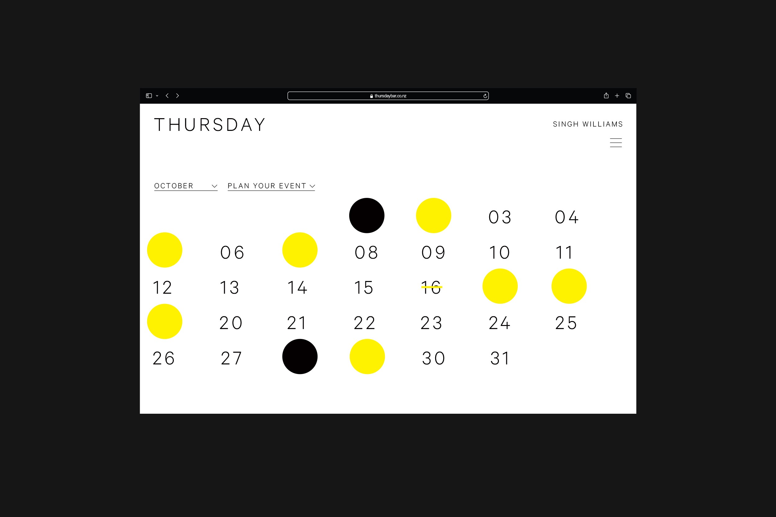
Open only one night a week, on Thursdays, this bar was created to reinvent the hospitality experience. Each week, members are invited to enjoy an unexpected experience, unique in New Zealand. We led the brand launch with a thoughtful, multi-platform approach, encompassing identity, public relations, social media, and on-site activations, to create a bold presence for this unconventional concept. — Designed for Crave Group.
Thursday
Open only one night a week, on Thursdays, this bar was created to reinvent the hospitality experience. Each week, members are invited to enjoy an unexpected experience, unique in New Zealand. We led the brand launch with a thoughtful, multi-platform approach, encompassing identity, public relations, social media, and on-site activations, to create a bold presence for this unconventional concept. — Designed for Crave Group.
Training for Open Futures
2i2L
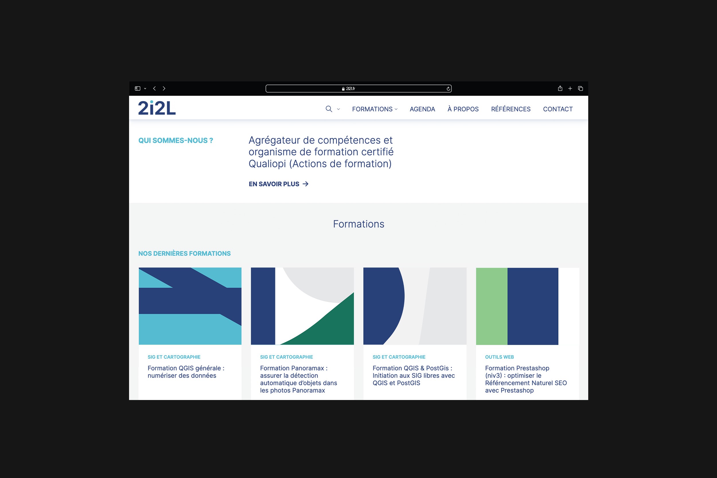
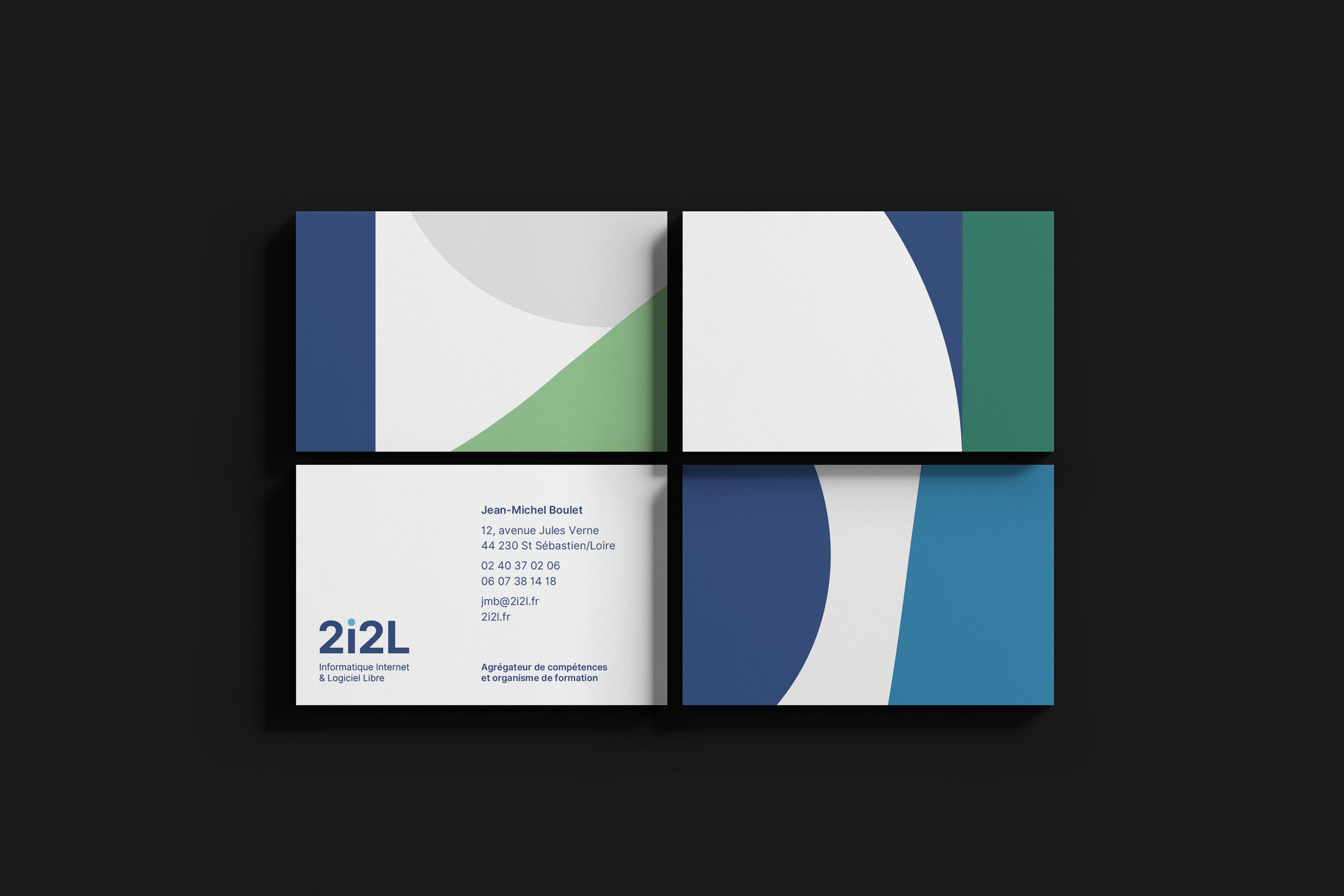
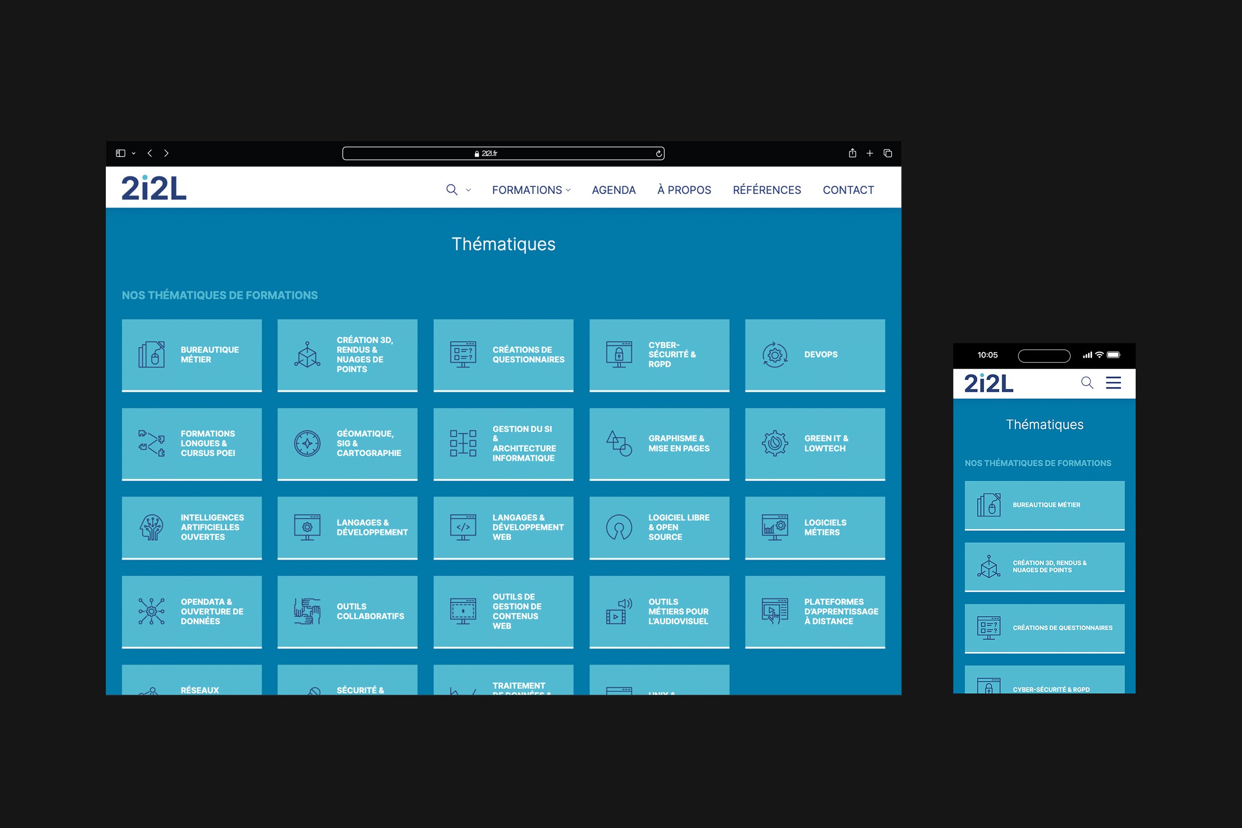
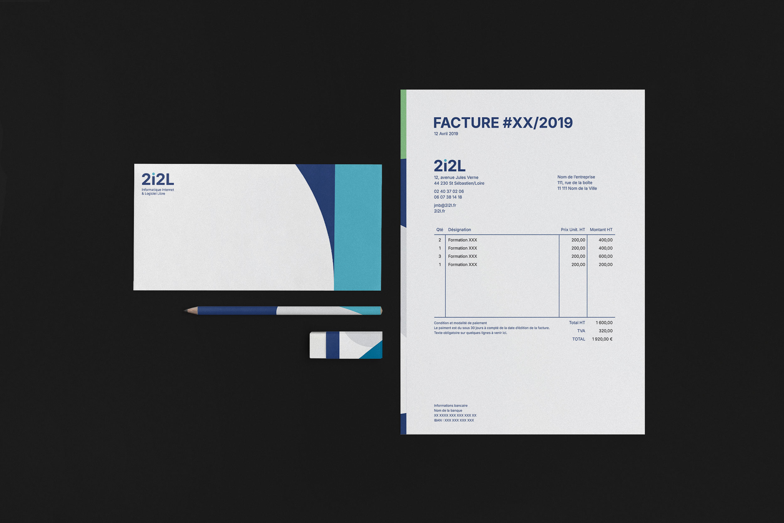
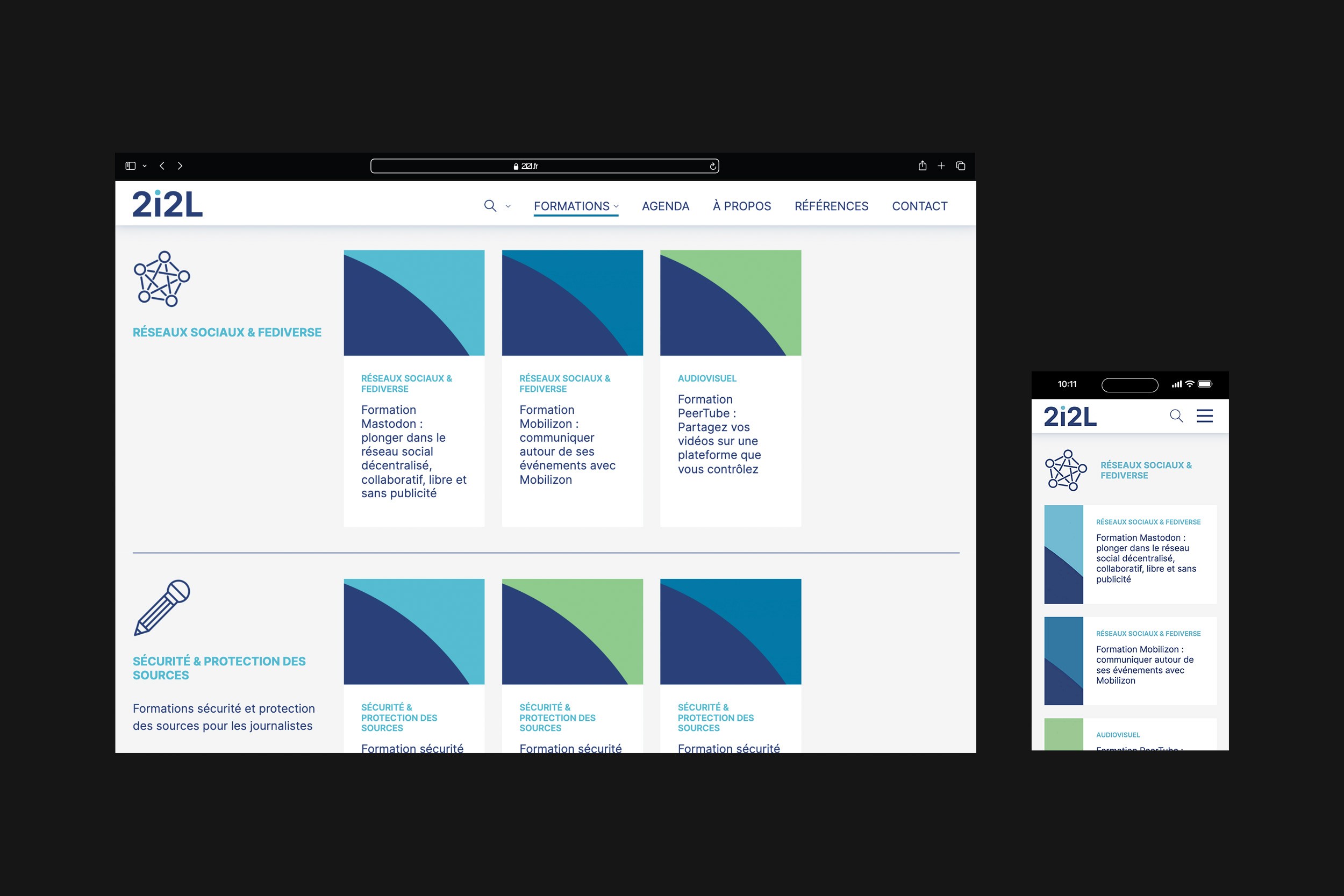
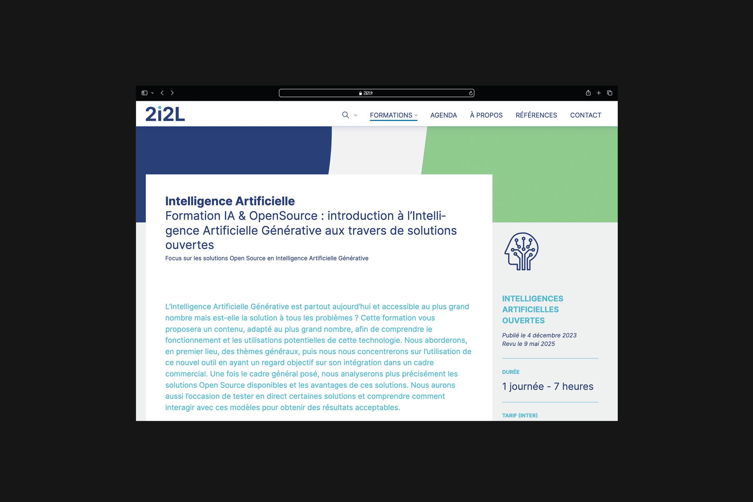
2i2L is a French organisation dedicated to open-source software training, built around values of transparency, accessibility and collaboration. The visual identity translates these ideas into a flexible design system spanning digital and print. Inspired by the barn swallow — a symbol of freedom and renewal — the mark is deconstructed into flowing, dynamic forms, reflecting movement and openness. A balanced blue palette and considered structure express the optimism and adaptability at the heart of open source.

Training for Open Futures
2i2L is a French organisation dedicated to open-source software training, built around values of transparency, accessibility and collaboration. The visual identity translates these ideas into a flexible design system spanning digital and print. Inspired by the barn swallow — a symbol of freedom and renewal — the mark is deconstructed into flowing, dynamic forms, reflecting movement and openness. A balanced blue palette and considered structure express the optimism and adaptability at the heart of open source.
Waitohi
Wellington City Council
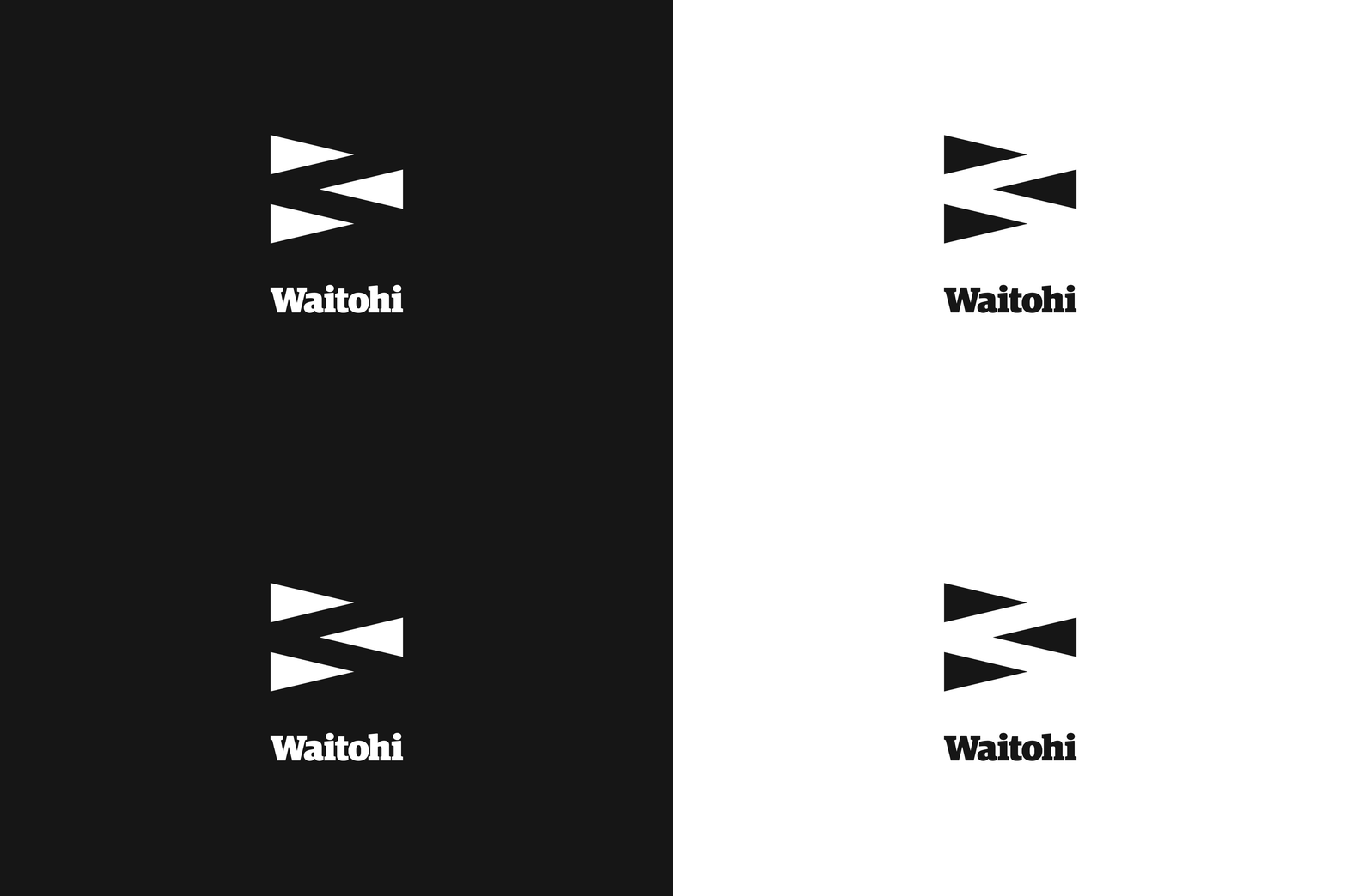
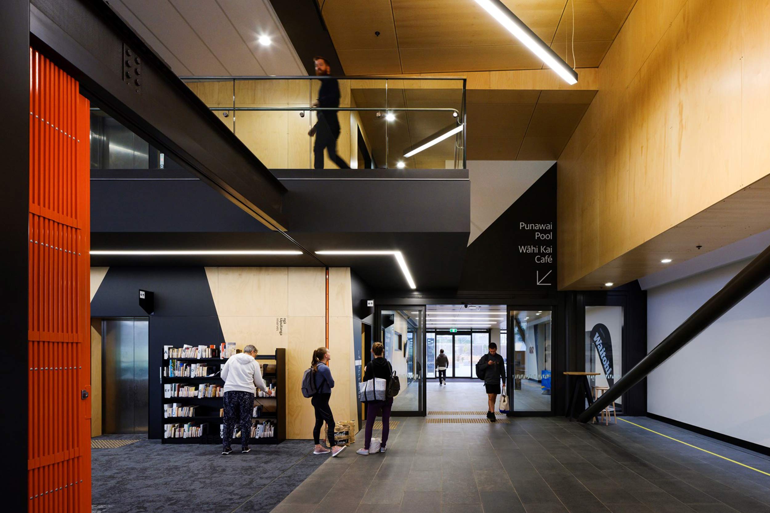
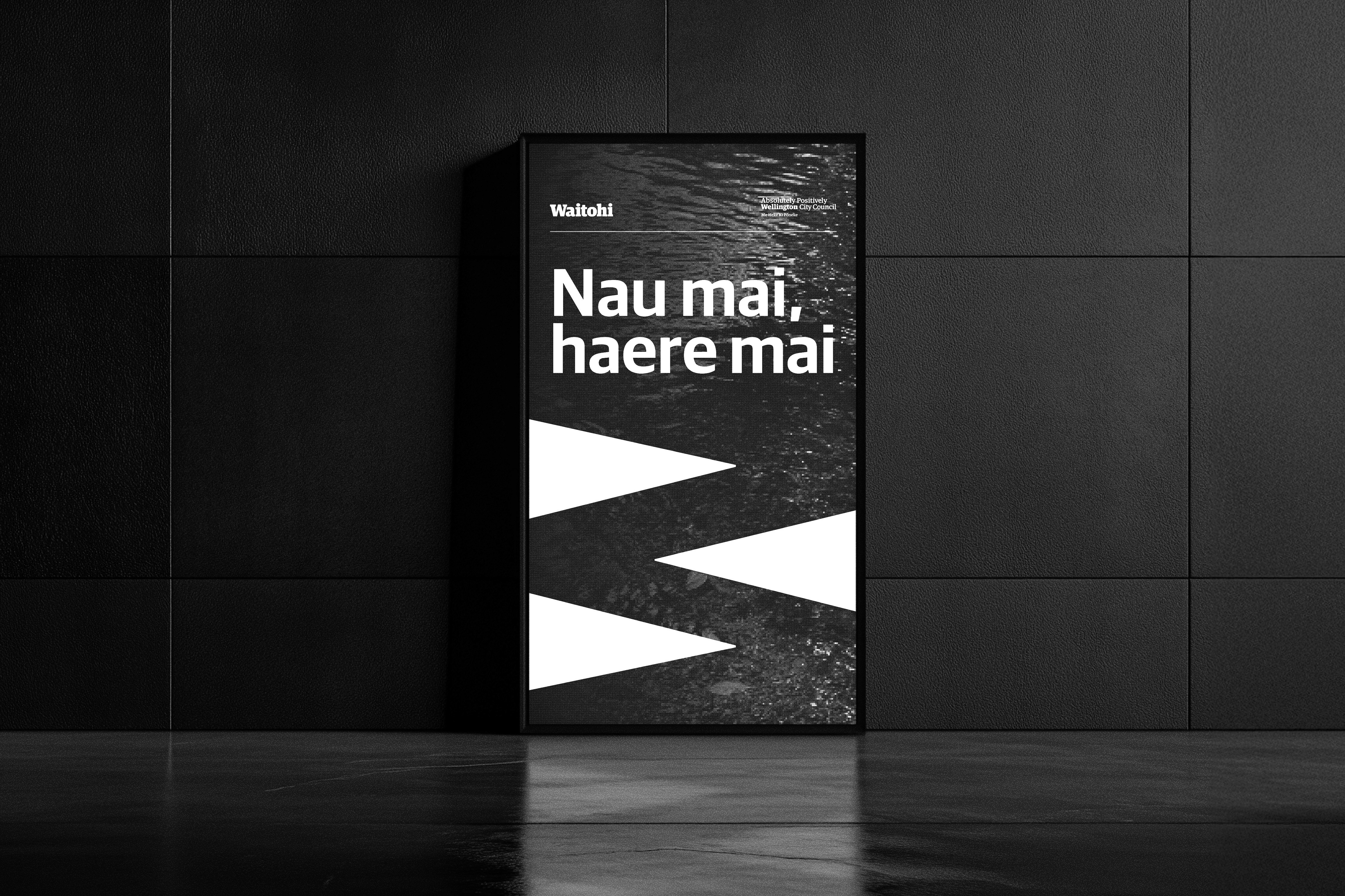
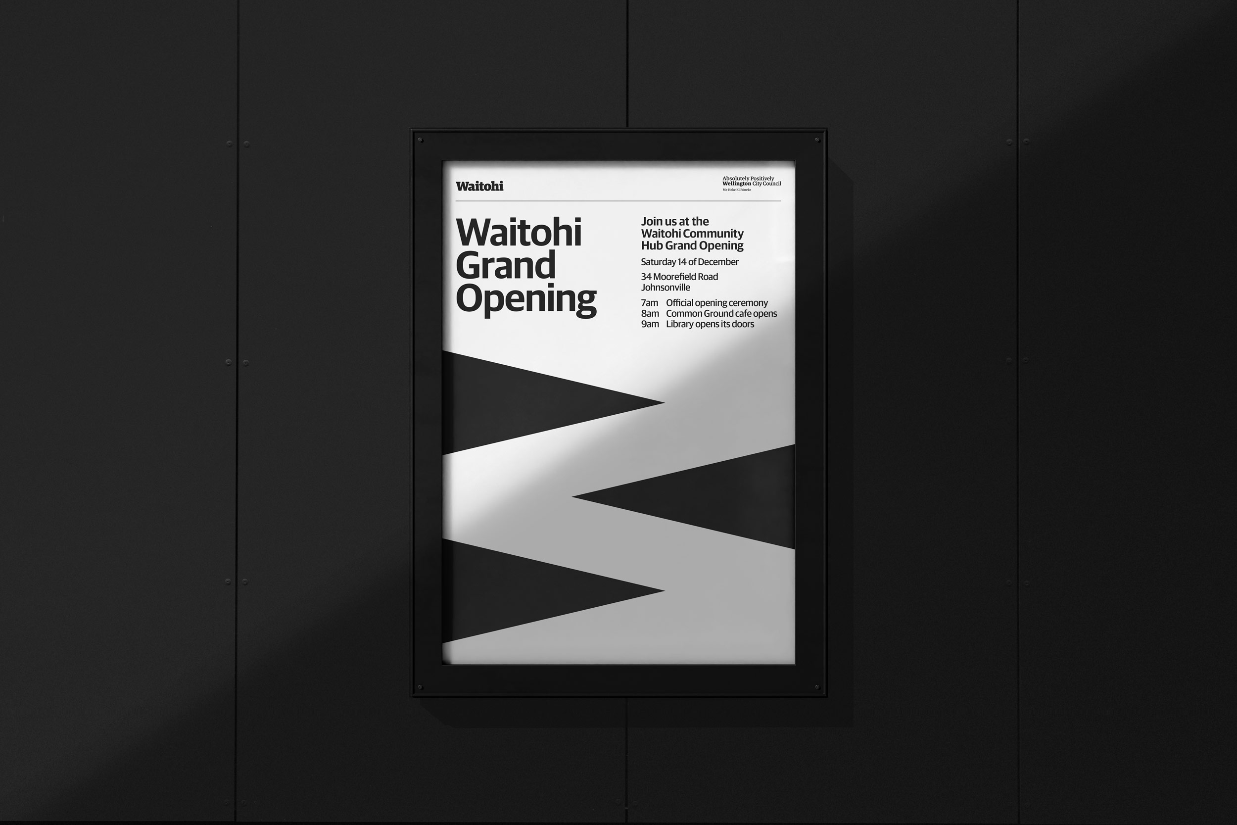
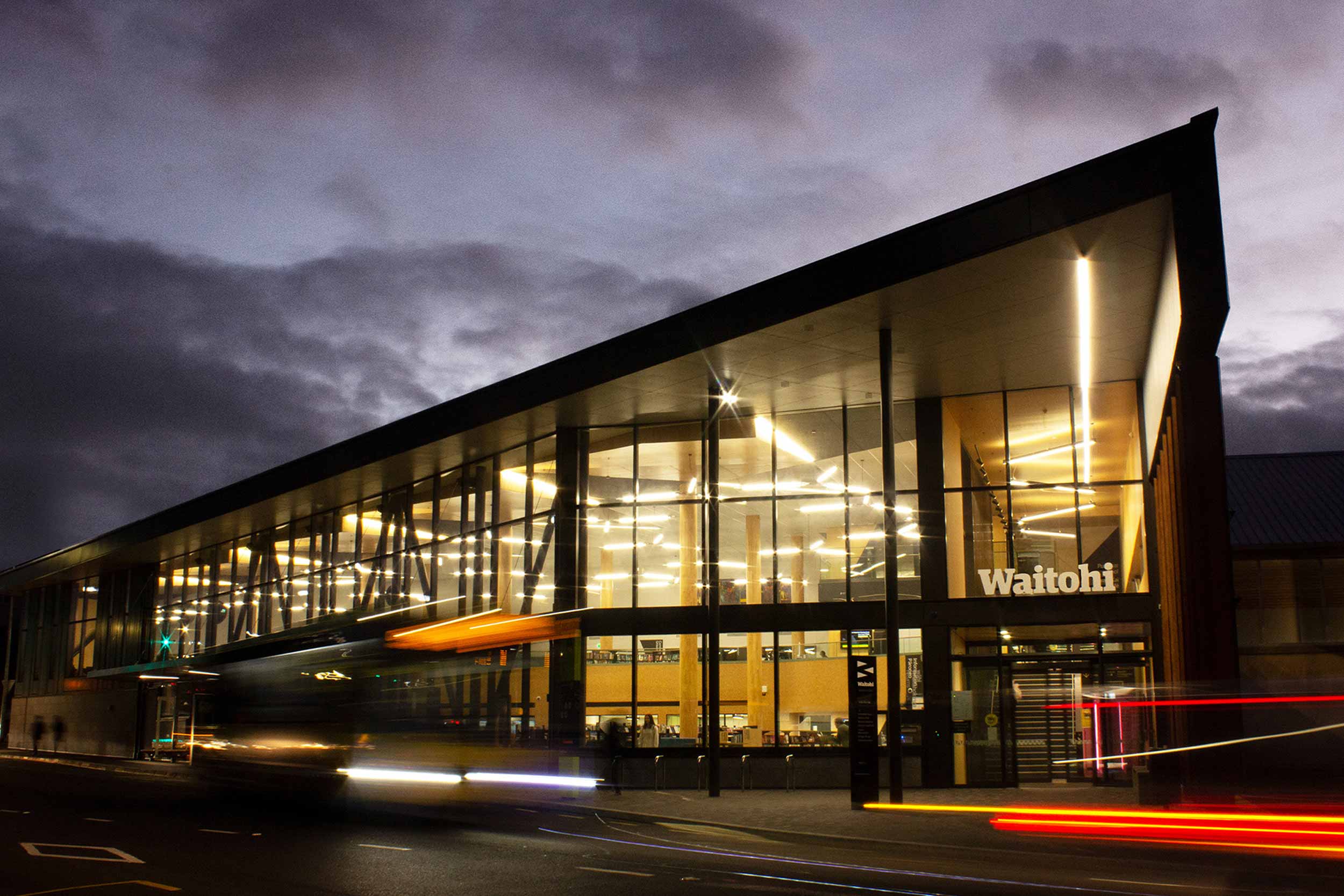
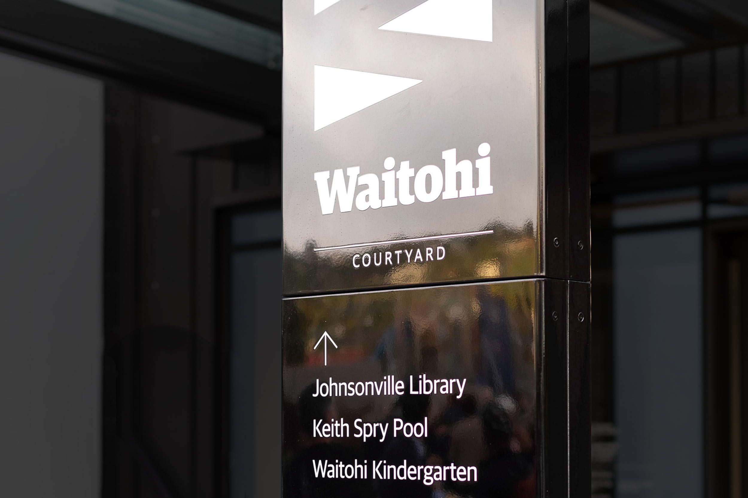
Waitohi is a multi-purpose community center located in Johnsonville, Wellington, that includes a library, swimming pool, daycare, café, and transportation hub. A graphic identity and wayfinding system were developed to help people navigate the space clearly and confidently. The visual language is closely linked to the location: three intersecting triangles form a bold black and white symbol that references both the name Waitohi and the river. It also reflects the legacy of Chief Waitohi, who united the warring iwi and brought peace to the region. — Designed while working at WCC Creative and Brand.

Waitohi
Waitohi is a multi-purpose community center located in Johnsonville, Wellington, that includes a library, swimming pool, daycare, café, and transportation hub. A graphic identity and wayfinding system were developed to help people navigate the space clearly and confidently. The visual language is closely linked to the location: three intersecting triangles form a bold black and white symbol that references both the name Waitohi and the river. It also reflects the legacy of Chief Waitohi, who united the warring iwi and brought peace to the region. — Designed while working at WCC Creative and Brand.
Open Spaces Strategy
Wellington City Council
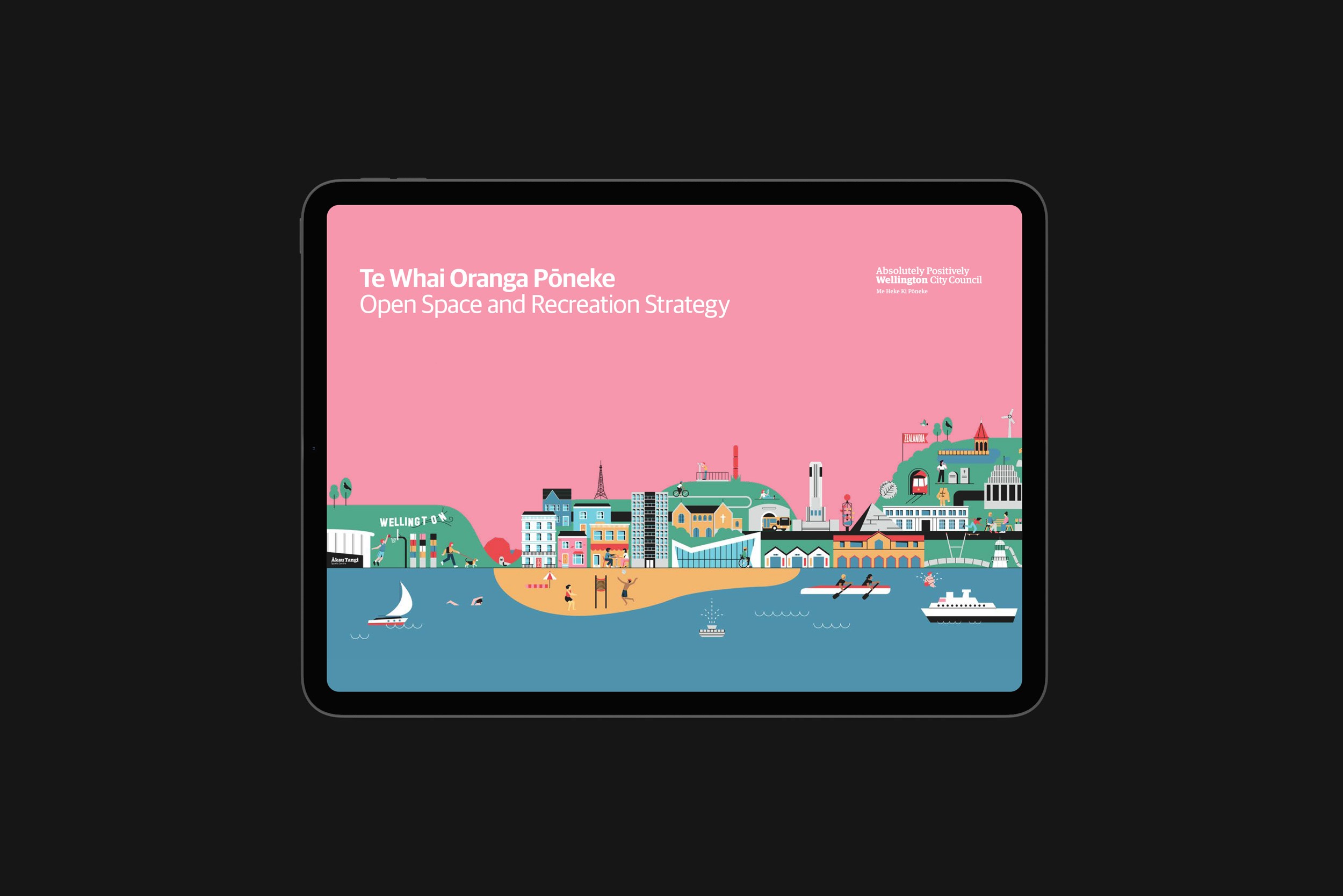
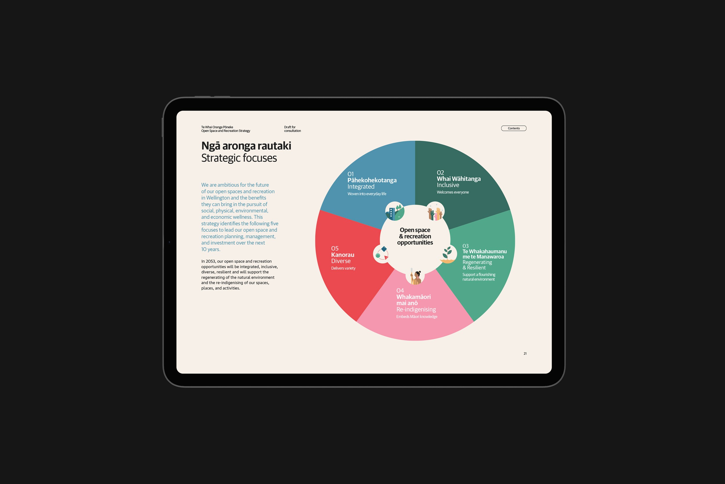
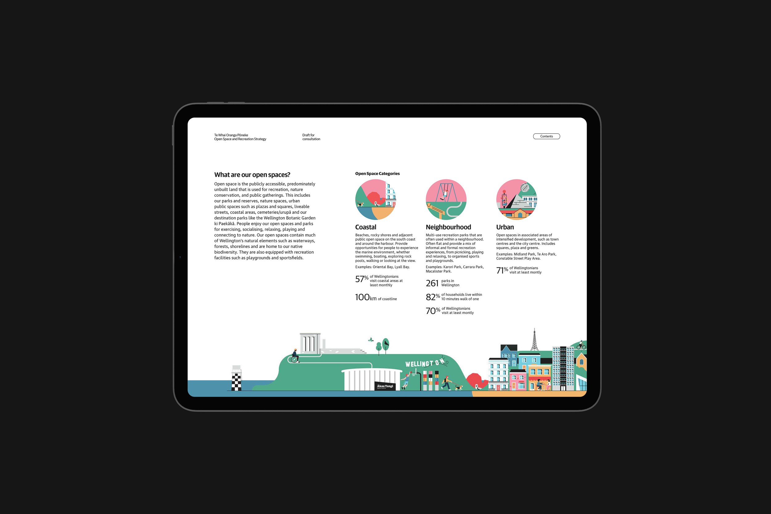
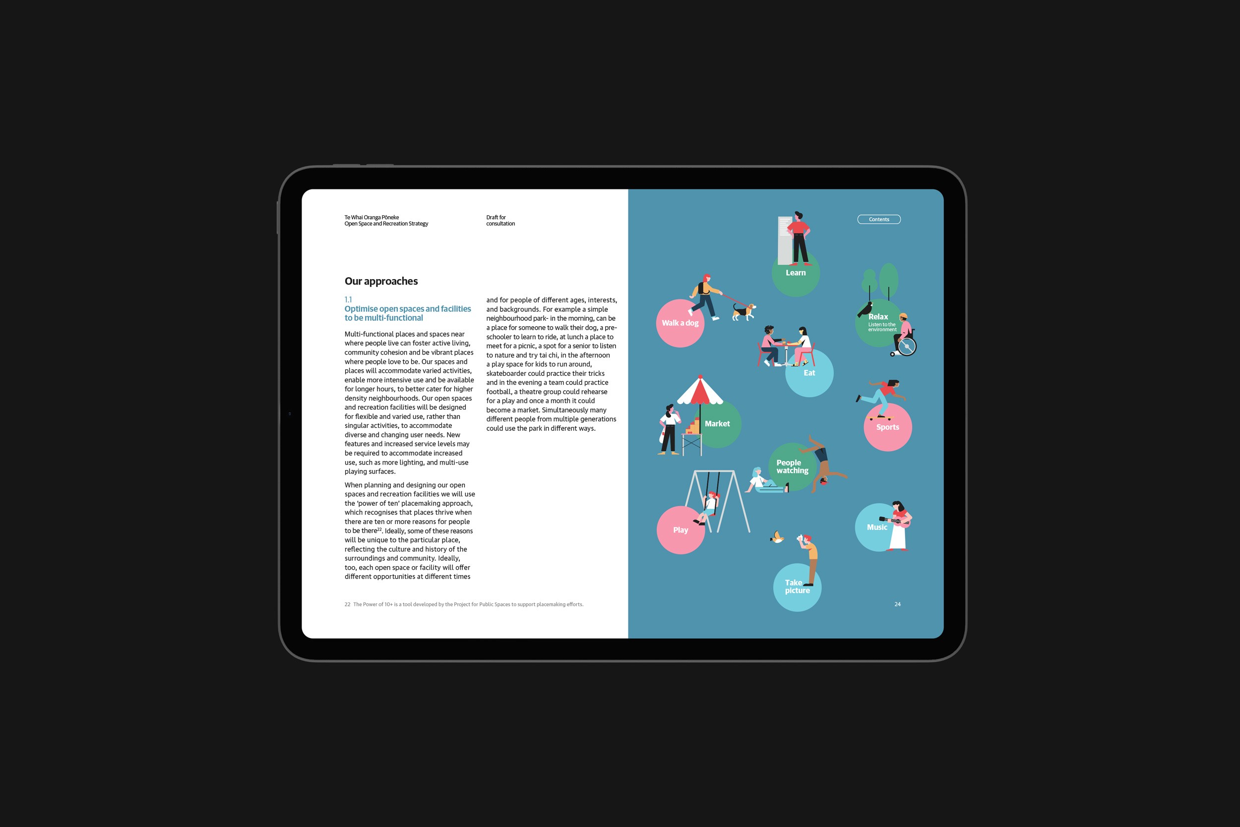
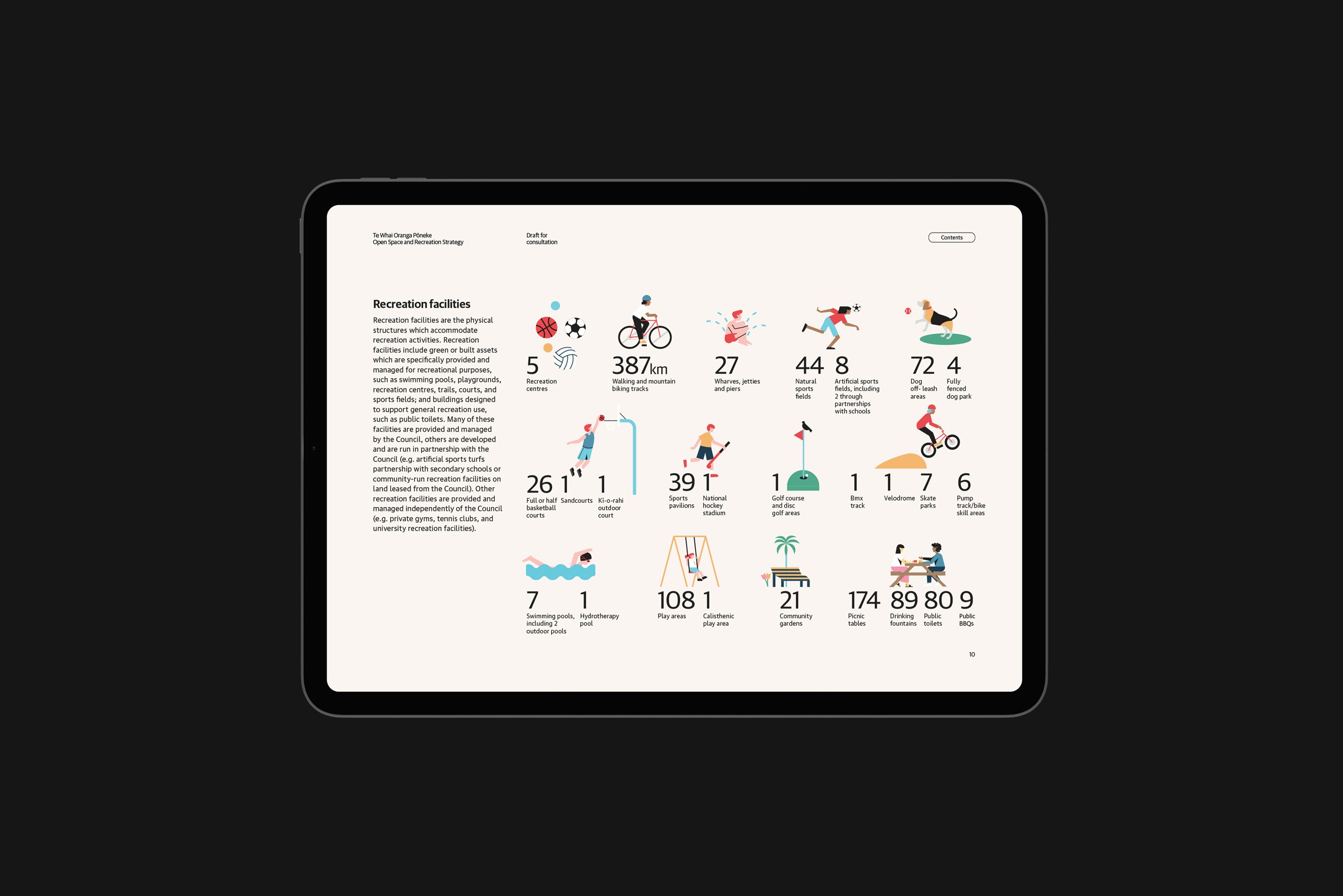
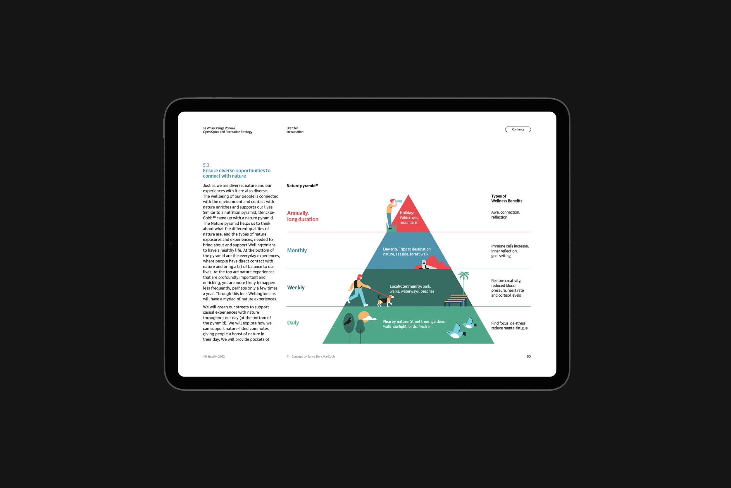
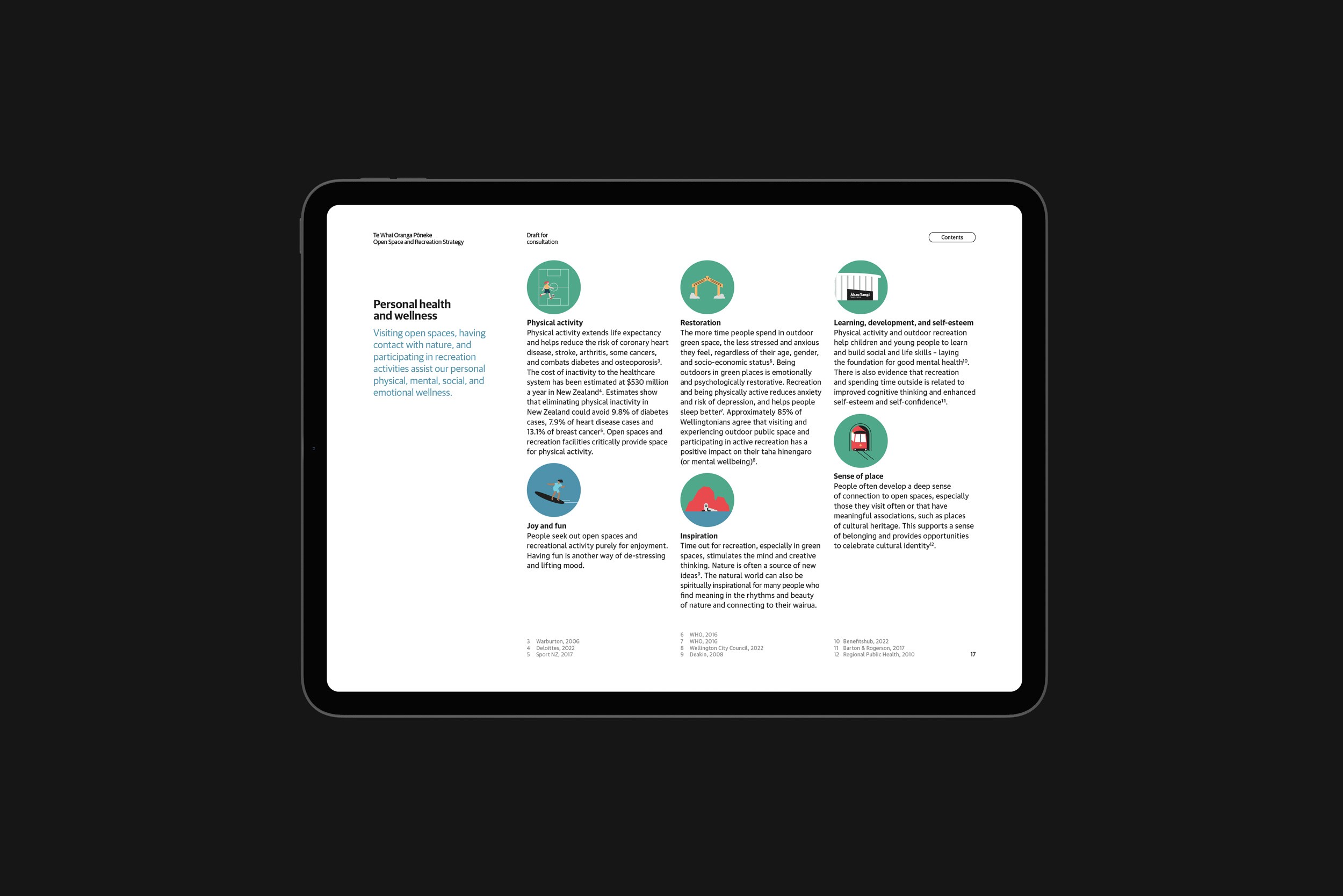
Te Whai Oranga Pōneke sets the 30-year vision for Wellington City Council’s approach to public open spaces and recreation. The design system—spanning digital and print—balances structure and fluidity, reflecting the framework’s focus on wellbeing and environmental connection. A clear layout, layered illustration style, and refined visual hierarchy bring warmth and accessibility to the strategy, while expressing the idea of “in the pursuit of wellness” that lies at the heart of Te Whai Oranga Pōneke.
Open Spaces Strategy
Te Whai Oranga Pōneke sets the 30-year vision for Wellington City Council’s approach to public open spaces and recreation. The design system—spanning digital and print—balances structure and fluidity, reflecting the framework’s focus on wellbeing and environmental connection. A clear layout, layered illustration style, and refined visual hierarchy bring warmth and accessibility to the strategy, while expressing the idea of “in the pursuit of wellness” that lies at the heart of Te Whai Oranga Pōneke.
Summer City
Wellington City Council
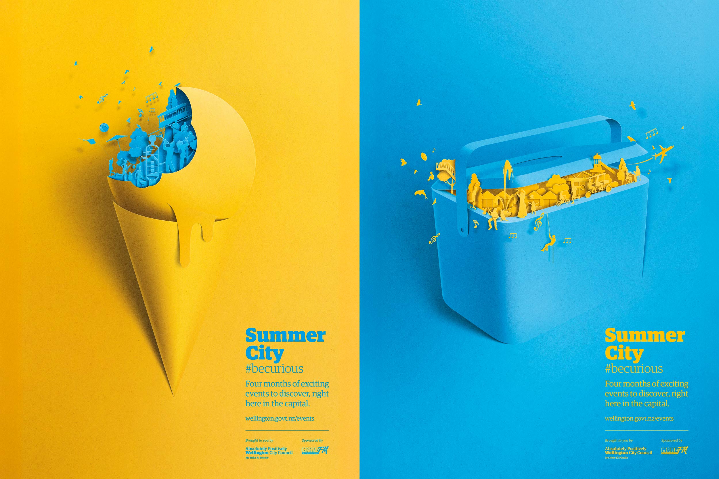
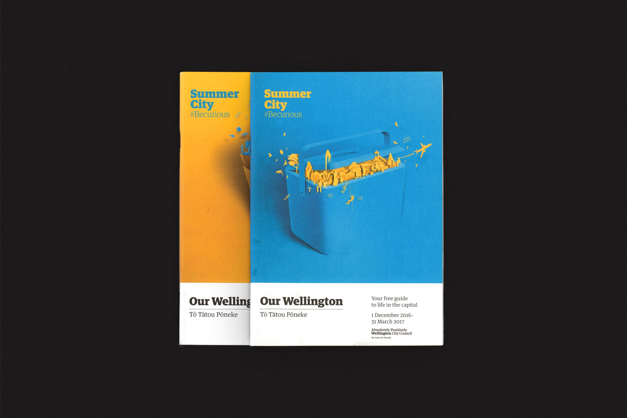
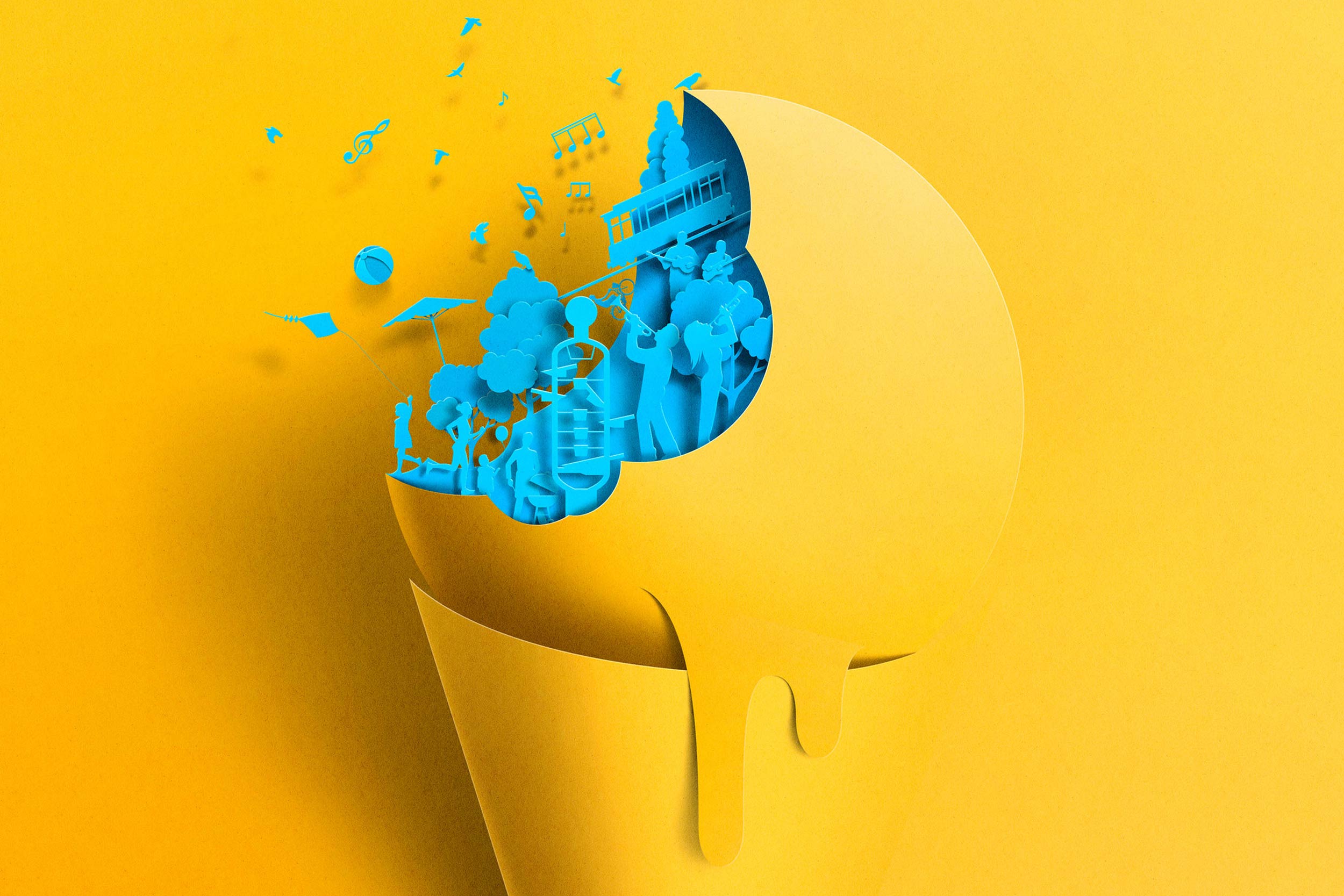
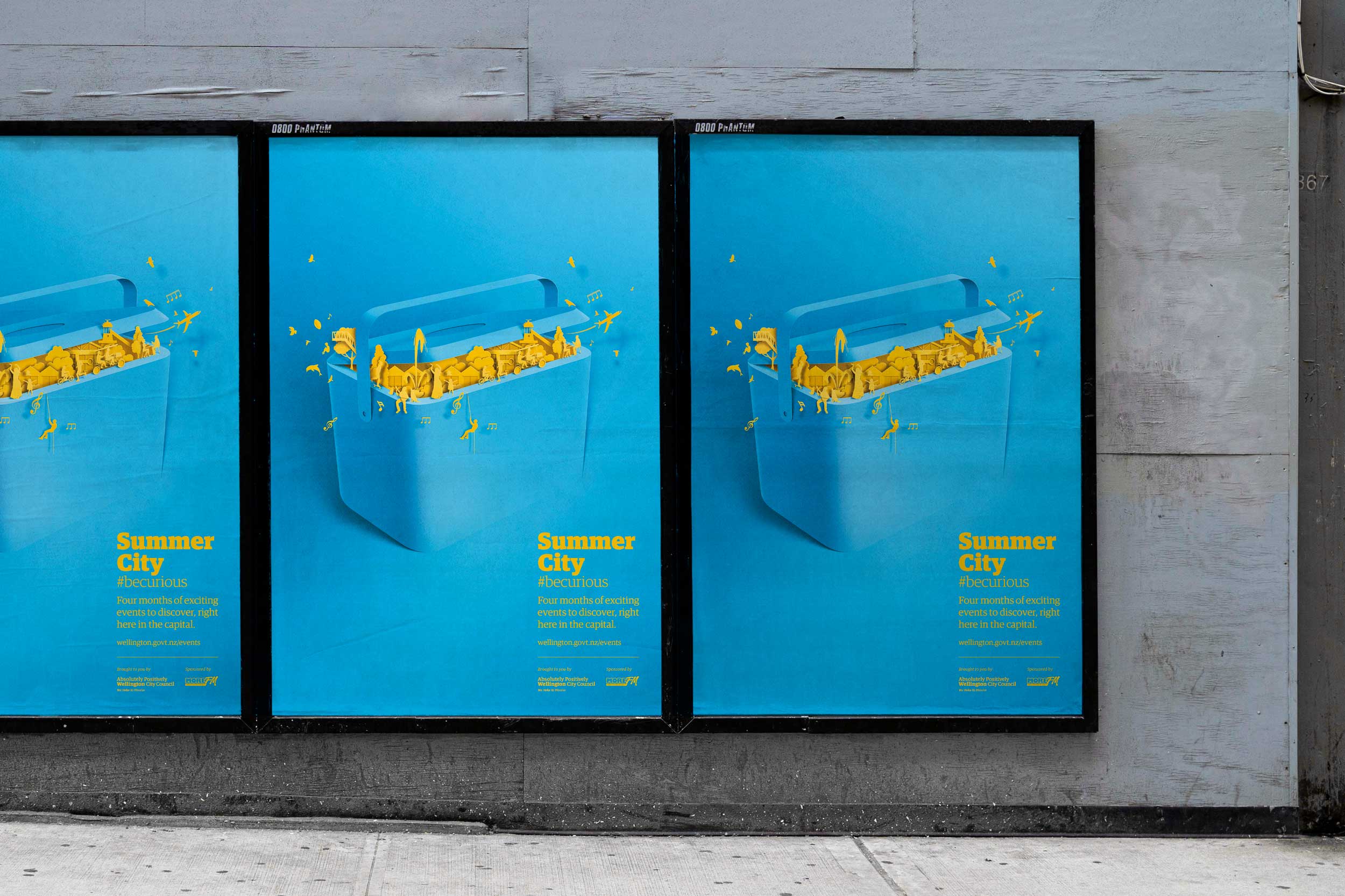
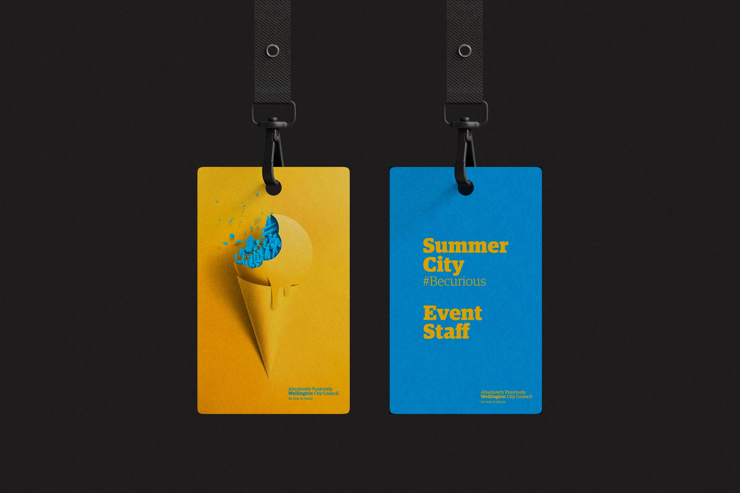
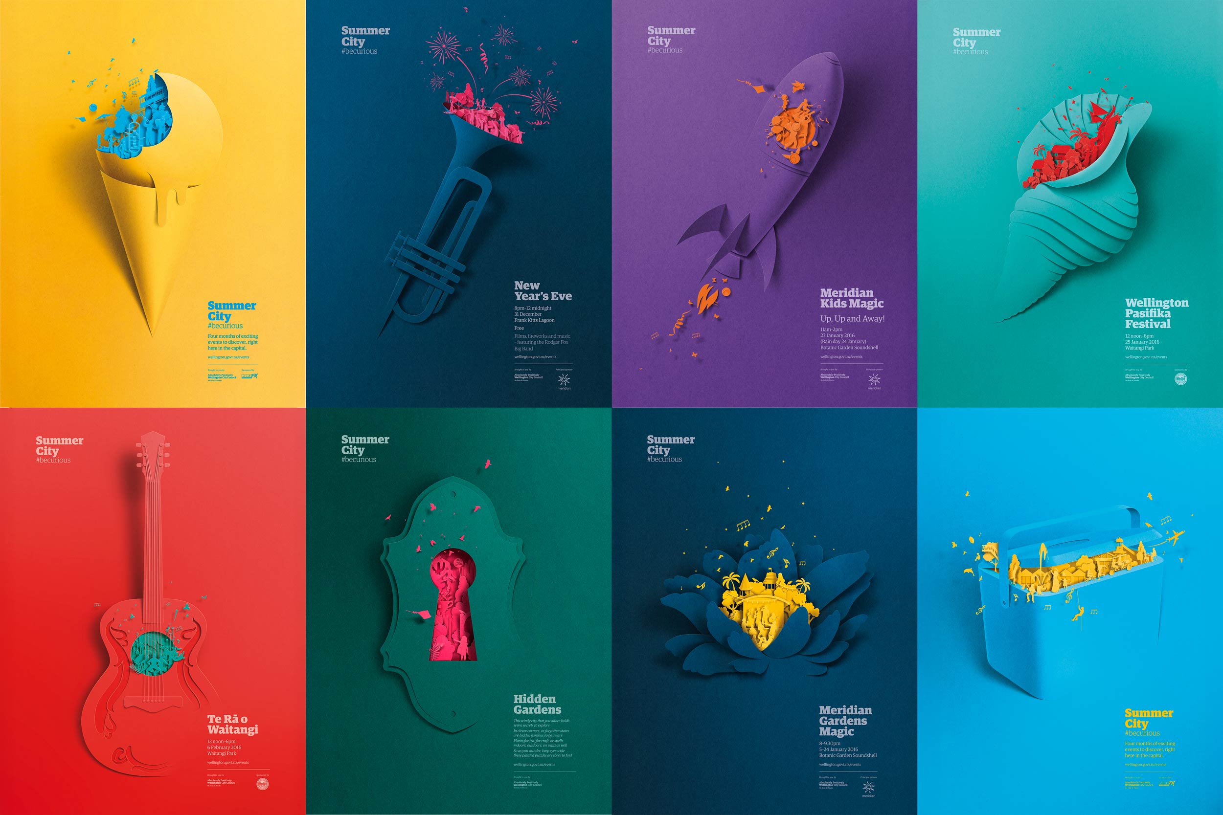
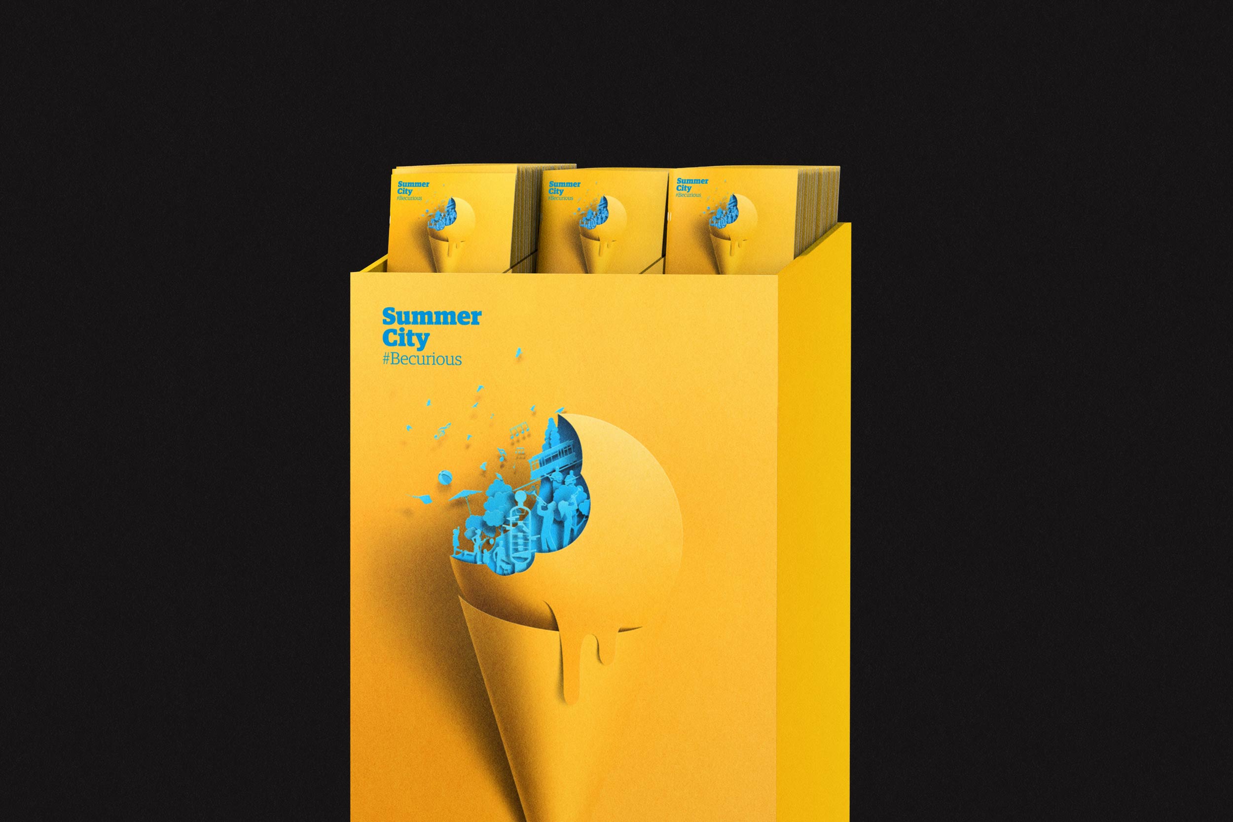
Summer City is Wellington City Council’s annual summer programme, uniting events from New Year’s Eve to Te Rā o Waitangi. The campaign invited audiences to ‘peek inside’ each event, reflecting its energy while staying cohesive. Centred on the theme “be curious,” it encouraged exploration and play, celebrating Summer City as vibrant Wellington experiences. — Designed while working at WCC Creative and Brand. — Illustrations by Eiko Ojala.
Summer City
Summer City is Wellington City Council’s annual summer programme, uniting events from New Year’s Eve to Te Rā o Waitangi. The campaign invited audiences to ‘peek inside’ each event, reflecting its energy while staying cohesive. Centred on the theme “be curious,” it encouraged exploration and play, celebrating Summer City as vibrant Wellington experiences. — Designed while working at WCC Creative and Brand. — Illustrations by Eiko Ojala.
Mueller Hut
Back Country
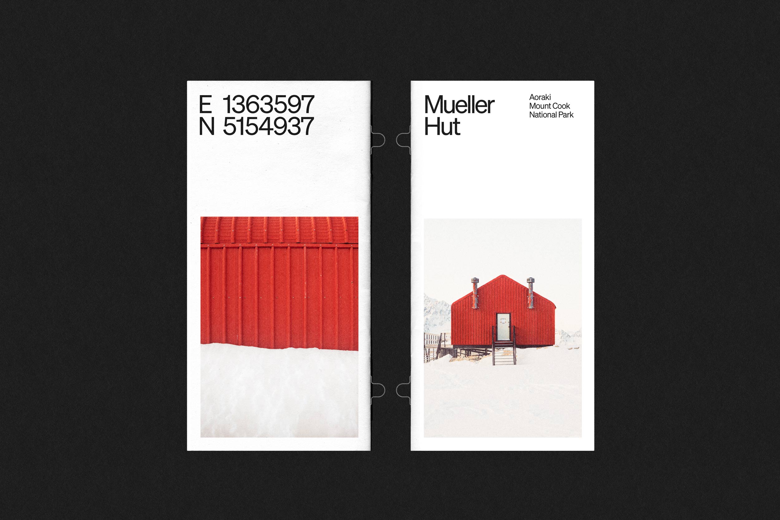
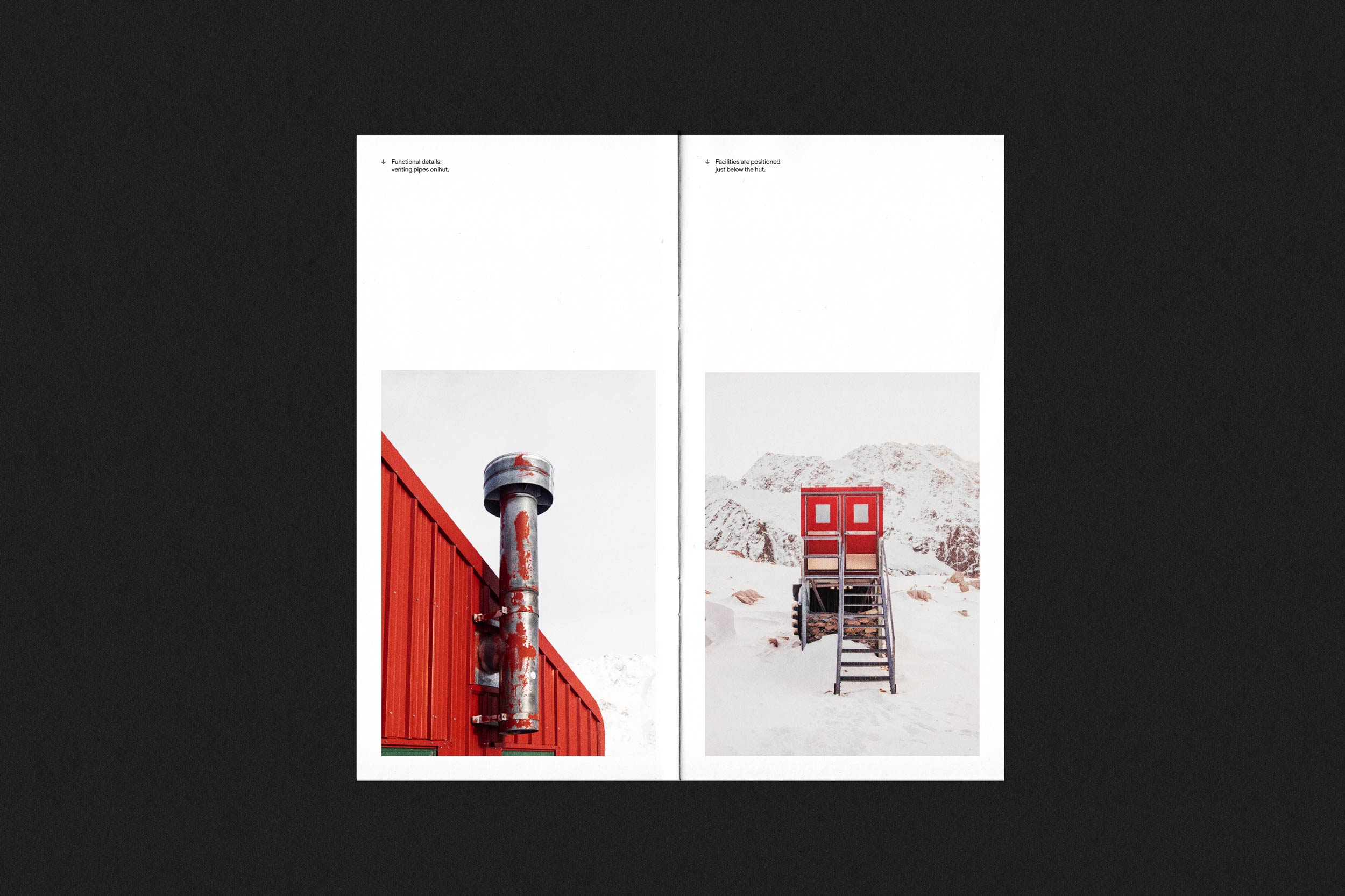
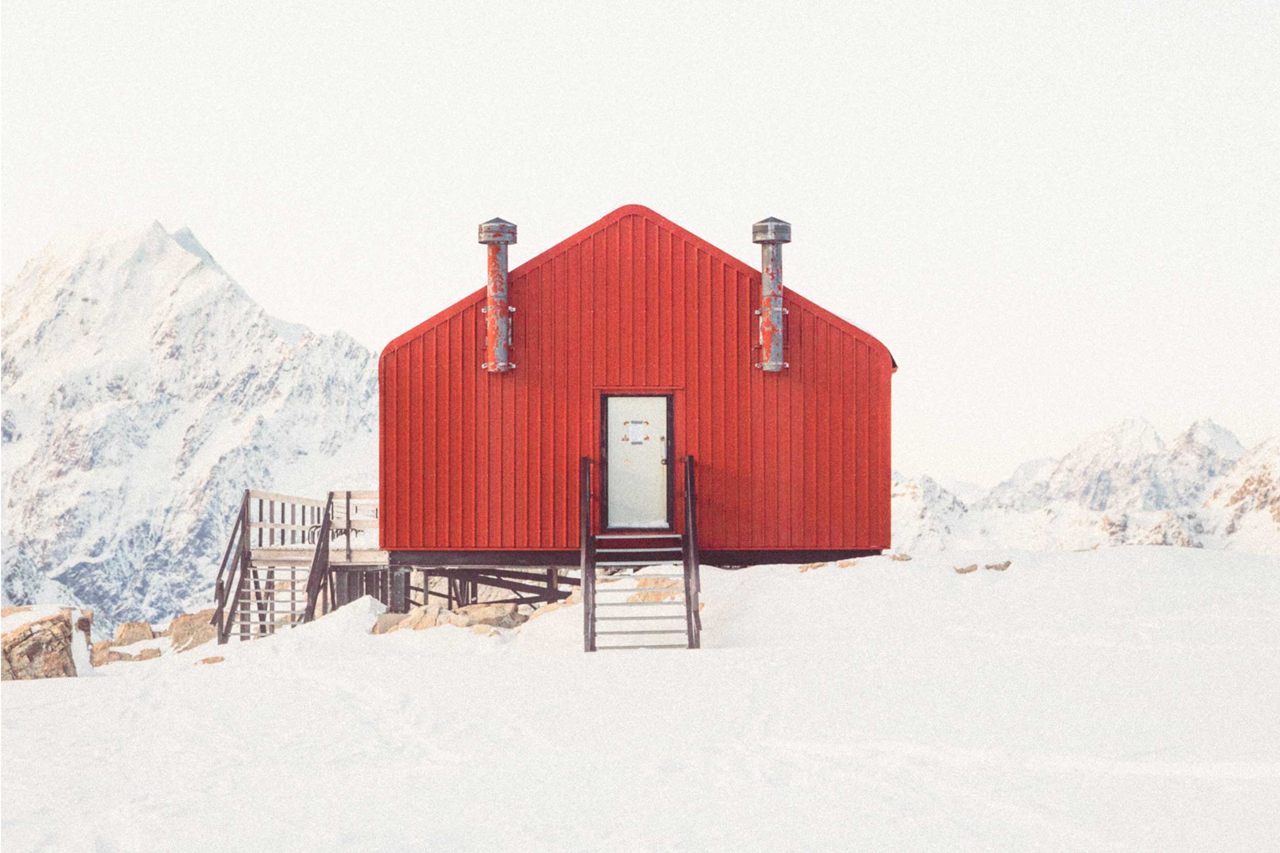
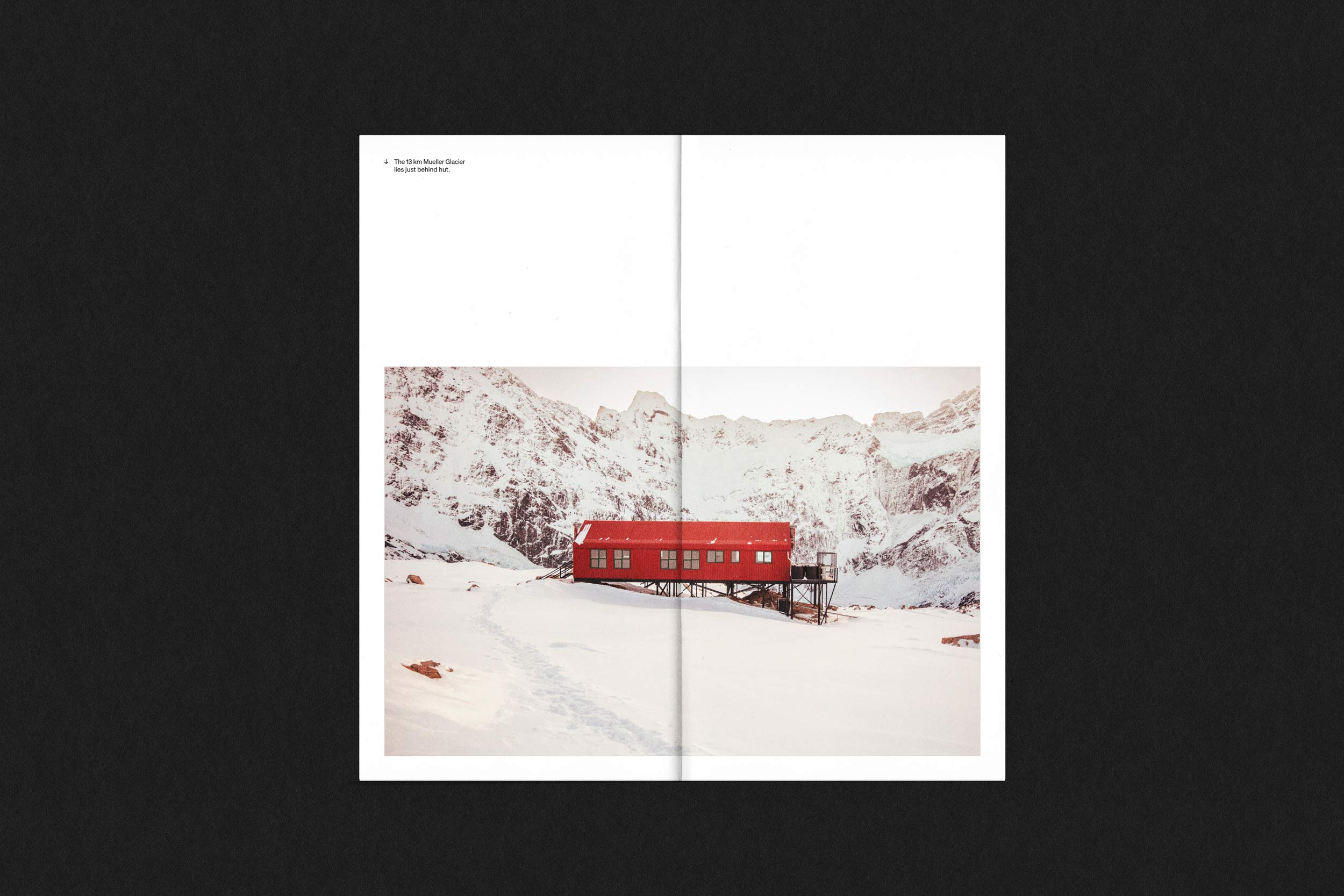
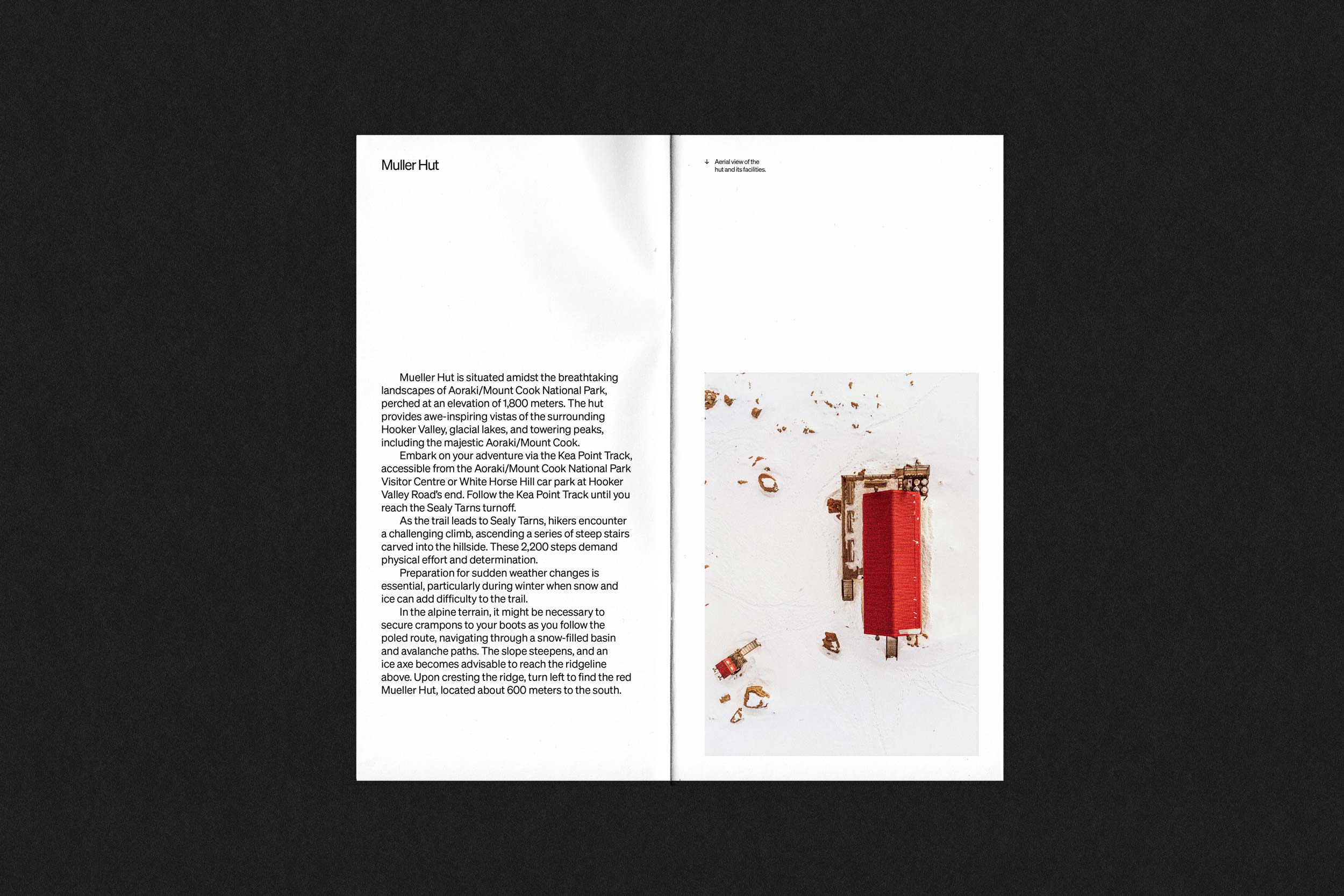
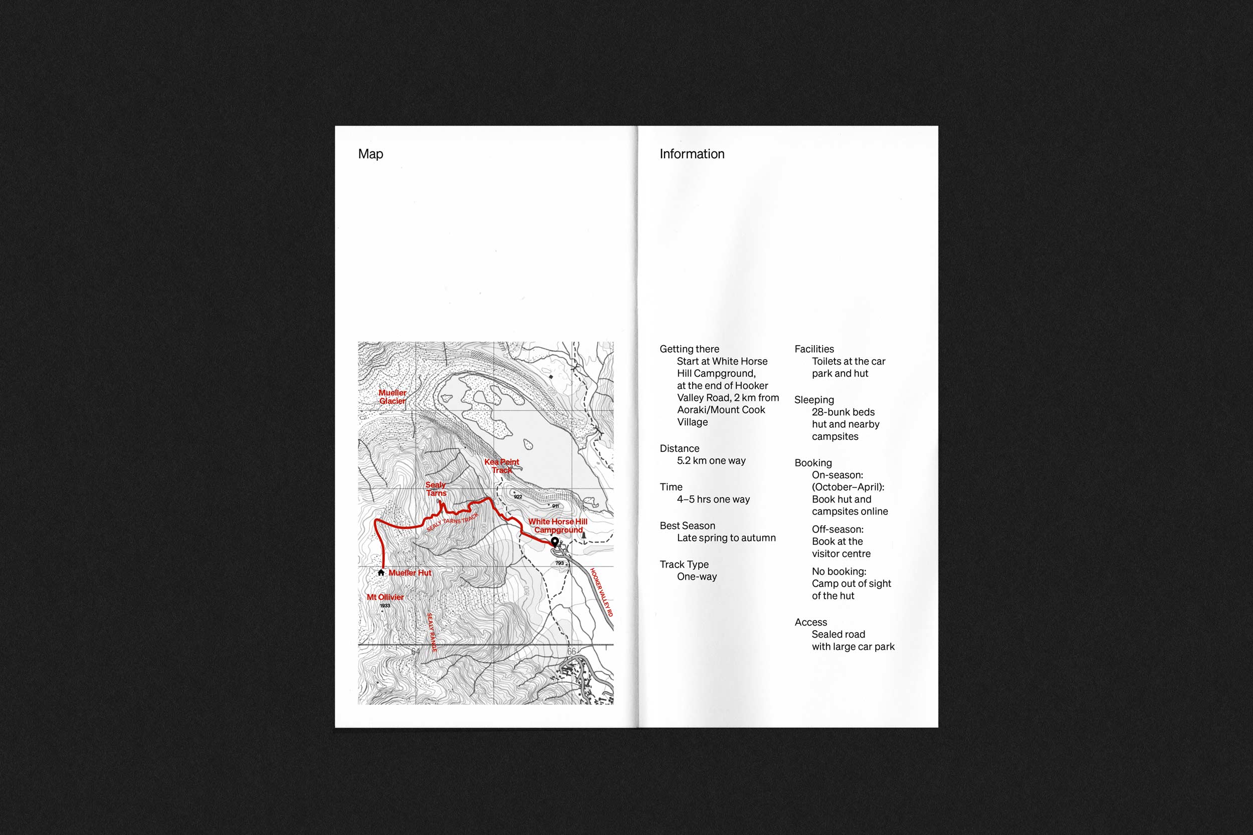
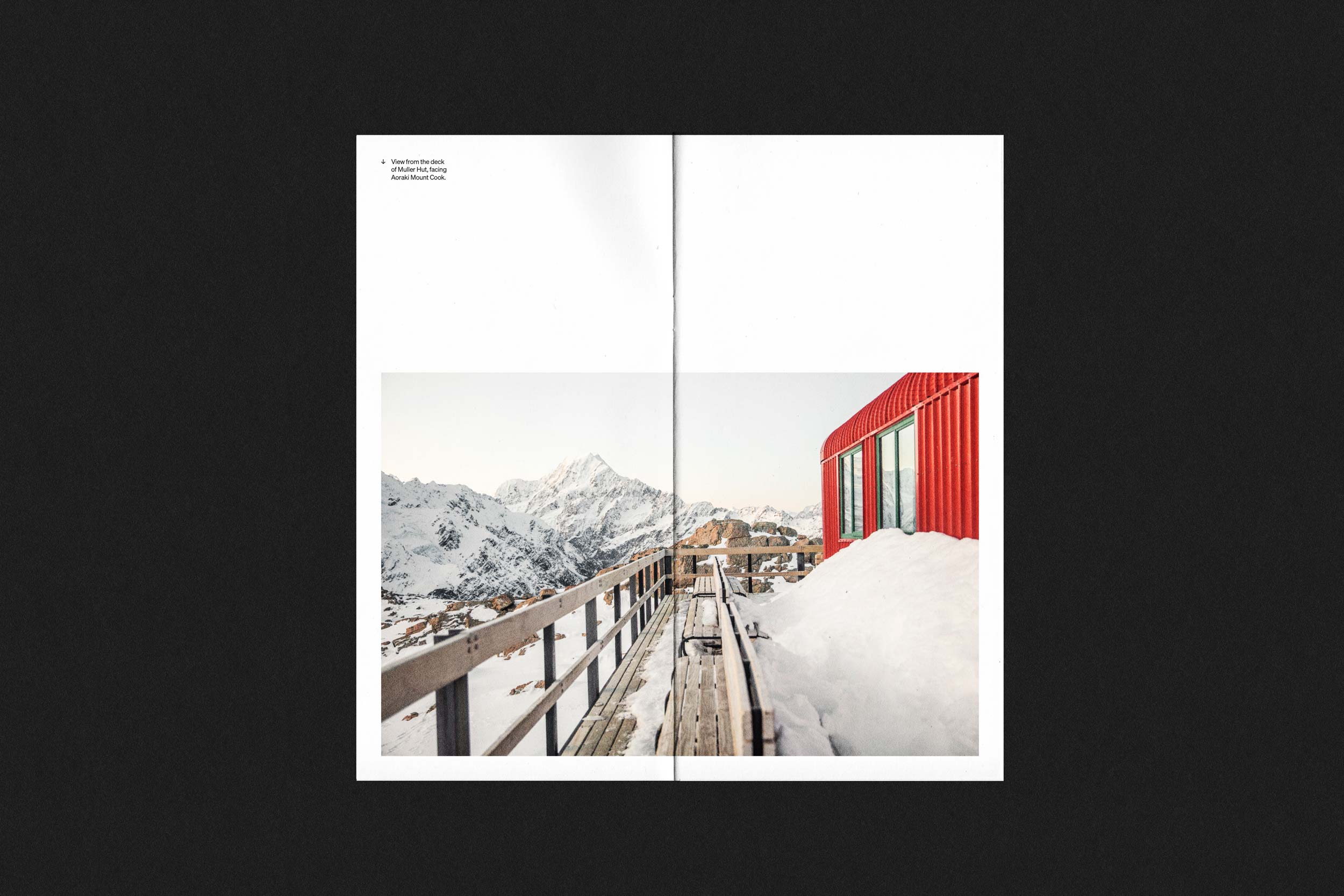
The Mueller Hut stands high in the Aoraki Mountains, its red exterior contrasting with the snow-covered landscape. We photographed it during a winter hike, focusing on its role as a practical shelter and a striking landmark in the Aoraki/Mt Cook environment. The images were compiled into a small booklet, inspired by the simple travel guides found in tourist offices. This is part of an ongoing project to document some of the most memorable hikes we undertake, to create a personal record and encourage others to get out and explore.
Mueller Hut
The Mueller Hut stands high in the Aoraki Mountains, its red exterior contrasting with the snow-covered landscape. We photographed it during a winter hike, focusing on its role as a practical shelter and a striking landmark in the Aoraki/Mt Cook environment. The images were compiled into a small booklet, inspired by the simple travel guides found in tourist offices. This is part of an ongoing project to document some of the most memorable hikes we undertake, to create a personal record and encourage others to get out and explore.